I am working on noise reduction and I need to learn how to analyze spectrograms
I mixed a pure speech file with violet noise in audacity and got the following spectrograms:
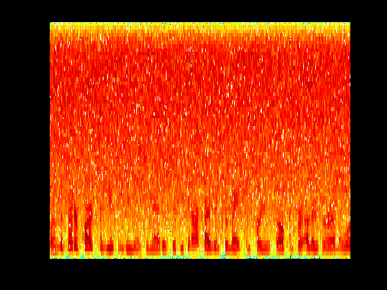
Matlab version
Sonogram version: (enter link description here)

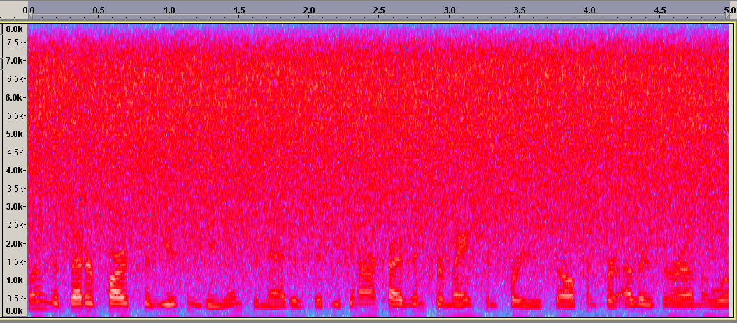
Spectrogram view in Audacity:
What do all the colours mean and why do they look different? Shouldn't everything have the same colours as in the Matlab version? Or are the exact colours not that important, since the darker pattern at the bottom of each figure still look similar in all of them?
--- EDIT :: Further additions: ---
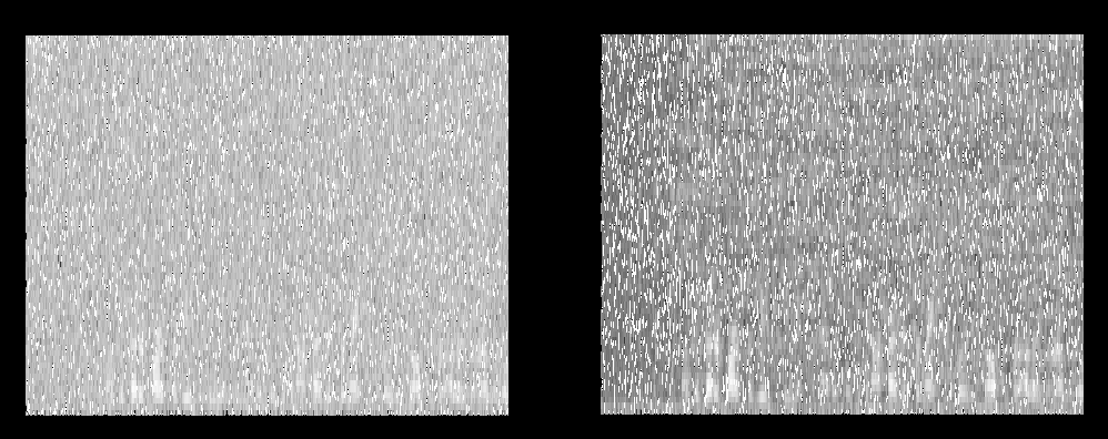
Here is a screenshot of the spectrogram of noisy speech as well as output of my noise reduced sound file.
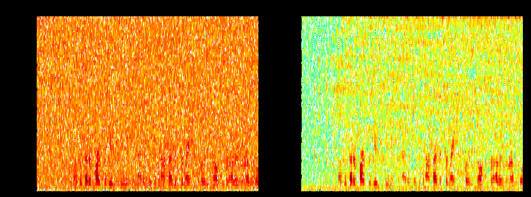
The one on the left is noisy signal while one on the right is the one passed through the noise reduction algorithm. Both figures are plotted through the spectrogram function of matlab, called as follows:
spectrogram(data, hanning(128), 64, 128, 16000)
The number 16000 is the Fs value (sampling frequency) returned by the wavread function used to read in the original noisy speech file into matlab. THeThe sound file is a male adult speaking, mixed with pinkviolet noise in audacity
--- EDIT 2: ---
Also, here is the same thing in gray-scale, if it helps