One way is through a bilogarithmic plot.
Define
bilog[val_, cut_: 1.], ff_: .25] := Module[ {out}, out = If[Abs[val] <= cut, ff val, Sign[val] Log10[Abs[val]] ] ]; for the data and
blvs[{rl_, rh_}, cut_: 1] := Module[ {out, lin, lgn, lgp, lgt, lgm, lgo, tik, tkn, tkp}, lin = Range[-.9 cut, .9 cut, cut/10]; lgp = Range[Log10[cut], Log10[rh], 1]; lgn = Range[Sign[rl] Log10[Abs@rl], Log10[cut], 1]; lgm = {#, Sign[#] 10^(Abs@#)} & /@ Join[lgn, lgp]; lgo = Log10[Range[1, 9, 1.]]; tkn = Sort@-(lgo + # & /@ Sort@Abs@lgn); tkp = Sort@+(lgo + # & /@ Sort@Abs@lgp); tkn = {#, ""} & /@ Flatten@tkn; tkp = {#, ""} & /@ Flatten@tkp; tik = Join[tkn, tkp, lgm] ] for the frame ticks, then
blv = {N@bilog[#[[1]], 1.], #[[2]]} & /@ llvaluefull; and
ListPlot[blv, Frame->True, FrameTicks -> {{Automatic, None}, {blvs[{-10000, 10000}, 1], None}}] gives you the plot I think you're after. Sans labels.

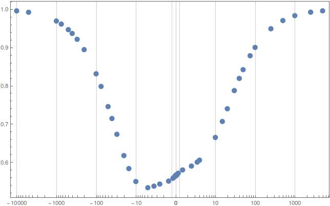
You'll also want to specify GridLines to make it clear that the region < Abs@cut has a linear scale.
The ff variable in the definition of bilog is cearly a fudge factor to scale the linear section so that it looks right.
Obviously, there are better ways of doing this job, and they are likely to involve the superposition of three properly-sized graphs for the appropriate regions. An exercise for the reader perhaps.
Another popular (at least in the geophysics community) transformation is through ArcSinh, but I'll leave definition of frame ticks as ananother exercise for the reader.