Recently installed the new version but I can't get the graphics to look the way I want them to. If I run this code
Plot[x^2, {x, -5, 5}, PlotStyle -> Thick] in version 8.0 and export the result as a png file then I get this: 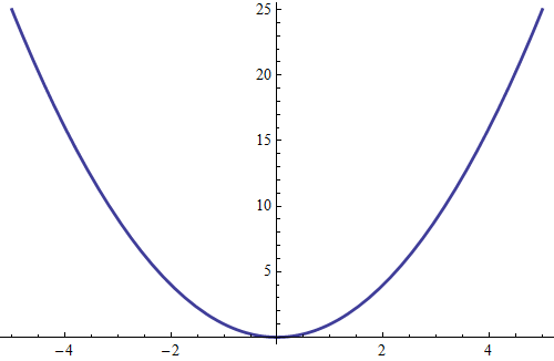
But if I run the same code in version 10.0 and export it, I get this: 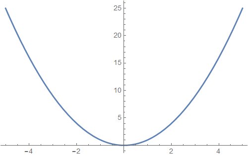
The blue trace looks better, in my opinion, in the older version. It's more vibrant, less faded or washed out. This also applies to the numbers on the axes, which look gray in the version 10.0 plot but black in the version 8.0 plot.
How can I reproduce the old graphics? Why did they make this change? Maybe the newer version is better for the screen, but I am trying to make publication-quality plots and need the old style.