Angular HtmlEditor - Predefined Items
Toolbar items allow users to format the HTML Editor's content and perform actions on it.
Predefined toolbar items include:
- Buttons that apply single-choice formats to the text.
- Action buttons.
- Select boxes that apply multiple-choice formats.
- Separators that are not user-interactive and only divide other elements.
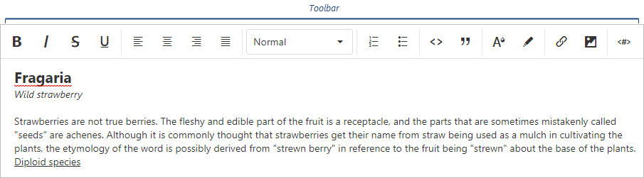
The following table lists toolbar items and the formats they apply (if applicable):
| Toolbar item name | Format | acceptedValues |
|---|---|---|
| "background" | "background" | Any value the background-color CSS property accepts. |
| "bold" | "bold" | true or false |
| "color" | "color" | Any value the color CSS property accepts. |
| "italic" | "italic" | true or false |
| "link" | "link" | String or Object ({ href: String, text: String, target: Boolean }) |
| "image" | "extendedImage" | String or Object ({ src: String, width: Number, height: Number, alt: String }) |
| "strike" | "strike" | true or false |
| "subscript" | "script" | "sub" |
| "superscript" | "script" | "super" |
| "underline" | "underline" | true or false |
| "blockquote" | "blockquote" | true or false |
| "header" | "header" | 1, 2, 3, 4, 5, or 6 |
| "increaseIndent" | "indent" | "+1" |
| "decreaseIndent" | "indent" | "-1" |
| "orderedList" | "list" | "ordered" |
| "bulletList" | "list" | "bullet" |
| "alignLeft" | "align" | "left" |
| "alignCenter" | "align" | "center" |
| "alignRight" | "align" | "right" |
| "alignJustify" | "align" | "justify" |
| "codeBlock" | "code-block" | true or false |
| "variable" | "variable" | Object ({ value: String, escapeChar: String | Array<String> }) |
| "font" | "font" | Any value the font-family CSS property accepts. |
| "size" | "size" | Any value the font-size CSS property accepts. |
| "undo" | - | - |
| "redo" | - | - |
| "clear" | - | - |
| "separator" | - | - |
| "cellProperties" | - | - |
| "tableProperties" | - | - |
| "insertTable" | - | - |
| "insertHeaderRow" | - | - |
| "insertRowAbove" | - | - |
| "insertRowBelow" | - | - |
| "insertColumnLeft" | - | - |
| "insertColumnRight" | - | - |
| "deleteColumn" | - | - |
| "deleteRow" | - | - |
| "deleteTable" | - | - |
To add a button to the toolbar, add its name to the items array:
jQuery
JavaScript
$(function(){ $("#htmlEditorContainer").dxHtmlEditor({ toolbar: { items: [ "bold", "italic", "alignRight", "alignLeft" ] } }) })Angular
HTML
TypeScript
<dx-html-editor> <dxo-toolbar> <dxi-item name="bold"/> <dxi-item name="italic"/> <dxi-item name="alignRight"/> <dxi-item name="alignLeft"/> </dxo-toolbar> </dx-html-editor>
import { DxHtmlEditorModule } from "devextreme-angular"; // ... export class AppComponent { // ... } @NgModule({ imports: [ // ... DxHtmlEditorModule ], // ... })Vue
<template> <DxHtmlEditor> <DxToolbar> <DxItem name="bold"/> <DxItem name="italic"/> <DxItem name="alignRight"/> <DxItem name="alignLeft"/> </DxToolbar> </DxHtmlEditor> </template> <script> import 'devextreme/dist/css/dx.light.css'; import { DxHtmlEditor, DxToolbar, DxItem } from 'devextreme-vue/html-editor'; export default { components: { DxHtmlEditor, DxToolbar, DxItem } } </script>React
import React from 'react'; import 'devextreme/dist/css/dx.light.css'; import { HtmlEditor, Toolbar, Item } from 'devextreme-react/html-editor'; class App extends React.Component { render() { return ( <HtmlEditor> <Toolbar> <Item name="bold"/> <Item name="italic"/> <Item name="alignRight"/> <Item name="alignLeft"/> </Toolbar> </HtmlEditor> ); } } export default App;ASP.NET MVC Controls
Razor C#
@(Html.DevExtreme().HtmlEditor() .ID("htmlEditor") .Toolbar(t => t .Items(i => { i.Add().Name("bold"); i.Add().Name("italic"); i.Add().Name("alignRight"); i.Add().Name("alignLeft"); }) ) )To add a select box, specify the name and acceptedValues:
jQuery
JavaScript
$(function(){ $("#htmlEditorContainer").dxHtmlEditor({ toolbar: { items: [{ name: "header", acceptedValues: [1, 2, 3, false] }, { name: "align", acceptedValues: ["left", "right", "center"] }] } }) })Angular
HTML
TypeScript
<dx-html-editor> <dxo-toolbar> <dxi-item [acceptedValues]="headerAcceptedValues" name="header" /> <dxi-item [acceptedValues]="alignAcceptedValues" name="align" /> </dxo-toolbar> </dx-html-editor>
import { DxHtmlEditorModule } from "devextreme-angular"; // ... export class AppComponent { headerAcceptedValues = [1, 2, 3, false]; alignAcceptedValues = ["left", "right", "center"]; } @NgModule({ imports: [ // ... DxHtmlEditorModule ], // ... })Vue
<template> <DxHtmlEditor> <DxToolbar> <DxItem :accepted-values="headerAcceptedValues" name="header" /> <DxItem :accepted-values="alignAcceptedValues" name="align" /> </DxToolbar> </DxHtmlEditor> </template> <script> import 'devextreme/dist/css/dx.light.css'; import { DxHtmlEditor, DxToolbar, DxItem } from 'devextreme-vue/html-editor'; export default { components: { DxHtmlEditor, DxToolbar, DxItem }, data() { return { headerAcceptedValues: [1, 2, 3, false], alignAcceptedValues: ['left', 'right', 'center'] }; } } </script>React
import React from 'react'; import 'devextreme/dist/css/dx.light.css'; import { HtmlEditor, Toolbar, Item } from 'devextreme-react/html-editor'; const headerAcceptedValues = [1, 2, 3, false]; const alignAcceptedValues = ['left', 'right', 'center']; class App extends React.Component { render() { return ( <HtmlEditor> <Toolbar> <Item acceptedValues={headerAcceptedValues} name="header" /> <Item acceptedValues={alignAcceptedValues} name="align" /> </Toolbar> </HtmlEditor> ); } } export default App;ASP.NET MVC Controls
Razor C#
@(Html.DevExtreme().HtmlEditor() .Toolbar(t => t .Items(i => { i.Add().Name("header") .AcceptedValues(new JS ("[1, 2, 3, false]")); i.Add().Name("align") .AcceptedValues(new[] { "left", "right", "center" }) }) ) )Customize Predefined Items
To customize a button, assign its name to the name property and specify button properties in the options object:
jQuery
JavaScript
$(function(){ $("#htmlEditorContainer").dxHtmlEditor({ toolbar: { items: [{ name: "clear", options: { icon: "clear", type: "danger" } }, // ... ] } }) })Angular
HTML
TypeScript
<dx-html-editor> <dxo-toolbar> <dxi-item [options]="clearFormatOptions" name="clear"> </dxi-item> </dxo-toolbar> </dx-html-editor>
import { DxHtmlEditorModule } from "devextreme-angular"; // ... export class AppComponent { clearFormatOptions = { icon: "clear", type: "danger" }; } @NgModule({ imports: [ // ... DxHtmlEditorModule ], // ... })Vue
<template> <DxHtmlEditor> <DxToolbar> <DxItem :options="clearFormatOptions" name="clear" /> </DxToolbar> </DxHtmlEditor> </template> <script> import 'devextreme/dist/css/dx.light.css'; import { DxHtmlEditor, DxToolbar, DxItem } from 'devextreme-vue/html-editor'; export default { components: { DxHtmlEditor, DxToolbar, DxItem }, data() { return { clearFormatOptions: { icon: 'clear', type: 'danger' } }; } } </script>React
import React from 'react'; import 'devextreme/dist/css/dx.light.css'; import { HtmlEditor, Toolbar, Item } from 'devextreme-react/html-editor'; const clearFormatOptions = { icon: 'clear', type: 'danger' }; class App extends React.Component { render() { return ( <HtmlEditor> <Toolbar> <Item options={clearFormatOptions} name="clear" /> </Toolbar> </HtmlEditor> ); } } export default App;ASP.NET MVC Controls
Razor C#
@(Html.DevExtreme().HtmlEditor() .Toolbar(t => t .Items(i => { i.Add().Name("clear") .Widget(w => w.Button() .Icon("clear") .Type(ButtonType.Danger) ); }) ) )To customize a select box, specify select box properties in the options object in addition to the name and acceptedValues properties:
jQuery
JavaScript
$(function(){ $("#htmlEditorContainer").dxHtmlEditor({ toolbar: { items: [{ name: "size", acceptedValues: ["11px", "14px", "16px"], options: { width: 150 } }, // ... ] } }) })Angular
HTML
TypeScript
<dx-html-editor> <dxo-toolbar> <dxi-item [options]="sizeFormatOptions" [acceptedValues]="sizeAcceptedValues" name="size" /> </dxo-toolbar> </dx-html-editor>
import { DxHtmlEditorModule } from "devextreme-angular"; // ... export class AppComponent { sizeAcceptedValues = ["11px", "14px", "16px"]; sizeFormatOptions = { width: 150 }; } @NgModule({ imports: [ // ... DxHtmlEditorModule ], // ... })Vue
<template> <DxHtmlEditor> <DxToolbar> <DxItem :options="sizeFormatOptions" :accepted-values="sizeAcceptedValues" name="size" /> </DxToolbar> </DxHtmlEditor> </template> <script> import 'devextreme/dist/css/dx.light.css'; import { DxHtmlEditor, DxToolbar, DxItem } from 'devextreme-vue/html-editor'; export default { components: { DxHtmlEditor, DxToolbar, DxItem }, data() { return { sizeFormatOptions: { width: 150 }, sizeAcceptedValues: ["11px", "14px", "16px"] }; } } </script>React
import React from 'react'; import 'devextreme/dist/css/dx.light.css'; import { HtmlEditor, Toolbar, Item } from 'devextreme-react/html-editor'; const sizeFormatOptions = { width: 150 }; const sizeAcceptedValues = ["11px", "14px", "16px"]; class App extends React.Component { render() { return ( <HtmlEditor> <Toolbar> <Item options={sizeFormatOptions} acceptedValues={sizeAcceptedValues} name="size" /> </Toolbar> </HtmlEditor> ); } } export default App;ASP.NET MVC Controls
Razor C#
@(Html.DevExtreme().HtmlEditor() .Toolbar(t => t .Items(i => { i.Add().Name("size") .AcceptedValues(new[] { "11px", "14px", "16px" }) .Widget(w => w.SelectBox() .Width(150) ); }) ) )See Also
Feel free to share topic-related thoughts here.
If you have technical questions, please create a support ticket in the DevExpress Support Center.
Thank you for the feedback! If you have technical questions, please create a support ticket in the DevExpress Support Center.