React VectorMap - controlBar
Configures the control bar.
Selector: ControlBar
Type:
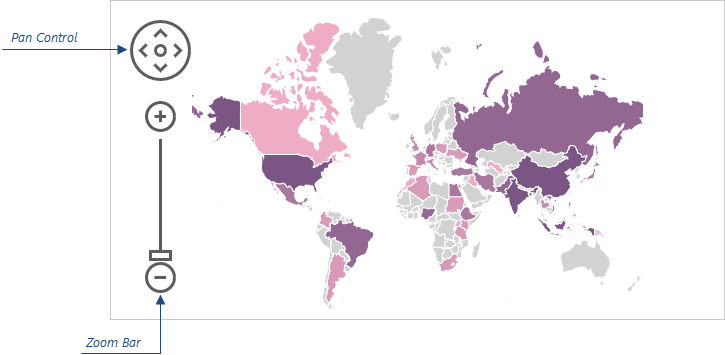
Users can use the pan control and zoom bar in the control bar panel to navigate the map.
The following code shows how to use the controlBar object to move the control bar to the right side of the map:
jQuery
JavaScript
$(function() { $("#vectorMapContainer").dxVectorMap({ // ... controlBar: { horizontalAlignment: "right" } }); });Angular
app.component.html
app.module.ts
<dx-vector-map ... > <dxo-control-bar horizontalAlignment="right"> </dxo-control-bar> </dx-vector-map>
// ... import { DxVectorMapModule } from 'devextreme-angular'; @NgModule({ imports: [ // ... DxVectorMapModule ], // ... }) export class AppModule { }Vue
App.vue
<template> <DxVectorMap ... > <DxControlBar horizontal-alignment="right" /> </DxVectorMap> </template> <script> import { DxVectorMap, DxControlBar } from 'devextreme-vue/vector-map'; export default { components: { DxVectorMap, DxControlBar }, // ... } </script>React
App.js
import React from 'react'; import { VectorMap, ControlBar } from 'devextreme-react/vector-map'; class App extends React.Component { render() { return ( <VectorMap> // ... <ControlBar horizontalAlignment="right" /> </VectorMap> ); } } export default App;ASP.NET MVC Controls
Razor C#
@(Html.DevExtreme().VectorMap() @* ... *@ .ControlBar(cb => cb .HorizontalAlignment(HorizontalAlignment.Right) ) )
borderColor
Specifies a color for the outline of the control bar elements.
Type:
Default Value: '#5d5d5d'
This property supports the following colors:
- Hexadecimal colors
- RGB colors
- RGBA colors
- Predefined/cross-browser color names
- Predefined SVG colors
- Paint server address
color
Specifies a color for the inner area of the control bar elements.
Type:
Default Value: '#ffffff'
This property supports the following colors:
- Hexadecimal colors
- RGB colors
- RGBA colors
- Predefined/cross-browser color names
- Predefined SVG colors
- Paint server address
horizontalAlignment
Specifies the position of the control bar.
Type:
Default Value: 'left'
In addition to this property, use the verticalAlignment property to adjust the position of the control bar.
verticalAlignment
Specifies the position of the control bar.
Type:
Default Value: 'top'
In addition to this property, use the horizontalAlignment property to adjust the position of the control bar.
Feel free to share topic-related thoughts here.
If you have technical questions, please create a support ticket in the DevExpress Support Center.
Thank you for the feedback! If you have technical questions, please create a support ticket in the DevExpress Support Center.