Gallery
Vue Bootstrap Gallery - free examples, templates & tutorial
Responsive Vue galleries created with Bootstrap 5. Image gallery, video gallery, photo gallery, full-page, eCommerce, lightbox, slider, thumbnails, & more.
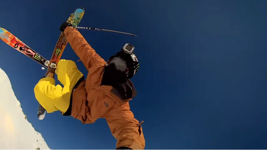
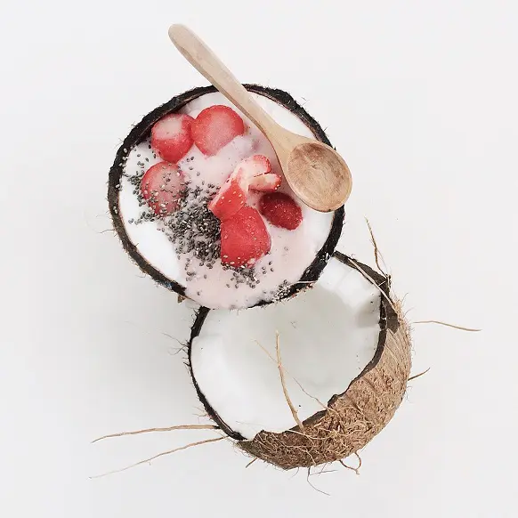
Static images
An example with the usage of static images.
To learn more read Images Docs.
.webp)


.webp)

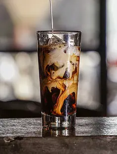
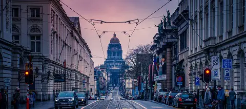
<template> <!-- Gallery --> <div class="row"> <div class="col-lg-4 col-md-12 mb-4 mb-lg-0"> <img src="https://mdbcdn.b-cdn.net/img/Photos/Horizontal/Nature/4-col/img%20(73).webp" class="w-100 shadow-1-strong rounded mb-4" alt="Boat on Calm Water" /> <img src="https://mdbcdn.b-cdn.net/img/Photos/Vertical/mountain1.webp" class="w-100 shadow-1-strong rounded mb-4" alt="Wintry Mountain Landscape" /> </div> <div class="col-lg-4 mb-4 mb-lg-0"> <img src="https://mdbcdn.b-cdn.net/img/Photos/Vertical/mountain2.webp" class="w-100 shadow-1-strong rounded mb-4" alt="Mountains in the Clouds" /> <img src="https://mdbcdn.b-cdn.net/img/Photos/Horizontal/Nature/4-col/img%20(73).webp" class="w-100 shadow-1-strong rounded mb-4" alt="Boat on Calm Water" /> </div> <div class="col-lg-4 mb-4 mb-lg-0"> <img src="https://mdbcdn.b-cdn.net/img/Photos/Horizontal/Nature/4-col/img%20(18).webp" class="w-100 shadow-1-strong rounded mb-4" alt="Waves at Sea" /> <img src="https://mdbcdn.b-cdn.net/img/Photos/Vertical/mountain3.webp" class="w-100 shadow-1-strong rounded mb-4" alt="Yosemite National Park" /> </div> </div> <!-- Gallery --> </template> Carousel / Slider
Carousel (also called "slider") is a slideshow cycling through different elements such as photos, videos, or text.
To learn more read Carousel Docs.
.webp)
First slide label
Nulla vitae elit libero, a pharetra augue mollis interdum.
.webp)
Second slide label
Lorem ipsum dolor sit amet, consectetur adipiscing elit.
.webp)
Third slide label
Praesent commodo cursus magna, vel scelerisque nisl consectetur.
<template> <MDBCarousel v-model="carousel1" :items="items1" fade /> </template> <script> import { ref } from "vue"; import { MDBCarousel } from "mdb-vue-ui-kit"; export default { components: { MDBCarousel }, setup() { const items1 = [{ src: "https://mdbootstrap.com/img/Photos/Slides/img%20(15).webp", alt: "...", label: "First slide label", caption: "Nulla vitae elit libero, a pharetra augue mollis interdum." }, { src: "https://mdbootstrap.com/img/Photos/Slides/img%20(22).webp", alt: "...", label: "Second slide label", caption: "Lorem ipsum dolor sit amet, consectetur adipiscing elit." }, { src: "https://mdbootstrap.com/img/Photos/Slides/img%20(23).webp", alt: "...", label: "Third slide label", caption: "Praesent commodo cursus magna, vel scelerisque nisl consectetur." } ]; const carousel1 = ref(0); return { items1, carousel1 }; } }; </script> Gallery with modals and YouTube videos
An example of the combination of bootstrap modals and youtube video embeds.
To learn more read Modals Docs.


<template> <!-- Button trigger modal --> <div class="row"> <div class="col-lg-4 col-md-12 mb-4 mb-lg-0"> <div class="bg-image hover-overlay ripple shadow-1-strong rounded"> <img src="https://mdbcdn.b-cdn.net/img/screens/yt/screen-video-1.webp" class="w-100" /> <a href="#!" @click="exampleModal = true"> <div class="mask" style="background-color: rgba(251, 251, 251, 0.2);"></div> </a> </div> </div> <div class="col-lg-4 mb-4 mb-lg-0"> <div class="bg-image hover-overlay ripple shadow-1-strong rounded"> <img src="https://mdbcdn.b-cdn.net/img/screens/yt/screen-video-2.webp" class="w-100" /> <a href="#!" @click="exampleModal2 = true"> <div class="mask" style="background-color: rgba(251, 251, 251, 0.2);"></div> </a> </div> </div> <div class="col-lg-4 mb-4 mb-lg-0"> <div class="bg-image hover-overlay ripple shadow-1-strong rounded"> <img src="https://mdbcdn.b-cdn.net/img/screens/yt/screen-video-3.webp" class="w-100" /> <a href="#!" @click="exampleModal3 = true"> <div class="mask" style="background-color: rgba(251, 251, 251, 0.2);"></div> </a> </div> </div> </div> <MDBModal id="exampleModal" tabindex="-1" labelledby="exampleModalLabel" v-model="exampleModal"> <MDBModalBody> <div class="ratio ratio-16x9"> <iframe src="https://www.youtube.com/embed/A3PDXmYoF5U" title="YouTube video" allowfullscreen></iframe> </div> </MDBModalBody> <MDBModalFooter> <MDBBtn color="secondary" @click="exampleModal = false">Close</MDBBtn> </MDBModalFooter> </MDBModal> <MDBModal id="exampleModal2" tabindex="-1" labelledby="exampleModalLabel2" v-model="exampleModal2"> <MDBModalBody> <div class="ratio ratio-16x9"> <iframe src="https://www.youtube.com/embed/wTcNtgA6gHs" title="YouTube video" allowfullscreen></iframe> </div> </MDBModalBody> <MDBModalFooter> <MDBBtn color="secondary" @click="exampleModal2 = false">Close</MDBBtn> </MDBModalFooter> </MDBModal> <MDBModal id="exampleModal3" tabindex="-1" labelledby="exampleModalLabel3" v-model="exampleModal3"> <MDBModalBody> <div class="ratio ratio-16x9"> <iframe src="https://www.youtube.com/embed/vlDzYIIOYmM" title="YouTube video" allowfullscreen></iframe> </div> </MDBModalBody> <MDBModalFooter> <MDBBtn color="secondary" @click="exampleModal3 = false">Close</MDBBtn> </MDBModalFooter> </MDBModal> </template> <script> import { MDBModal, MDBModalBody, MDBModalFooter, MDBBtn, } from 'mdb-vue-ui-kit'; import { ref } from 'vue'; export default { components: { MDBModal, MDBModalBody, MDBModalFooter, MDBBtn, }, setup() { const exampleModal = ref(false); const exampleModal2 = ref(false); const exampleModal3 = ref(false); return { exampleModal, exampleModal2, exampleModal3, }; }, }; </script> Lightbox
If you need advanced options you can use MDBootstrap LightBox component.
Note: This component requires MDBootstrap Pro package.

<template> <MDBLightbox> <MDBRow> <MDBCol lg="6"> <MDBLightboxItem src="https://mdbootstrap.com/img/Photos/Thumbnails/Slides/1.webp" fullScreenSrc="https://mdbootstrap.com/img/Photos/Slides/1.webp" alt="Lightbox image 1" class="w-100 mb-2 mb-md-4" /> <MDBLightboxItem src="https://mdbootstrap.com/img/Photos/Thumbnails/Square/1.webp" fullScreenSrc="https://mdbootstrap.com/img/Photos/Square/1.webp" alt="Lightbox image 2" class="w-100" /> </MDBCol> <MDBCol lg="6"> <MDBLightboxItem src="https://mdbootstrap.com/img/Photos/Thumbnails/Vertical/1.webp" fullScreenSrc="https://mdbootstrap.com/img/Photos/Vertical/1.webp" alt="Lightbox image 3" class="w-100" /> </MDBCol> </MDBRow> </MDBLightbox> </template> <script> import { MDBLightbox, MDBLightboxItem, MDBRow, MDBCol } from 'mdb-vue-ui-kit'; export default { components: { MDBLightbox, MDBLightboxItem, MDBRow, MDBCol } }; </script> Advanced multi-item carousel
If you need advanced multi-item gallery you can use MDBootstrap Multi Item component.
Note: This component requires MDBootstrap Pro package.


<template> <MDBMultiCarousel :images="[ { src: 'https://mdbootstrap.com/img/Photos/Thumbnails/Slides/1.jpg', alt: 'Gallery image 1', class: 'w-100', }, { src: 'https://mdbootstrap.com/img/Photos/Thumbnails/Slides/2.jpg', alt: 'Gallery image 2', class: 'w-100', }, { src: 'https://mdbootstrap.com/img/Photos/Thumbnails/Slides/3.jpg', alt: 'Gallery image 3', class: 'w-100', }, { src: 'https://mdbootstrap.com/img/Photos/Thumbnails/Slides/4.jpg', alt: 'Gallery image 4', class: 'w-100', }, ]" /> </template> <script> import { MDBBtn } from "mdb-vue-ui-kit"; export default { components: { MDBBtn } }; </script> Vertical multi item carousel
Vertical implementation of Multi Item carousel.
Note: This component requires MDBootstrap Pro package.
<template> <MDBMultiCarousel vertical style="max-width: 20rem"> <img src="https://mdbootstrap.com/img/Photos/Thumbnails/Slides/1.jpg" alt="Gallery image 1" class="w-100" /> <img src="https://mdbootstrap.com/img/Photos/Thumbnails/Slides/2.jpg" alt="Gallery image 2" class="w-100" /> <img src="https://mdbootstrap.com/img/Photos/Thumbnails/Slides/3.jpg" alt="Gallery image 3" class="w-100" /> <img src="https://mdbootstrap.com/img/Photos/Thumbnails/Slides/4.jpg" alt="Gallery image 4" class="w-100" /> </MDBMultiCarousel> </template> <script> import { MDBMultiCarousel } from "mdb-vue-multi-carousel"; export default { components: { MDBMultiCarousel } }; </script> eCommerce gallery
An example of gallery with zoom effect, adjusted to eCommerce projects.
To learn more read eCommerce Gallery Docs.
Note: This component requires MDBootstrap Pro package.
<template> <MDBRow> <MDBCol col="6"> <MDBECommerceGallery :lightboxRef="lightbox12" zoomEffect autoHeight> <MDBRow class="py-3 shadow-5"> <MDBCol col="12" class="mb-1"> <MDBLightbox ref="lightbox12"> <MDBLightboxItem src="https://mdbootstrap.com/img/Photos/Horizontal/E-commerce/Vertical/14a.webp" alt="Gallery image 1" class="ecommerce-gallery-main-img active w-100" /> </MDBLightbox> </MDBCol> <MDBCol class="mt-1"> <img src="https://mdbootstrap.com/img/Photos/Horizontal/E-commerce/Vertical/14a.webp" data-fullscreen-src="https://mdbootstrap.com/img/Photos/Horizontal/E-commerce/Vertical/14a.webp" alt="Gallery image 1" class="active w-100" /> </MDBCol> <MDBCol class="mt-1"> <img src="https://mdbootstrap.com/img/Photos/Horizontal/E-commerce/Vertical/12a.webp" data-fullscreen-src="https://mdbootstrap.com/img/Photos/Horizontal/E-commerce/Vertical/12a.webp" alt="Gallery image 2" class="w-100" /> </MDBCol> <MDBCol class="mt-1"> <img src="https://mdbootstrap.com/img/Photos/Horizontal/E-commerce/Vertical/13a.webp" data-fullscreen-src="https://mdbootstrap.com/img/Photos/Horizontal/E-commerce/Vertical/13a.webp" alt="Gallery image 3" class="w-100" /> </MDBCol> <MDBCol class="mt-1"> <img src="https://mdbootstrap.com/img/Photos/Horizontal/E-commerce/Vertical/15a.webp" data-fullscreen-src="https://mdbootstrap.com/img/Photos/Horizontal/E-commerce/Vertical/15a.webp" alt="Gallery image 4" class="w-100" /> </MDBCol> </MDBRow> </MDBECommerceGallery> </MDBCol> </MDBRow> </template> <script> import { MDBRow, MDBCol, MDBLightbox, MDBLightboxItem } from "mdb-vue-ui-kit"; import { MDBECommerceGallery } from "mdb-vue-ecommerce-gallery"; import { ref } from "vue"; export default { components: { MDBRow, MDBCol, MDBLightbox, MDBLightboxItem, MDBECommerceGallery }, setup() { const lightbox12 = ref(null) return { lightbox12 } } }; </script>