Here we see that in the new color scheme, the comment is only barely distinguishable from the preceding code, and even less so from the literals (e.g., 'gre\'ater') It might not not so close that I'd consider it a clear failure in this regard, but it's enough to make me at least a little uncomfortable (and at least with respect to serving people with color vision deficiencies, pretty close to an outright failure).
Draw circles and arrows and a paragraph on the back of each one to be used as evidence in court.
Jerry Coffin
- 3.2k
- 2
- 20
- 18
OnTo me, the new color scheme appears to have at least a couple of different general types of problems.
One is technical accuracy (i.e., accuracy in the tokenization itself). For example, looking at the Python example, if is in one color, and None in a different color (which appears to be the same color for 0, 1, and 0b101 and for someFunc and SomeClass). if and None are both keywords, so it would appear reasonable that they both be the same color. It doesn't seem reasonable or useful for two keywords to be in clearly different colors, and one of them in the same color as some identifiers and literal values.
Another is the choices of colors themselves. Generally speaking, for comfortable viewing we want to balance between two extremes. If there's too little difference between colors, it's not always clear whether two things are the same or different colors. When colors can't be distinguished easily, we lose much of the benefit of using coloring to start with.
At the same time, we don't want too much contrast, especially when two things are immediately adjacent to each other hand. If we do this, now Iviewing simply becomes uncomfortable1.
In this case, we see what may be some of the first problem. As previously mentioned, in the Python example, None, someFunc, SomeClass, 1, 0 and 0b101 are all shown in what looks like the same color. It's possible that this isn't really a parsing problem--maybe it's assigning a unique color to each, and they just happen to be so similar that we can't distinguish them.
The old color scheme also differentiates between the class name and the function name, where the new one seems to use the same color for both. Given that they're both syntactically identifiers, it's open to argument that this doesn't affect accuracy (as such), but it seems pretty clear to me that the old scheme is providing more useful information.
In the dark mode pictures, we see at least a few clear-cut cases of excessive contrast. The most obvious are the parameters (param1 and param2) shown in bright white against a deep-black background. In this case, we've pretty clearly gone beyond the level of contrast that most people can guesslook at whycomfortably. As an aside, there are a few cases where it's a bit more reasonable to break or at least bend this rule a bit. For example, if you're coloring something with a very small area (e.g., a period or comma) you didn't docan often get away with a bit higher contrast than if the area were larger.
At least in my opinion, the light mode version of the new coloring fares at least somewhat better in this respect. We still have None colored to start withmatch the identifiers and literals, and mismatching if. InOn the other hand, the background in this case is a side by side comparisonlight grey, and the parameter names are in a fundamental differencesomewhat darker grey, so the contrast range is obviousconsiderably more manageable. Where
Given a wide audience, we'd also like the color schemes to work well for people with color impaired vision. The most common color vision impairment is called Deuteranomaly. If we run the pictures through a filter, we can see a simulation of approximately how these would look. For example, here's the light-mode Python code with simulated deuteranomaly vision:
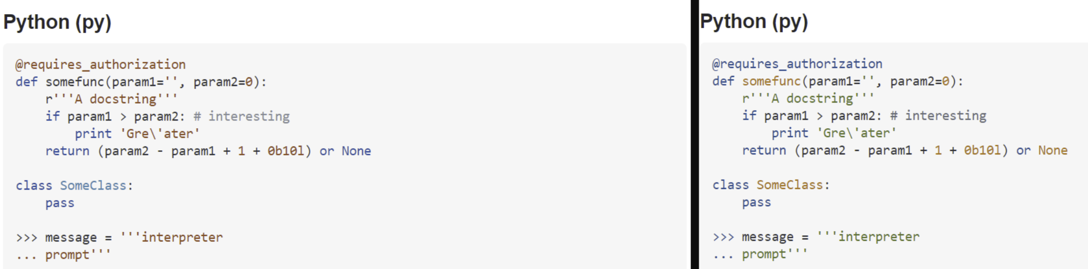
Here we see that in the new color scheme, the comment is only barely distinguishable from the preceding code, and even less so from the literals (e.g., 'gre\'ater') It might not not so close that I'd consider it a clear failure in this regard, but it's enough to make me at least a little uncomfortable.
The old color scheme was mostly fairly restrainedis clearly superior in this regard--although contrast is certainly reduced in some cases, everything that started out as a separate color remains quite easily distinct.
There are, of course, other forms of color vision deficiency, up to and tastefulincluding truly complete color blindness. Fortunately, that's pretty rare. Deuteranomaly is the new leans much more toward insipidmost common, and garishdealing well with it will frequently also work out well for most of the other somewhat less common cases (e.g., Protanomaly, Tritanomaly, etc.)
Unfortunately, it's fairly difficult to do automated testing of when colors have enough contrast for the difference to be easily visible. There are computations for "delta E" to tell you how much difference there is between two colors, but eyes are easily deceived, so (for example) the surroundings can make two areas with identical colors look obviously different, or areas with different colors difficult to distinguish. About the best we can hope for in a case like this (retrofitting to a system, affecting far too many pages to review each individually) is to get rid of obvious problems.
- Now rarely relevant, but back in the days of CRTs you could get away with more in this regard, because individual pixels tended to have some degree of gradient at the edges, so even the brightest white against the darkest black still had at least some degree of gradient from one to the other. That's much less true with LCDs though, so we have to be more careful as the technology no longer covers for our mistakes.
On the other hand, now I can guess at why you didn't do this to start with. In a side by side comparison, a fundamental difference is obvious. Where the old color scheme was mostly fairly restrained and tasteful, the new leans much more toward insipid and garish.
To me, the new color scheme appears to have at least a couple of different general types of problems.
One is technical accuracy (i.e., accuracy in the tokenization itself). For example, looking at the Python example, if is in one color, and None in a different color (which appears to be the same color for 0, 1, and 0b101 and for someFunc and SomeClass). if and None are both keywords, so it would appear reasonable that they both be the same color. It doesn't seem reasonable or useful for two keywords to be in clearly different colors, and one of them in the same color as some identifiers and literal values.
Another is the choices of colors themselves. Generally speaking, for comfortable viewing we want to balance between two extremes. If there's too little difference between colors, it's not always clear whether two things are the same or different colors. When colors can't be distinguished easily, we lose much of the benefit of using coloring to start with.
At the same time, we don't want too much contrast, especially when two things are immediately adjacent to each other. If we do this, viewing simply becomes uncomfortable1.
In this case, we see what may be some of the first problem. As previously mentioned, in the Python example, None, someFunc, SomeClass, 1, 0 and 0b101 are all shown in what looks like the same color. It's possible that this isn't really a parsing problem--maybe it's assigning a unique color to each, and they just happen to be so similar that we can't distinguish them.
The old color scheme also differentiates between the class name and the function name, where the new one seems to use the same color for both. Given that they're both syntactically identifiers, it's open to argument that this doesn't affect accuracy (as such), but it seems pretty clear to me that the old scheme is providing more useful information.
In the dark mode pictures, we see at least a few clear-cut cases of excessive contrast. The most obvious are the parameters (param1 and param2) shown in bright white against a deep-black background. In this case, we've pretty clearly gone beyond the level of contrast that most people can look at comfortably. As an aside, there are a few cases where it's a bit more reasonable to break or at least bend this rule a bit. For example, if you're coloring something with a very small area (e.g., a period or comma) you can often get away with a bit higher contrast than if the area were larger.
At least in my opinion, the light mode version of the new coloring fares at least somewhat better in this respect. We still have None colored to match the identifiers and literals, and mismatching if. On the other hand, the background in this case is a light grey, and the parameter names are in a somewhat darker grey, so the contrast range is considerably more manageable.
Given a wide audience, we'd also like the color schemes to work well for people with color impaired vision. The most common color vision impairment is called Deuteranomaly. If we run the pictures through a filter, we can see a simulation of approximately how these would look. For example, here's the light-mode Python code with simulated deuteranomaly vision:
Here we see that in the new color scheme, the comment is only barely distinguishable from the preceding code, and even less so from the literals (e.g., 'gre\'ater') It might not not so close that I'd consider it a clear failure in this regard, but it's enough to make me at least a little uncomfortable.
The old color scheme is clearly superior in this regard--although contrast is certainly reduced in some cases, everything that started out as a separate color remains quite easily distinct.
There are, of course, other forms of color vision deficiency, up to and including truly complete color blindness. Fortunately, that's pretty rare. Deuteranomaly is the most common, and dealing well with it will frequently also work out well for most of the other somewhat less common cases (e.g., Protanomaly, Tritanomaly, etc.)
Unfortunately, it's fairly difficult to do automated testing of when colors have enough contrast for the difference to be easily visible. There are computations for "delta E" to tell you how much difference there is between two colors, but eyes are easily deceived, so (for example) the surroundings can make two areas with identical colors look obviously different, or areas with different colors difficult to distinguish. About the best we can hope for in a case like this (retrofitting to a system, affecting far too many pages to review each individually) is to get rid of obvious problems.
- Now rarely relevant, but back in the days of CRTs you could get away with more in this regard, because individual pixels tended to have some degree of gradient at the edges, so even the brightest white against the darkest black still had at least some degree of gradient from one to the other. That's much less true with LCDs though, so we have to be more careful as the technology no longer covers for our mistakes.
I found it rather frustrating that I couldn't easily see how the before/after pictures differed, so I did a bit of cutting and pasting so I could look at the before/after side by side to compare them more easily. Then it occurred to me that others might like to do the same, so feel free to have a look. Should be the same basic info as in the question, but arranged for more meaningful viewing.
First dark mode:
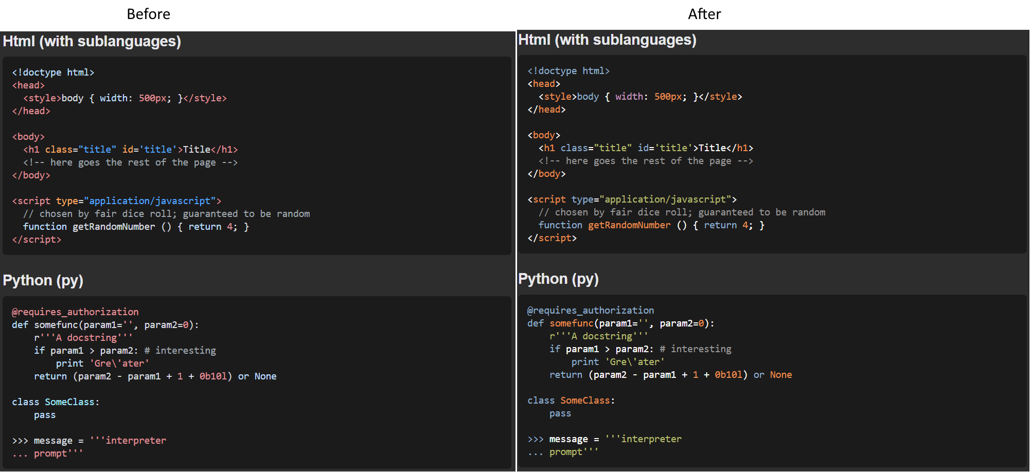
And then light mode:
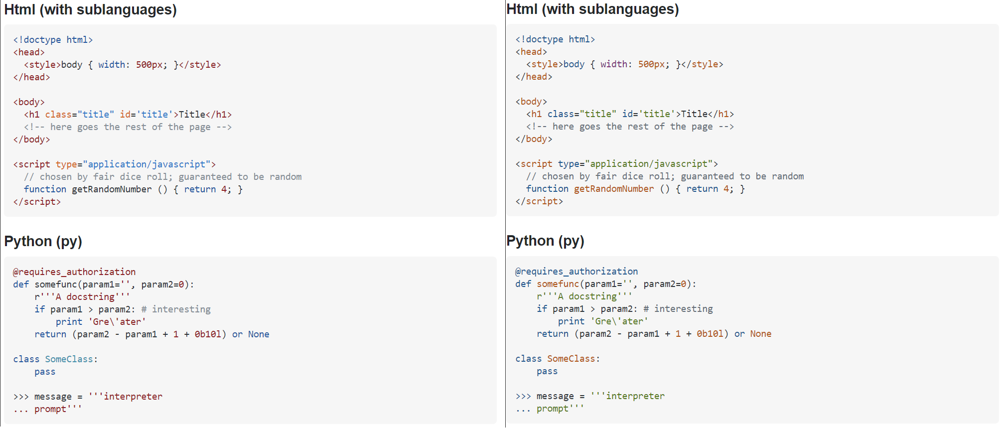
Sorry, my cutting wasn't quite perfect, so (especially in light mode) you can see some dark lines that really shouldn't be there. But even if there's a little extra junk, at least you can do a real comparison so the changes are reasonably apparent.
On the other hand, now I can guess at why you didn't do this to start with. In a side by side comparison, a fundamental difference is obvious. Where the old color scheme was mostly fairly restrained and tasteful, the new leans much more toward insipid and garish.
I found it rather frustrating that I couldn't easily see how the before/after pictures differed, so I did a bit of cutting and pasting so I could look at the before/after side by side to compare them more easily. Then it occurred to me that others might like to do the same, so feel free to have a look. Should be the same basic info as in the question, but arranged for more meaningful viewing.
First dark mode:
And then light mode:
Sorry, my cutting wasn't quite perfect, so (especially in light mode) you can see some dark lines that really shouldn't be there. But even if there's a little extra junk, at least you can do a real comparison so the changes are reasonably apparent.
On the other hand, now I can guess at why you didn't do this to start with. In a side by side comparison, a fundamental difference is obvious. Where the old color scheme was mostly fairly restrained and tasteful, the new leans much more toward insipid and garish.