edited tags
Link
user152859
user152859
edited tags
Link
TylerH
  • 24.4k
  • 5
  • 63
  • 94
Notice removed Draw attention by Alex K
Bounty Ended with blackgreen's answer chosen by Alex K
Notice added Draw attention by Alex K
Bounty Started worth 50 reputation by Alex K
Notice removed Reward existing answer by TheSimpliFire
Bounty Ended with John Omielan's answer chosen by TheSimpliFire
Notice added Reward existing answer by TheSimpliFire
Bounty Started worth 200 reputation by TheSimpliFire
Notice removed Reward existing answer by TheSimpliFire
Bounty Ended with John Omielan's answer chosen by TheSimpliFire
Notice added Reward existing answer by TheSimpliFire
Bounty Started worth 100 reputation by TheSimpliFire
Notice removed Reward existing answer by gnat
Bounty Ended with John Omielan's answer chosen by gnat
added 174 characters in body
Source Link

Update 1

I’ve restored the profile age to all and fixed a few bugs y’all reported. I’ll be addressing individual answers as best as I can.

Original post

On our way to a fully responsive Stack Overflow, we just shipped some changes to the user profile. We won’t be enabling responsiveness just yet, but the top portion will be ready to be squishy.

I hope these changes are low impact on our way to a fully responsive profile. Think of this as more a realignment than a redesign.

Some changes that you’ll see immediately:

  1. Basic reach-related stats moved to underneath the avatar near reputation.
  2. Various links and other stats are now under the display name and some stats behind are only viewable by you or a moderator.
  3. We got rid of the “Apparently, this user prefers to keep an air of mystery about them”, instead showing no biography. If it’s your profile and you don’t have a biography, we show a call to action to add one.
  4. We’ve added an Edit profile button under the avatar if you’re a moderator or you’re viewing your own profile.
  5. Biographies now have way more room horizontally, but we still cap to vertical scrolling.
  6. The consecutive visit calendar UI has gone away. This is some super legacy UI that isn’t remotely mobile-friendly. The statistic will continue to be displayed for badge-earning purposes, but I think it’s a potentially toxic metric.
  7. Dropped the profile views metric entirely. It’s a vanity metric and we don’t think it’s worth keeping around.

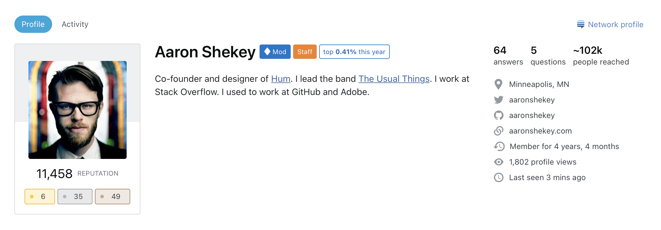
Before

Profile before

After

Profile afterProfile after

On our way to a fully responsive Stack Overflow, we just shipped some changes to the user profile. We won’t be enabling responsiveness just yet, but the top portion will be ready to be squishy.

I hope these changes are low impact on our way to a fully responsive profile. Think of this as more a realignment than a redesign.

Some changes that you’ll see immediately:

  1. Basic reach-related stats moved to underneath the avatar near reputation.
  2. Various links and other stats are now under the display name and some stats behind are only viewable by you or a moderator.
  3. We got rid of the “Apparently, this user prefers to keep an air of mystery about them”, instead showing no biography. If it’s your profile and you don’t have a biography, we show a call to action to add one.
  4. We’ve added an Edit profile button under the avatar if you’re a moderator or you’re viewing your own profile.
  5. Biographies now have way more room horizontally, but we still cap to vertical scrolling.
  6. The consecutive visit calendar UI has gone away. This is some super legacy UI that isn’t remotely mobile-friendly. The statistic will continue to be displayed for badge-earning purposes, but I think it’s a potentially toxic metric.
  7. Dropped the profile views metric entirely. It’s a vanity metric and we don’t think it’s worth keeping around.

Before

Profile before

After

Profile after

Update 1

I’ve restored the profile age to all and fixed a few bugs y’all reported. I’ll be addressing individual answers as best as I can.

Original post

On our way to a fully responsive Stack Overflow, we just shipped some changes to the user profile. We won’t be enabling responsiveness just yet, but the top portion will be ready to be squishy.

I hope these changes are low impact on our way to a fully responsive profile. Think of this as more a realignment than a redesign.

Some changes that you’ll see immediately:

  1. Basic reach-related stats moved to underneath the avatar near reputation.
  2. Various links and other stats are now under the display name and some stats behind are only viewable by you or a moderator.
  3. We got rid of the “Apparently, this user prefers to keep an air of mystery about them”, instead showing no biography. If it’s your profile and you don’t have a biography, we show a call to action to add one.
  4. We’ve added an Edit profile button under the avatar if you’re a moderator or you’re viewing your own profile.
  5. Biographies now have way more room horizontally, but we still cap to vertical scrolling.
  6. The consecutive visit calendar UI has gone away. This is some super legacy UI that isn’t remotely mobile-friendly. The statistic will continue to be displayed for badge-earning purposes, but I think it’s a potentially toxic metric.
  7. Dropped the profile views metric entirely. It’s a vanity metric and we don’t think it’s worth keeping around.
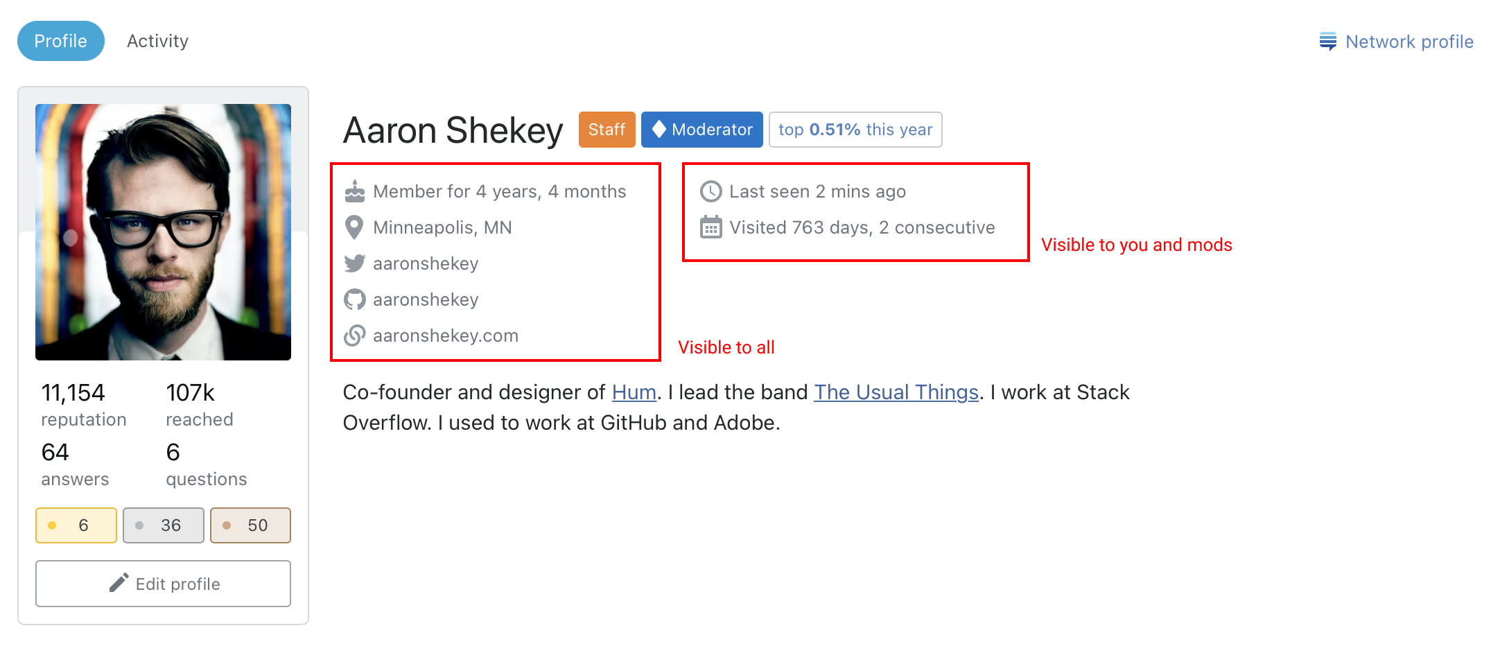
Before

Profile before

After

Profile after

Notice added Reward existing answer by gnat
Bounty Started worth 100 reputation by gnat
In the case of a moderator, it's not necessarily their avatar.
Source Link
41686d6564
  • 15.5k
  • 2
  • 38
  • 88
Loading
deleted 4 characters in body
Source Link
Spevacus StaffMod
  • 36.6k
  • 11
  • 84
  • 186
Loading
added [announcements] tag, since it's an announcement
Link
Loading
deleted 5 characters in body
Source Link
Loading
This has actually always been the case: only users themselves and mods could see it from the beginning, so avoid confusion
Source Link
Loading
Source Link
Loading