In the post entitled Ch-ch-ch-changes: Left nav, responsive design, & themes, I described a number of changes that are coming with the introduction of the left navigation bar. In addition to the navigation changes, we will be introducing responsive design and new theming across the Stack Exchange network of sites. See that post for the full details. This post will focus on updating the schedule for the release of these features and responding to some of the feedback from the previous post.
When will the changes be coming?
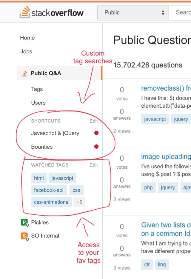
Current state - Left navigation is on for anyone who is in a Stack Overflow team.
Late April - Finish core implementation, addressing early feedback, enable responsive design for Stack Overflow for Teams beta users.
Mid-May - Address bugs and critical feedback, limited deployment for public Stack Overflow users, broad testing on MSE, gathering feedback on preliminary site designs for existing communities with custom designs.
Early June - Deploy to Stack Overflow, MSO, and MSE for all users.
Late June - Address bugs and critical feedback. Begin deployment for all users on sites with custom themes. Plan is to do this roughly by site age, though we reserve the right to vary the order due to implementation concerns. Outline process and timeline for sites without custom themes to get one.
July and beyond - Design, community review and deploy site themes to additional sites.
Response to feedback
We received a lot of great feedback in the last post. Below I've summarized the major themes/issues raised, will provide a short response and will tag each one (status-planned, status-review, status-bydesign, status-declined, etc.) to indicate how we will be proceeding. There is still research and design work to come up a full solution for the issues we are going to address.
Left navigation bar
We are committed to the left nav, but based on your feedback we'll be addressing some key concerns.
Hide/collapse left nav status-planned
One of the biggest concerns was the amount of space that is taken up by the left nav. We're currently working on making the left nav collapsable. If you collapse it, then the left nav stays collapsed. When you click on the hamburger to access it the left nav comes up as an overlay and will dismiss when you make a choice or click away. Plan is that this will be remembered per site. For example you can keep it open on SO.com, but keep it collapsed on other sites.
Add more value in left nav status-planned
Implicit in much of the feedback was the idea that the left nav real estate is not delivering enough value per pixel. Based on the images we showed it was clear that for people who are not on SO.com or aren't in a team, the left nav is pretty empty. We have some great ideas for adding value here and have already started work on one. More specifics in an upcoming post.
A design exploration showing examples of features we could add/move to left nav.
Resize the left nav status-declined
Another idea mentioned was resizing the left nav to reduce the amount of space it takes. We looked at several models for this and didn't love any of them. Some of the best options require coming up with good iconography for each item and we know how much fun that is (review queue anyone?). Also, this is a lot more work than hide/collapse. So, we will start with hide/collapse first and evaluate how it works for everyone.
Left nav vs. site selector status-review
Monica raised a great issue about the relationship of left nav and the site selector. We agree that there is room for improvement here. We looked at some models that attempted to merge the two, but we couldn't get it right. Also, it felt like a radical change. So, we are keeping this one on the back burner for now, but will likely come back to review it.
Network site theming
Who gets a new theme? status-planned
Simple answer here is the Community team is working out the criteria for who (beyond graduated sites) will get themes. It's kinda silly that sites that have been around for years are still using the basic theme. One of the reasons for simplifying the theming is to enable more sites to get customized themes. Theming will still require support from TeamDAG for the forseeable future (no self service theming) and it will take time for us to work through the full list of sites, but the goal is to get themes to all sites that have proved themselves viable.
Fonts status-planned
Boy, this one was just a bone-headed miss on my part (forest for the trees). Not sure how we missed it. Thanks to Adam for bringing it up and giving us a list of font usage to consider. We are still working out the plan. It won't be use whatever font you want. Some sites may need to change their font. The goal is to support content related font choices within a specific set of fonts. List of fonts is to come. Completely esthetic fonts choices are not the focus.
Specialized (e.g. MathJax) content status-planned
There are no plans to remove features to support specialized content. However, there may be special work to make it work well in a responsive design. That said, the goal is no change to the experience if your viewport is the same as today's min width and the left nav is hidden. At smaller viewports we will need to introduce a horizontal scrollbar if the custom elements can't be scaled down.
Badges status-planned
People love their badges. This was the top voted feedback. We will support the current custom badges and will do our best to create new badges for new themes.
Keep theming as it is today status-bydesign
Unsurprising people also love their current themes and don't want to lose them. Given that highly themed sites are the minority and that the current theming level is unsustainable, we're going to have to disappoint here. In addition, things like voting and favorite buttons are a core part of the Q&A experience that should be shared across the network. It was a mistake that we ever allowed for those to be themed. So, while we will keep a more limited support for header graphics and colors, we won't be supporting the previous level of theming. The benefit is that most sites will have a theme and theming for all sites will extend to the mobile experience. Of course, that is still strong medicine for the communities who have extensive themes under the old system.
Responsive design
Much of the feedback around responsive design comes from our reliance on a video that shows a WIP and doesn't capture real world usage. You really need to use it. That said, there is no doubt we will get some stuff wrong when it goes live. We will work through issues as we identify them.
Prioritize right column over left nav status-review
The real answer on this one is "kinda". If you collapse the left nav, then we effectively prioritize things in the way Monica suggests. However, if the left nav is pinned, then we will continue prioritizing it over the right sidebar. We are also, going to look at how we integrate sidebar content into the main content area. Some of it does need to be prioritized appropriately instead of just being dropped to the bottom of the page. Professional-advice disclaimer (see Health, Law, and Mi Yodeya) is a great example of this type of an issue.
Don't squish the search bar into oblivion status-completed
Well, actually we completely squish it. Search bar drops to a search icon at narrow viewports. This lets us keep a full set of menus in place while supporting search.
Other issues
What about Area 51 and chat? status-bydesign
Poor Area 51 and chat (and SE.com to be honest). They never get the love. For now, they will stay as is. We simply don't have resources to address them. That said, there is so much the team would love to do here.
Again, thanks everyone for the feedback. I'll update the schedule above as we make progress or if any changes come up.