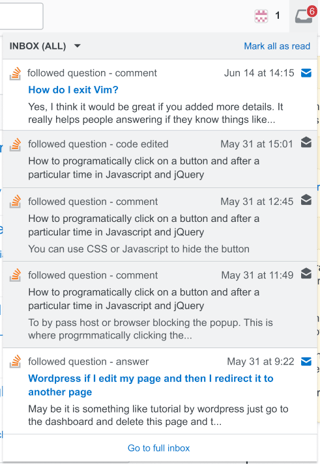
In the inbox dropdown, read notifications are still clickable, but are now fully grayed out (including the link title), as shown above. There are no significant changes to how unread notifications look in the dropdown.
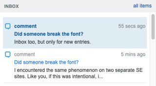
I see pretty much the inverse here:
As of now, the unread notifications are marked with a colored background and the read ones are simply white. I feel this distinction is good enough and it looks prettier to me:
Could you please not touch the design here? Or if you really want the read notifications to be grayed out, please leave the background white at least.