Toolpad Core - Tutorial
Learn how to use Toolpad Core through an illustrative example dashboard.
Bootstrapping
- To choose a project name and create a basic project for this tutorial, run:
npx create-toolpad-app@latest --example tutorial- To start the basic project on http://localhost:3000, run:
cd <project-name> npm install && npm run dev- The following splash screen appears:
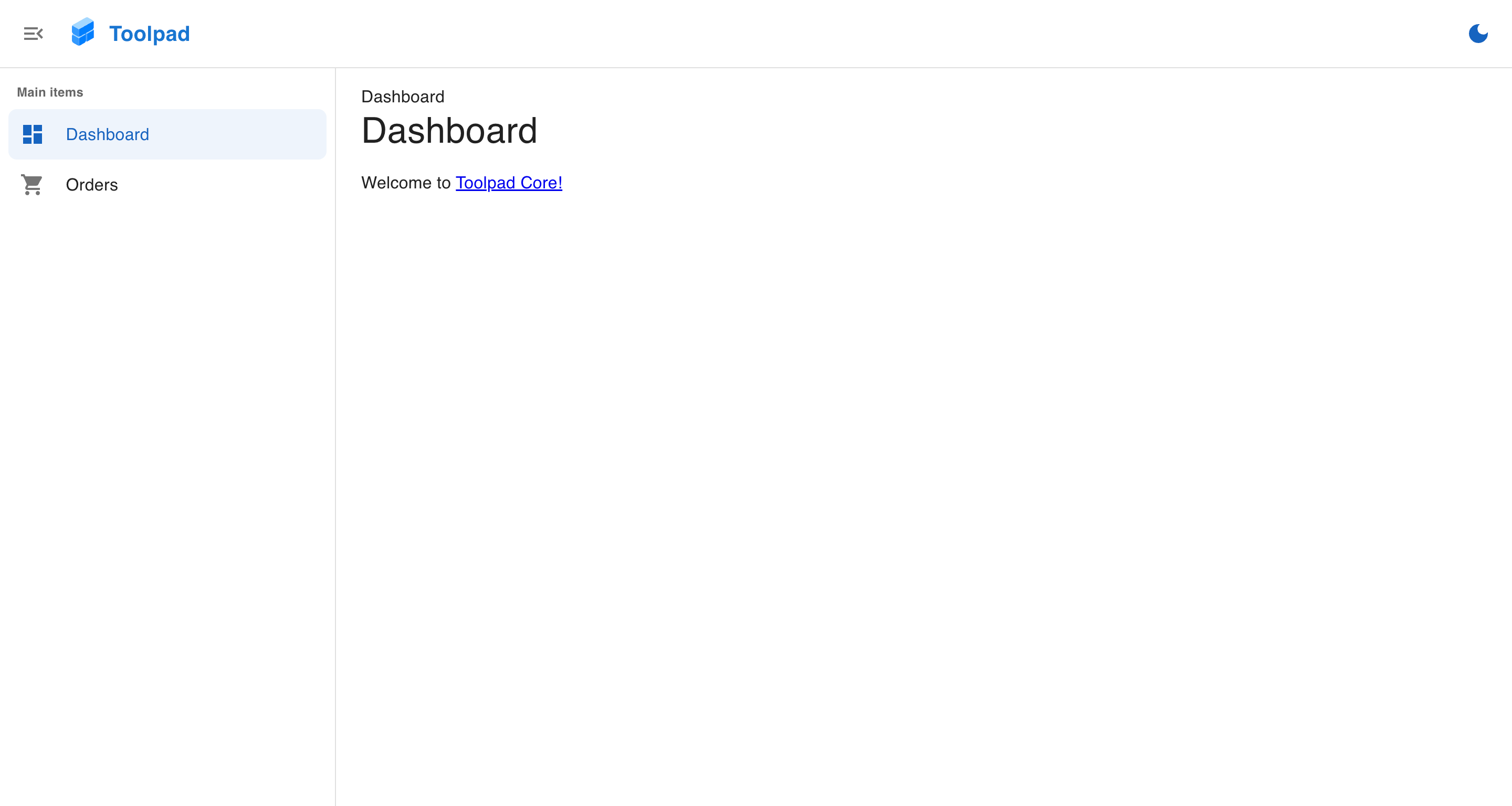
Starting with Toolpad Core
- The app has two pages already created in a dashboard layout, with routing, breadcrumbs and theming already set up:
Create a new page
- To add a new page and make it appear in the sidebar navigation, create a new folder within the
(dashboard)directory titledpage-2and add the following content topage.tsxinside it:
./(dashboard)/page-2/page.tsx
import Typography from '@mui/material/Typography'; export default function Home() { return ( <Typography variant="h6" color="grey.800"> This is page 2! </Typography> ); } - Add the newly created page to the sidebar navigation by adding the following code to the navigation items array in
app/layout.tsx:
app/layout.tsx
// Add the following import: import TimelineIcon from '@mui/icons-material/Timeline'; // ... const NAVIGATION: Navigation = [ // Add the following new item: { segment: 'page-2', title: 'Page 2', icon: <TimelineIcon />, }, ]; The newly created page can now be navigated to from the sidebar, like the following: