There are already 9 answers here with the top one having 60+ upvotes; many of the answers are very good. The goal of writing this yet another answer is to provide "a real example" as asked by the OP, together with an illustration, and some links to further discussions here on CrossValidated.
The top answer in this thread suggests that PCA is more of a dimensionality reduction technique, whereas FA is more of a latent variable technique. This is sensu stricto correct. But many answers here and many treatments elsewhere present PCA and FA as two completely different methods, with dissimilar if not opposite goals, methods and outcomes. I disagree; I believe that when PCA is taken to be a latent variable technique, it is quite close to FA, and they should better be seen as very similar methods.
I provided my own account of the similarities and differences between PCA and FA in the following thread: Is there any good reason to use PCA instead of EFA? Also, can PCA be a substitute for factor analysis? There I argue that for simple mathematical reasons the outcome of PCA and FA can be expected to be quite similar, given only that the number of variables is not very small (perhaps over a dozen). See my [long!] answer in the linked thread for mathematical details and Monte Carlo simulations. For a much more concise version of my argument see here: Under which conditions do PCA and FA yield similar results?
Here I would like to show it on an example. I will analyze the wine dataset from UCI Machine Learning Repository. It is a fairly well-known dataset with $n=178$ wines from three different grapes described by $p=13$ variables. Here is how the correlation matrix looks like:

I ran both PCA and FA analysis and show 2D projections of the data as biplots for both of them on the figure below (PCA on the left, FA on the right). Horizontal and vertical axes show 1st and 2nd component/factor scores. Each of the $n=178$ dots corresponds to one wine, and dots are colored according to the group (see legend):
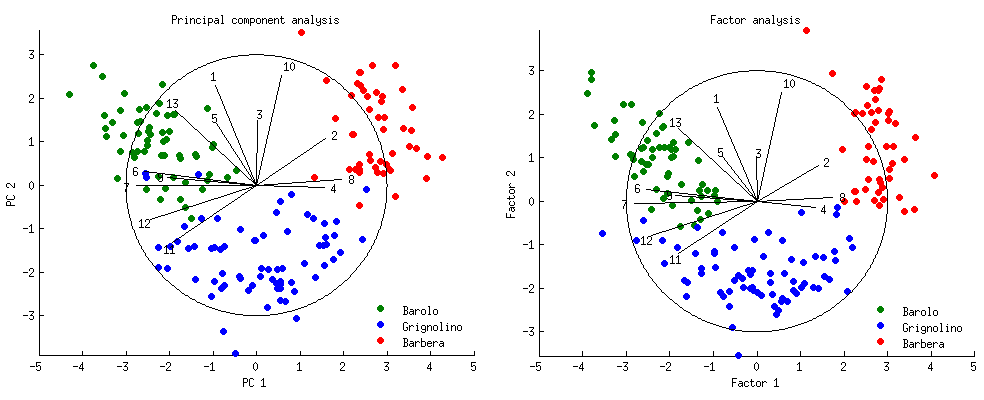
The loadings of the 1st and 2nd component/factor onto the each of the $p=13$ original variables are shown as black lines. They are equal to correlations between each of the original variables and the two components/factors. Of course correlations cannot exceed $1$, so all loading lines are contained inside of the "correlation circle" showing maximal possible correlation. All loadings and the circle are arbitrarily scaled by a factor of $3$, otherwise they would be too small to be seen (so the radius of the circle is $3$ and not $1$).
Note that there is hardly any difference between PCA and FA! There are small deviations here and there, but the general picture is almost identical, and all the loadings are very similar and point in the same directions. This is exactly what was expected from the theory and is no surprise; still, it is instructive to observe.
PS. For a much prettier PCA biplot of the same dataset, see this answer by @vqv.
PPS. Whereas PCA calculations are standard, FA calculations might require a comment. Factor loadings were computed by an "iterated principal factors" algorithm until convergence (9 iterations), with communalities initialized with partial correlations. Once the loadings converged, the scores were calculated using Bartlett's method. This yields standardized scores; I scaled them up by the respective factor variances (given by loadings lengths).