The site logo is using the wrong glyphs for its smallcaps portions. This looks bad. In The Elements of Typographical Style, Robert Bringhurst writes:
Genuine small caps are not simply shrunken versions of the full caps. They differ from large caps in stroke weight, letterfit, and internal proportions as well as in height. Any good set of small caps is designed as such from the ground up. Thickening, shrinking, and squashing the full caps with digital modification routines will only produce a parody.
If you just look at the logo up at the top of the page right now, you’ll see that the faked small caps don’t look right compared to the fullsized initial cap. Notice how the stroke width of the U is different from that of the N, I, or X:
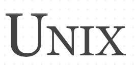
See how much wider the thick stroke of the U is than that of the I, for example? It also has the wrong x-height for the smallcaps in the font, and it distorts the proportions of the glyphs so they look all spindly and weird.
In comparison, here is what it might look like using actual smallcaps available in the font.
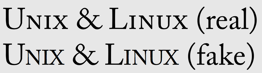
Compare the two N’s and the two U’s up there. Notice how the faked ones are all stretched and funny looking compared with the real ones. Those are not smallcaps.
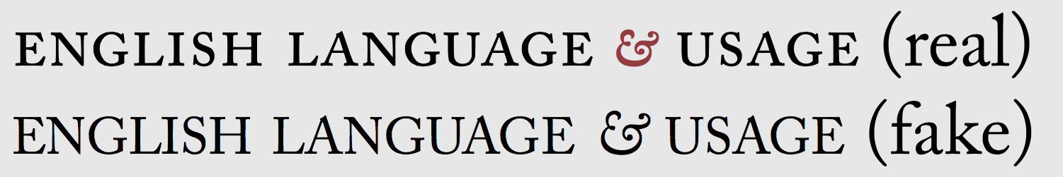
I've set that in Caslon so you can compare like with like of what happens when you switch between faked small caps and real ones. Here's the same with the logo from the English Language & Usage site, which uses real smallcaps in Caslon, not faked ones:
The current logo is what Bringhurst calls “a parody”; it looks unprofessionally done. This is easy to fix, and should be.