Currently, the font specification calls Georgia as the primary serif font for question titles. While undeniably an attractive font, its zero renders almost exactly the same as a lower case letter 'o'. This introduces a significant level of ambiguity:
While I think it extremely unlikely that there is a serif font that is readily available on most Unix user's machines that would have a slashed or dotted zero (the ideal), with only a small tweak to the CSS, it would be possible to improve the rendering of zeros for most users:

I'm reluctant to suggest a significant change as I think the overall look of the site is extremely professional - however, for a site for coders and geeks, having ambiguous zeros is rather unfortunate1.
With only a small change to the stylesheet, this can be improved. From:
#question-header .question-hyperlink { color: #155078; font-family: Georgia,"Times New Roman",Times,serif; font-size: 24px; ... } to:
#question-header .question-hyperlink { color: #155078; font-family: "Times New Roman",Times,serif; font-size: 28px; ... } Is this something that others are similarly exercised about? Could it be considered for a change?
Other example questions where this has an impact (mentioned in chat):
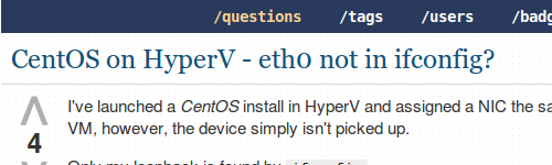
- What is signal 0 in a trap command?What is signal 0 in a trap command?
- what is commit=0 for ext4? does mdadm not support it?what is commit=0 for ext4? does mdadm not support it?
- Message while booting : “can't allocate mem resource [0xc0000000-0xbfffffff]”Message while booting : “can't allocate mem resource [0xc0000000-0xbfffffff]”
- ext4 overrides my commit=100 mount option with commit=0ext4 overrides my commit=100 mount option with commit=0
UPDATE
Updated to highlight a couple of particularly egregious examples: