Matplotlib チュートリアル - 軸のタイトル
胡金庫 2024年2月15日 Matplotlib Matplotlib Axis
このチュートリアルでは、Matplotlib の軸タイトルについて学習します。
Matplotlib 軸のタイトル
構文:
matplotlib.pyplot.title(label, fontdict=None, loc=None, **kwargs) 現在の軸のタイトルを設定します。
パラメーター
| 名前 | データ・タイプ | 説明 |
|---|---|---|
ラベル | str | ラベルテキスト |
fontdict | dict | ファミリー、色、重量、サイズなどのラベルテキストフォント辞書 |
loc | str | タイトルの場所。3つのオプション、{'center'、 'left'、 'right'} があり、デフォルトのオプションは center です |
# -*- coding: utf-8 -*- import numpy as np import matplotlib.pyplot as plt x = np.linspace(0, 4 * np.pi, 1000) y = np.sin(x) plt.figure(figsize=(4, 3)) plt.plot(x, y, "r") plt.xlabel( "Time (s)", size=16, ) plt.ylabel("Value", size=16) plt.title( "Title Example", fontdict={"family": "serif", "color": "darkblue", "weight": "bold", "size": 18}, ) plt.grid(True) plt.show() 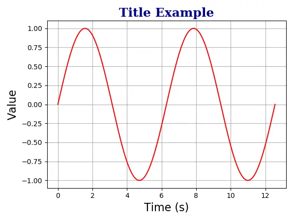
plt.title( "Title Example", fontdict={"family": "serif", "color": "darkblue", "weight": "bold", "size": 18}, ) Matplotlib 軸の複数のタイトル
1つの軸には、最大で 3つのタイトルを左、中央、右の位置に配置できます。特定のタイトルの位置は loc 引数で指定されます。
# -*- coding: utf-8 -*- import numpy as np import matplotlib.pyplot as plt x = np.linspace(0, 4 * np.pi, 1000) y = np.sin(x) plt.figure(figsize=(8, 6)) plt.plot(x, y, "r") plt.xlabel( "Time (s)", size=16, ) plt.ylabel("Value", size=16) plt.title( "Left title", fontdict={"family": "serif", "color": "darkblue", "weight": "bold", "size": 16}, loc="left", ) plt.title( "Center title", fontdict={"family": "monospace", "color": "red", "weight": "bold", "size": 16}, loc="center", ) plt.title( "Right title", fontdict={"family": "fantasy", "color": "black", "weight": "bold", "size": 16}, loc="right", ) plt.grid(True) plt.show() 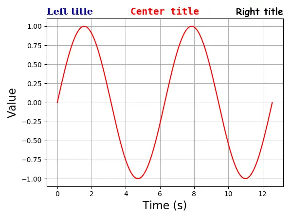
プロット内の Matplotlib 軸タイトル
positon =(m, n) または同等のオプション x = m、y = n を使用して、タイトルをプロット内に配置することもできます。ここで、m と n は 0.0〜1.0 の数値です。
位置 (0, 0) はプロットの左下隅で、位置 (1.0, 1.0) は右上隅です。
# -*- coding: utf-8 -*- import numpy as np import matplotlib.pyplot as plt x = np.linspace(0, 4 * np.pi, 1000) y = np.sin(x) plt.figure(figsize=(6, 4.5)) plt.plot(x, y, "r") plt.xlabel("Time (s)", size=16) plt.ylabel("Value", size=16) plt.title( "Title Example", position=(0.5, 0.9), fontdict={"family": "serif", "color": "darkblue", "weight": "bold", "size": 16}, ) plt.show() 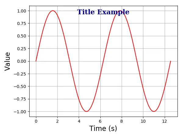
チュートリアルを楽しんでいますか? <a href="https://www.youtube.com/@delftstack/?sub_confirmation=1" style="color: #a94442; font-weight: bold; text-decoration: underline;">DelftStackをチャンネル登録</a> して、高品質な動画ガイドをさらに制作するためのサポートをお願いします。 Subscribe
