Adding 95% Confidence Intervals to Line Charts in Plotly
Last Updated : 23 Jul, 2025
Creating a line chart with a 95% confidence interval (CI) in Plotly is a powerful way to visualize data with uncertainty. Confidence intervals provide a range of values that likely contain the true value of the parameter being measured, thus adding a layer of statistical insight to your visualizations. This article will guide you through the process of adding a 95% confidence interval to a line chart using Plotly in Python.
Understanding Confidence Intervals
Before diving into the implementation, it's important to understand what a confidence interval represents. A 95% confidence interval suggests that if the same population is sampled multiple times, approximately 95% of the intervals calculated from those samples will contain the true population parameter. This is crucial in fields like data analysis and scientific research where understanding the reliability of an estimate is essential.
Step-by-Step Guide to Adding a 95% Confidence Interval
To create a line chart with a confidence interval in Plotly, you need to have Python installed along with the necessary libraries. You can install the required libraries using pip:
pip install pandas plotly
Step 1: Import Required Libraries
First, import the necessary libraries. Plotly is used for creating interactive plots, and pandas is used for data manipulation.
Python import pandas as pd import plotly.graph_objects as go
Step 2: Generate or Load Your Data
For this example, we'll generate some synthetic data. However, you can replace this with your dataset.
Python import numpy as np # Generate synthetic data np.random.seed(0) x = np.arange(2000, 2025) y = np.random.normal(loc=0, scale=1, size=len(x)).cumsum() ci_upper = y + 1.96 * np.std(y) / np.sqrt(len(y)) ci_lower = y - 1.96 * np.std(y) / np.sqrt(len(y))
Using Plotly's go.Figure, you can create a line chart and add the confidence interval as a filled area.
Python fig = go.Figure() # Add the main line fig.add_trace(go.Scatter( x=x, y=y, mode='lines', name='Mean', line=dict(color='rgb(31, 119, 180)') )) # Add the confidence interval fig.add_trace(go.Scatter( x=np.concatenate([x, x[::-1]]), y=np.concatenate([ci_upper, ci_lower[::-1]]), fill='toself', fillcolor='rgba(0,100,80,0.2)', line=dict(color='rgba(255,255,255,0)'), hoverinfo='skip', showlegend=False, name='95% CI' ))
Step 4: Customize the Layout
Customize the layout to make the chart more informative and visually appealing.
Python fig.update_layout( title='Line Chart with 95% Confidence Interval', xaxis_title='Year', yaxis_title='Value', hovermode='x' ) fig.show()
Here is the complete code together,
Python import numpy as np import plotly.graph_objects as go # Step 1: Generate Data np.random.seed(0) x = np.arange(2000, 2025) y = np.random.normal(loc=0, scale=1, size=len(x)).cumsum() ci_upper = y + 1.96 * np.std(y) / np.sqrt(len(y)) ci_lower = y - 1.96 * np.std(y) / np.sqrt(len(y)) # Step 2: Create the Plotly Figure fig = go.Figure() # Add the main line fig.add_trace(go.Scatter( x=x, y=y, mode='lines', name='Mean', line=dict(color='rgb(31, 119, 180)') )) # Add the confidence interval fig.add_trace(go.Scatter( x=np.concatenate([x, x[::-1]]), y=np.concatenate([ci_upper, ci_lower[::-1]]), fill='toself', fillcolor='rgba(0,100,80,0.2)', line=dict(color='rgba(255,255,255,0)'), hoverinfo='skip', showlegend=False, name='95% CI' )) # Step 3: Customize the Layout fig.update_layout( title='Line Chart with 95% Confidence Interval', xaxis_title='Year', yaxis_title='Value', hovermode='x' ) # Step 4: Display the Plot fig.show()
Output:
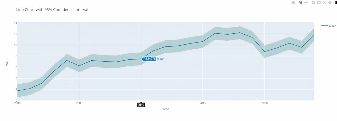 95% Confidence Intervals to Line Charts in Plotly
Explanation of the Code:
- Data Generation: The code generates synthetic data using a normal distribution and calculates the cumulative sum to simulate a trend over time. The 95% confidence interval is calculated using the standard error and the z-score for a 95% confidence level.
- Plotly Traces: The main line is added using go.Scatter with mode='lines'. The confidence interval is added as a filled area using the fill='toself' attribute, which creates a shaded region between the upper and lower bounds.
- Layout Customization: The layout is customized to include titles and hover information, enhancing the interactivity and readability of the chart.
Conclusion
Adding a 95% confidence interval to a line chart in Plotly provides a visual representation of uncertainty, which is crucial for data analysis and interpretation. By following the steps outlined in this article, you can effectively incorporate confidence intervals into your Plotly visualizations, thereby enhancing the depth and reliability of your data presentations.