Trusted by the world’s leading companies

Overview
The Blazor ComboBox component is a dropdown list with an editable option that also allows users to choose an option from a predefined pop-up list. It can be used as an alternative to the HTML select tag and has several out-of-the-box features such as data binding, filtering, grouping, cascading, templates, UI customization, pop-up list and customization.
Custom value
This editable combo box in Blazor allows the entry of a custom value when the option the user searched for is not available in the pop-up list. You can also set a value for the combo box or get the selected value from the combo box at any time through the interactive APIs.

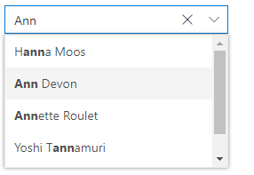
Filtering
Built-in filtering support with a rich set of filtering configurations is available to meet all your application needs.

Custom filtering
Filter queries are customizable, and you can use your own filter libraries to filter data.

Diacritic sensitivity
The Blazor ComboBox component supports diacritic character sensitivity. This behavior can be turned on or off.

Filter settings
The filter search can be customized with case sensitivity and can be performed with minimum query string characters.

Grouping with categories
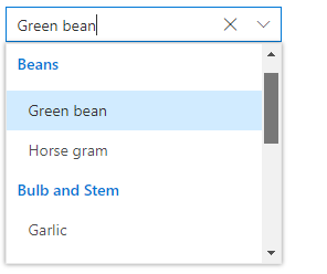
Group the pop-up list items with a corresponding category that makes it easy for users to pick an item quickly from the dropdown and also improves the visual experience for users.
Autofill
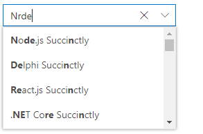
The autofill option allows users to easily search through options in the combo box. When a user is typing a query string to search, the available matching options will be filled automatically.

Cascading combo boxes
Provides an option to create multiple cascading combo boxes in Blazor, which helps users populate data for a child combo box based on the current selected value of the parent combo box.

Forms support
Since the ComboBox is a form component, it supports HTML forms, template-driven forms (Angular), and reactive forms.
Mobile responsive UI
The Blazor ComboBox component supports a responsive mode that provides an adaptive, redesigned UI appearance for mobile devices and touch actions.
Web accessibility
-
Fully supports WAI-ARIA accessibility guidelines to work with screen readers and assistive devices.
-
Follows WAI-ARIA best practices for implementing keyboard interaction.
-
Follows WCAG 2.0 standard in UI element visual design such as for foreground color, background color, line spacing, text, and images.
-
Supports right-to-left (RTL) rendering for users working in right-to-left languages like Hebrew, Arabic, or Persian.
Developer-friendly APIs
Developers can customize all UI elements and control their behaviors according to the end user’s requirements using the control’s rich set of client-side APIs.
Blazor ComboBox Code Example
Easily get started with the Blazor ComboBox using a few simple lines of C# code example as demonstrated below. Also explore our Blazor ComboBox Example that shows you how to render and configure the Blazor ComboBox component.
@using Syncfusion.Blazor.DropDowns <SfComboBox TValue="string" TItem="GameFields" Placeholder="e.g. Basketball" @bind-Value="@ComboBoxValue" DataSource="@Games"> <ComboBoxFieldSettings Text="Text" Value="ID"/> </SfComboBox> @code { public class GameFields { public string ID { get; set; } public string Text { get; set; } } private List<GameFields> Games = new List<GameFields>() { new GameFields(){ ID= "Game1", Text= "American Football" }, new GameFields(){ ID= "Game2", Text= "Badminton" }, new GameFields(){ ID= "Game3", Text= "Basketball" }, new GameFields(){ ID= "Game4", Text= "Cricket" }, new GameFields(){ ID= "Game5", Text= "Football" }, new GameFields(){ ID= "Game6", Text= "Golf" }, new GameFields(){ ID= "Game7", Text= "Hockey" }, new GameFields(){ ID= "Game8", Text= "Rugby"}, new GameFields(){ ID= "Game9", Text= "Snooker" }, new GameFields(){ ID= "Game10", Text= "Tennis"} }; }Other supported frameworks
The ComboBox control is also available in our Angular, React, Vue, and JavaScript frameworks, which were built from their own TypeScript libraries. Check out the ComboBox control in these different platforms from the following links.
Not sure how to create your first Blazor ComboBox? Our tutorial videos and documentation can help.
I’d love to watch it now I’d love to read it nowBlazor Components – 145+ UI and DataViz Components
Frequently Asked Questions
Why should you choose Syncfusion Blazor ComboBox?
Syncfusion Blazor ComboBox provides the following features:
- A great alternative to the HTML select tag, with a modern look and feel.
Editable combo box with advanced features, including auto suggestion, grouping, filtering, sorting and more.
The UI rich ComboBox control in Blazor has been provided virtualization to improve the UI performance for a large amount of data.
Supports complete customization of the UI and pop-up list through different template options.
- One of the best Blazor ComboBox in the market that offers feature-rich UI to interact with the software.
- Simple configuration and API.
- Supports all modern browsers.
- Mobile-touch friendly and responsive.
Extensive demos, documentation and video to learn quickly and get started with Blazor ComboBox component.
Where can I find the Syncfusion Blazor ComboBox demo?
You can find our Blazor ComboBox demo here.
Can I download and utilize the Syncfusion Blazor ComboBox for free?
No, this is a commercial product and requires a paid license. However, a free community license is also available for companies and individuals whose organizations have less than $1 million USD in annual gross revenue, 5 or fewer developers, and 10 or fewer total employees.
How do I get started with Syncfusion Blazor ComboBox?
A good place to start would be our comprehensive getting started documentation.
Our Customers Love Us


 Documentation
 Awards
Greatness—it’s one thing to say you have it, but it means more when others recognize it. Syncfusion® is proud to hold the following industry awards.


