Blazor DateRangePicker - Highly Configurable Component
- An advanced DateRangePicker component with highly customizable options.
- A first Material-designed DateRangePicker for all devices.
- A rich feature set including spans of days, range restriction, predefined dates (like last 30 days), validation, and automatic formatting takes this component to the next level of usage.

Quick Overview Video
Trusted by the world’s leading companies

Overview
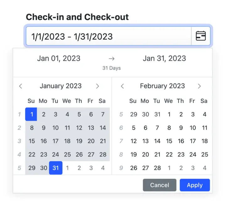
The Blazor DateRangePicker is a lightweight and mobile-friendly component that allows end users to select start and end dates as a range from a calendar pop-up or by entering the value directly in an HTML input text box.
Why choose Syncfusion Essential Studio® Blazor DateRangePicker?
Customizable date formats
The Blazor DateRangePicker component’s input value can be customized in addition to the default culture-specific date format.
Preset range
Define preset ranges (like last 30 days or last week) to set date ranges frequently used by the end users.
Adapts to any resolution
The Date Range Picker has a highly responsive layout and an optimized design for desktops, touch screens, and smart phones. It works well on all mobile phones that use iOS, Android, or Windows OS.
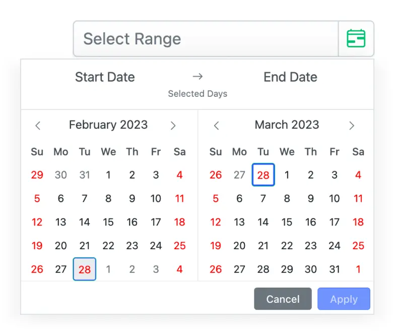
Specific date restrictions
Restricts dates outside the min and max date ranges, allowing only valid dates to be entered. Users cannot enter or choose restricted dates.
Attractive customizable themes
Cutting edge design with 5+ built-in themes such as Fluent, Tailwind CSS, Bootstrap, Material, Fabric, and more. Utilize the online Theme Studio tool to customize themes of Date Range Picker easily.
Globalization and localization
Enables users from different locales to use the DateRangePicker by formatting dates, currency, and numbering to suit preferences.
Blazor DateRangePicker Code Example
Easily get started with the Blazor DateRangePicker using a few simple lines of C# code example as demonstrated below, Also explore our Blazor DateRangePicker Example that shows you how to render the DateRangePicker component in Blazor.
@using Syncfusion.Blazor.Calendars <SfDateRangePicker TValue="DateTime?" Placeholder="Choose a Range" Min="@MinDate" Max="@MaxDate"/> @code { public DateTime MinDate {get;set;} = new DateTime(2017, 01, 05); public DateTime MaxDate {get;set;} = new DateTime(2017, 12, 20); }DateRangePicker with multiple language
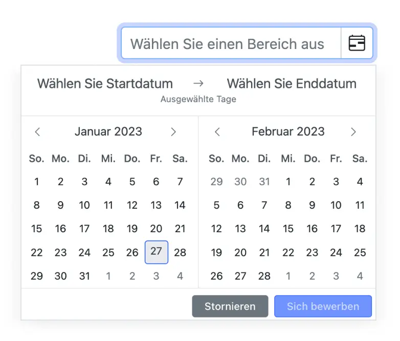
Globalization translates the names of months, days, and the today button text to any supported language. The date format and first day of the week are set to specific cultures.
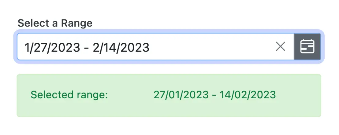
Date selection within a range
Enter or select a value within a specific range of dates by defining the min and max properties.
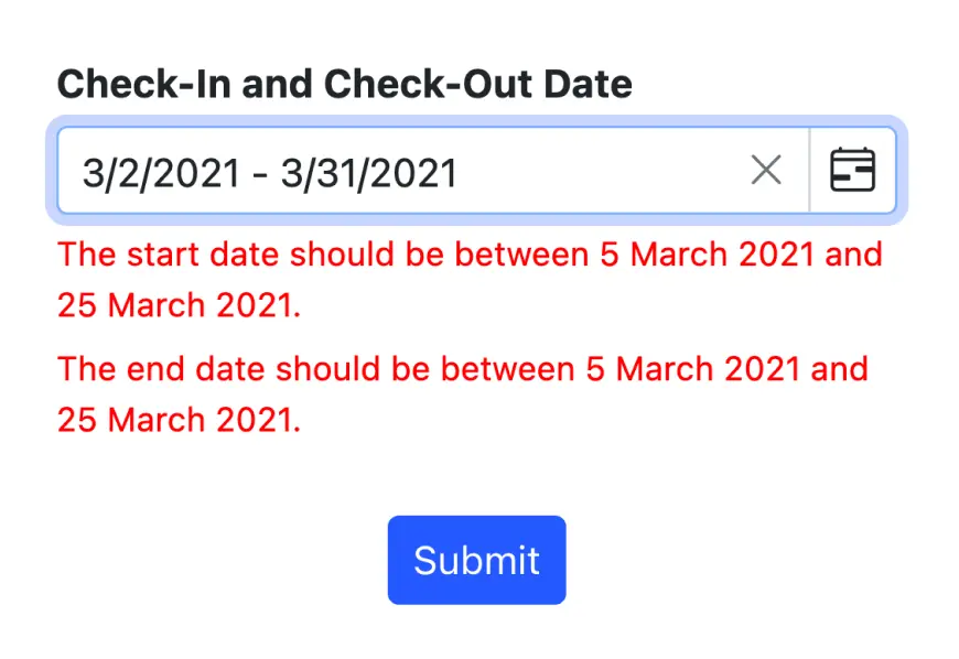
Date-range validation
The Blazor Date Range Picker allows display of date ranges. When the date value is out of this range, validation error is triggered. The invalid and out-of-date-range values are set in a disabled state to prevent users from entering them or selecting them.
Customize DateRangePicker
The appearance of the component can be completely changed. Customize the application’s look and feel according to the requirement.

Accessibility

Keyboard navigation
The Blazor DateRangePicker component ensures that every cell is accessible using the keyboard. Major features like sort, select, and edit can be performed using keyboard commands alone; no mouse interaction is required. This helps in creating highly accessible applications using this component.

Screen reader
The Blazor DateRangePicker view has complete WAI-ARIA accessibility support. The DateRangePicker UI includes high-contrast visual elements that help visually impaired people to have the best viewing experience. Also, valid UI descriptions are easily accessible through assistive technologies such as screen readers.

Right to left (RTL)
Right-to-left rendering allows displaying the text and layout of the DateRangePicker from right to left. This improves the user experience and accessibility for RTL languages.
 Customizable date formats Specific date restrictions Inline and pop-up modes
Other supported frameworks
The DateRangePicker is available for the React, Angular, JavaScript, and Vue frameworks. Explore its platform-specific options through the following links:


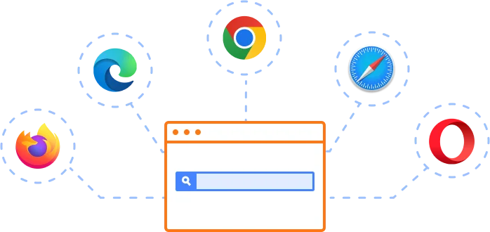
Supported browsers
The Blazor DateRangePicker works well with all modern web browsers, including Chrome, Firefox, Edge, Safari, and Opera.
Not sure how to create your first Blazor DateRangePicker? Our tutorial videos and documentation can help.
I’d love to watch it now I’d love to read it nowBlazor Components – 145+ UI and DataViz Components
ALL COMPONENTS
SMART COMPONENTS
GRIDS
DATA VISUALIZATION
FILE VIEWERS & EDITORS
DROPDOWNS
NAVIGATION
INPUTS
BUTTONS
INTERACTIVE CHAT
Frequently Asked Questions
Why should you choose Syncfusion Essential Studio® Blazor DateRangePicker?
An advanced daterangepicker component with highly customizable options.
Provides month range picker option.
A rich feature set including spans of days, range restriction, predefined dates (like last 30 days), validation, and automatic formatting takes this component to the next level of usage.
- One of the best Blazor DateRangePicker in the market that offers feature-rich UI to interact with the software.
Using Placeholder, you can display a short hint in the input element.
Simple configuration and API.
- Supports all modern browsers.
- Mobile-touch friendly and responsive.
Extensive demos, documentation and videos to learn quickly and get started with Blazor DateRangePicker.
Where can I find the Syncfusion Blazor DateRangePicker demo?
You can find our Blazor DateRangePicker demo, which demonstrates how to render and configure the Date Range Picker.
Can I download and utilize the Syncfusion Blazor DateRangePicker for free?
No, this is a commercial product and requires a paid license. However, a free community license is also available for companies and individuals whose organizations have less than $1 million USD in annual gross revenue, 5 or fewer developers, and 10 or fewer total employees.
How do I get started with Syncfusion Blazor DateRangePicker?
A good place to start would be our comprehensive getting started documentation.
Our Customers Love Us
Having an excellent set of tools and a great support team, Syncfusion® reduces customers’ development time.Here are some of their experiences.

Blazor components
The speed how they adding new Blazor controls and update theirs functionality. I am using Blazor components. Searching for Blazor components I found that Syncfusion very fast adopted theirs controls for new development platform. Tech support is fast and excellent. The best of best is that they provide free controls for small business.

Igor L, 
CEO, Small-Business
Syncfusion objects with a Blazor
I have used some of the Syncfusion objects with a Blazor application. The support group has always been very helpful.

Kris B,
Software Development Consultant, Small-Business
Rated by users across the globe
Syncfusion Blazor DateRangePicker Resources


UI Kits  Figma Download
Figma Download Awards
Greatness—it’s one thing to say you have it, but it means more when others recognize it. Syncfusion® is proud to hold the following industry awards.

