Trusted by the world’s leading companies

Overview
The Blazor Dialog is a user interface (UI) component that displays critical information, errors, warnings, and questions to users, as well as confirms decisions and collects input from the users. The component has a rich set of built-in features such as action buttons, positioning, animation, dragging, resizing, templating, and more with mobile dialog support.
Blazor Modal Dialog Code Example
Easily get started with the Blazor Dialog using a few simple lines of C# code as demonstrated below. Also explore our Blazor Modal Dialog Example that shows you how to render and configure the Blazor Dialog.
@using Syncfusion.Blazor.Buttons <SfButton @onclick="@OpenDialog">Open Modal Dialog</SfButton> <SfDialog Width="250px" IsModal="true" @bind-Visible="@IsVisible"> <DialogEvents OnOverlayClick="@OnOverlayclick"> </DialogEvents> <DialogTemplates> <Content> This is a modal dialog </Content> </DialogTemplates> </SfDialog> @code { private bool IsVisible { get; set; } = true; private void OpenDialog() { this.IsVisible = true; } private void OnOverlayclick(MouseEventArgs arg) { this.IsVisible = false; } }Modal dialogs (modal window)
The two types of dialogs are modal and non-modal (modeless), based on user interactions:
- Modal dialogs force users to interact with them before continuing. They are used to show important information and non-continuous process information (for example, a sign-up or login form).
- Non-modal dialogs allow users to interact outside the dialog box even if it is in an active state, which is suitable for frequent, nonblocking dialogs (for example, find-and-replace dialogs).
Action buttons
The Blazor Dialog component provides built-in support to perform actions using buttons, which define necessary callback functions to handle user input.
Localization
The localization library allows you to localize the default text content. In the Dialog component, the close button’s tooltip text alone will be localized based on the specified culture.

Positioning
Users can position a Blazor dialog wherever they want on a page. It is easy to configure this through built-in positions or any custom axis value (for example, top left, bottom right, top right, bottom left, 100 75, etc.).
Draggable
The Blazor modal dialog can be moved anywhere in a page by dragging its header to reposition the dialog dynamically.
Overlays
Blazor Modal Dialogs create overlays on open modal windows that provide options for a user to control the closing behavior of the dialog.

Additional dialogs
Users can launch multiple Blazor Dialogs simultaneously or one above the other based on their z-index (z-depth).
Animation
A variety of smooth, built-in animations are available to configure the opening and closing of modal dialogs. The Blazor Dialog is animated based on CSS3 animation from the Animation library.
Resizable
The Blazor Dialog window can be resized by dragging the edges or borders of the Dialog within the target container using its handle (grip) or hovering over it.
Close options
The Blazor Modal Dialog can be closed by clicking the close icon, with an overlay click, or by pressing the ESC key. Users can restrict the closing behavior of a dialog based on its callback function parameters.
Right-to-left (RTL)
The Blazor Dialog component supports right-to-left rendering. Users can change the text direction and layout of the Dialog component from right to left. This improves the user experience and accessibility for those who use RTL languages.

Accessibility
-
Fully supports WAI-ARIA accessibility, making the Dialog accessible to on-screen readers and assistive devices.
-
Follows WAI-ARIA best practices for implementing keyboard interaction.
-
UI element visuals such as foreground color, background color, line spacing, text, and images are designed based on the WCAG 2.0 standard.

Responsiveness
The Blazor Dialog component is highly configurable to make mobile dialogs with better user experiences across phone, tablet, and desktop form factors.
Themes
The Blazor Dialog component has several built-in themes such as Tailwind CSS, Bootstrap 5, Bootstrap 4, Bootstrap, Material, Fabric, and high contrast. Users can customize these built-in themes or create new themes to achieve the desired look and feel either by simply overriding Sass variables or using the Theme Studio application.
 145+ UI components 1200+ interactive Blazor demos 3.3M+ downloads
Other supported frameworks
The Dialog is available for the React, Angular, JavaScript, and Vue frameworks. Explore its platform-specific options through the following links:


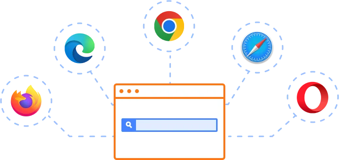
Supported browsers
The Blazor Dialog works well with all modern web browsers, including Chrome, Firefox, Edge, Safari, and Opera.
Not sure how to create your first Blazor Dialog? Our tutorial videos and documentation can help.
I’d love to watch it now I’d love to read it now.Blazor Components – 145+ UI and DataViz Components
ALL COMPONENTS
SMART COMPONENTS
GRIDS
DATA VISUALIZATION
FILE VIEWERS & EDITORS
DROPDOWNS
NAVIGATION
INPUTS
BUTTONS
INTERACTIVE CHAT
Frequently Asked Questions
Why should you choose Syncfusion Blazor Dialog?
The Syncfusion Blazor Dialog is a highly customizable dialog box which supports the following features:
- Display critical information, errors, warnings, confirmations, alerts, questions, and message boxes.
Use built-in features such as action buttons, drag-and-drop, positioning, animations.
- Also have support for bootstrap theme in Blazor dialog box which users can customize it.
- One of the best Blazor Dialog in the market that offers feature-rich UI to interact with the software.
Simple configuration and API.
- Supports all modern browsers.
Extensive demos, documentation, and videos to learn quickly and get started with Blazor Dialog.
Where can I find the Syncfusion Blazor Dialog demo?
You can find our Blazor Dialog demo, which demonstrates how to render and configure the Dialog.
Can I download and utilize the Syncfusion Blazor Dialog for free?
No, this is a commercial product and requires a paid license. However, a free community license is also available for companies and individuals whose organizations have less than $1 million USD in annual gross revenue, 5 or fewer developers, and 10 or fewer total employees.
How do I get started with Syncfusion Blazor Dialog?
A good place to start would be our comprehensive getting started documentation.
Our Customers Love Us
Having an excellent set of tools and a great support team, Syncfusion® reduces customers’ development time.Here are some of their experiences.

Blazor components
The speed how they adding new Blazor controls and update theirs functionality. I am using Blazor components. Searching for Blazor components I found that Syncfusion very fast adopted theirs controls for new development platform. Tech support is fast and excellent. The best of best is that they provide free controls for small business.

Igor L, 
CEO, Small-Business
Syncfusion objects with a Blazor
I have used some of the Syncfusion objects with a Blazor application. The support group has always been very helpful.

Kris B,
Software Development Consultant, Small-Business
Rated by users across the globe
Syncfusion Blazor Dialog Resources


UI Kits  Figma Download
Figma Download Awards
Greatness—it’s one thing to say you have it, but it means more when others recognize it. Syncfusion® is proud to hold the following industry awards.

