Overview
The Flutter Histogram Chart is a bar (column) chart used for frequency distribution in which the widths of the bars are proportional to classes into which variables have been divided and the heights of the bars are proportional to class frequencies. You can create beautiful, animated, real-time and high-performance histogram chart that also supports the interactive features such as zooming and panning, trackball, crosshair, tooltip and selection.

Key features

Distribution curve
Provides a graphical representation of the normal distribution of data.

Data labels
Data points can easily be annotated with data labels to improve readability.
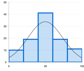
UI customization
Customizes the color and border of the Flutter Histogram Chart using built-in APIs to make it visually unique.
Code example
Easily get started with the Flutter Histogram Chart using a few simple lines of DART code example as demonstrated below,
import 'package:flutter/material.dart'; import 'package:syncfusion_flutter_charts/charts.dart'; @override Widget build(BuildContext context) { return Scaffold( body: Center( child: Container( child: SfCartesianChart( series: <CartesianSeries>[ HistogramSeries<SalesData, num>( dataSource: chartData, yValueMapper: (SalesData sales, _) => sales.yValue, binInterval: 20, showNormalDistributionCurve: true, curveColor: const Color.fromRGBO(192, 108, 132, 1), borderWidth: 3 ), ] ) ) ) ); }Learning resources


Flutter Histogram Chart User Guide
Learn available options to customize the Flutter Histogram Chart.