React Chip UI – Customizable Tags and Interactive Action Chips
- Simple content is represented in a compact element.
- Built-in support to disable, remove, and customize chip.
- Easy integration with forms, filters, and selection workflows.
- Avatars, icons, and custom templates are supported for rich visual representation.
Trusted by the world’s leading companies

Overview
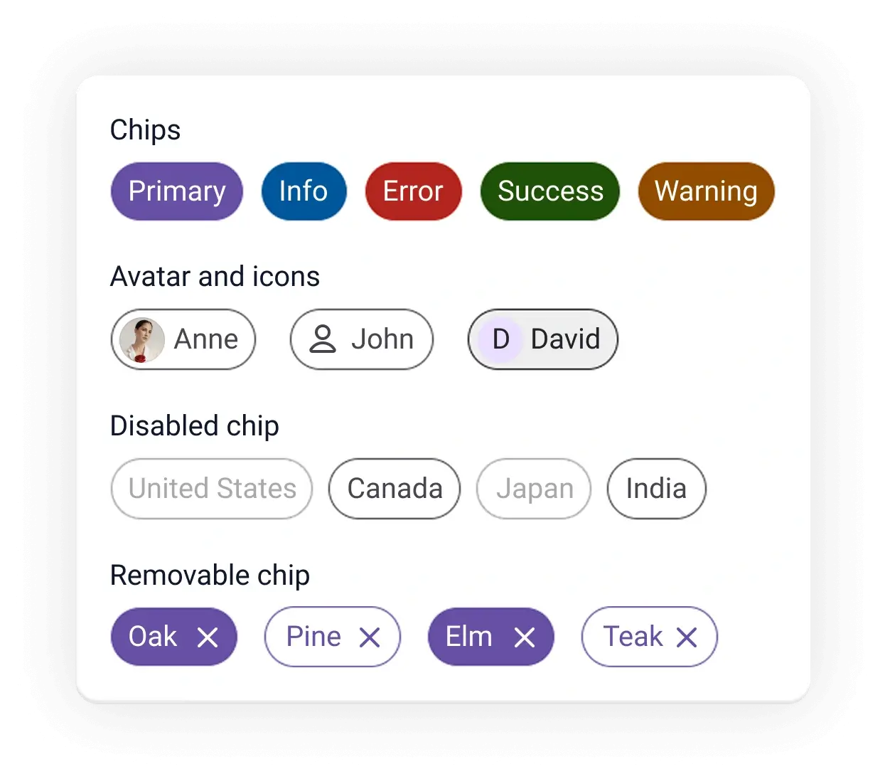
The React Chip is a compact UI component that provides small blocks of text information. A chip can also contain avatars, images, letters, and close icons. You can use multiple chips as tags when filtering contacts and email inboxes, for selecting choices from available options, and for providing input to an application.

React Chip code example
Get started with the React Chip using a few lines of TSX code, as demonstrated below. Also, explore this React Chip demo, which shows how to render and configure the Chip component in React.
import { Chip } from '@syncfusion/react-buttons'; export default function App() { return ( <div className="component-section"> <Chip>Anne</Chip> <Chip>John</Chip> <Chip>Margaret</Chip> </div> ); }Chip colors
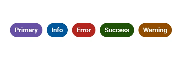
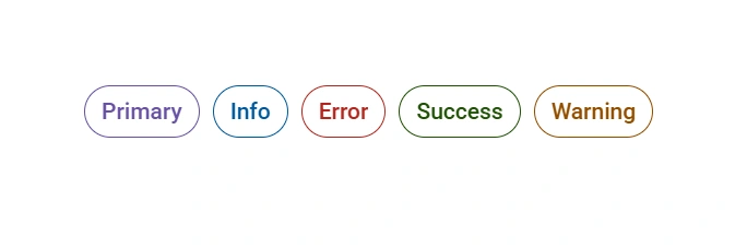
The React Chip supports predefined colors representing primary, info, error, success, and warning states to enhance UI clarity.
Chip variants
The React Chip supports two visual variants, outlined and filled, to define the chip’s appearance.
Avatars and icons
Enhance the Chip component with visual elements like avatars, icons, and custom styling to improve recognition and the user experience.

Templates
The Chip supports HTML elements, which can be updated dynamically based on the use case. This allows flexible representation of text, icons, images, or interactive elements within each chip.
Dynamic chip
A chip includes a delete icon that allows users to remove individual chips from the interface.


Not sure how to create your first React Chip component? Our documentation can help.
I’d love to read it nowPure React Components
Developed using React’s core principles, this library employs functional components and hooks without any external dependencies.
GRIDS
DATA VISUALIZATION
NAVIGATION
INPUTS
Frequently Asked Questions
Why should you choose the Syncfusion® React Chip component?
The Syncfusion React Chip provides the following features:
- Representation of simple content in a compact element.
- Colors for primary, success, info, warning, and error messages.
Extensive customization options.
Simple configuration and APIs.
- Support for all modern browsers.
Expansive learning demos to help you get started quickly.
Where can I find the Syncfusion React Chip demo?
Find our React Chip demo here. It demonstrates how to render and configure the Chip component.
Can I download and utilize the Syncfusion React Chip for free?
No, this is a commercial product and requires a paid license. However, a free Community License is also available for companies and individuals whose organizations have less than $1 million USD in annual gross revenue, 5 or fewer developers, and 10 or fewer total employees.
How do I get started with the Syncfusion React Chip component?
A good place to start would be our comprehensive getting started documentation.
Rated by users across the globe
Syncfusion React Chip resources


Awards
Greatness—it’s one thing to say you have it, but it means more when others recognize it. Syncfusion® is proud to hold the following industry awards.

