React Message - Accessible, Flexible UI for Notifications
- A lightweight, responsive component designed to clearly indicate the severity and context of messages to end users.
- Features built-in support for severity icons and predefined appearance variants to highlight message importance.
- Offers a highly customizable user interface for seamless integration and styling.
Trusted by the world’s leading companies

Overview
The React Message is a versatile graphical user interface that presents messages with clear visual severity indicators. It utilizes distinct icons and color schemes to convey the importance and context of each message effectively. The component includes a range of built-in features, such as customizable severity levels, appearance variants, icons, and flexible content for easy integration and styling.
React Message code example
Get started with the React Message component using a few simple lines of TSX code, as demonstrated below. Explore this React Message example to see how to render and configure the component.
import { Message, Severity } from '@syncfusion/react-notifications'; export default function App() { return ( <div> <Message severity={Severity.Success}>Your message has been sent successfully</Message> </div> ); };Severities
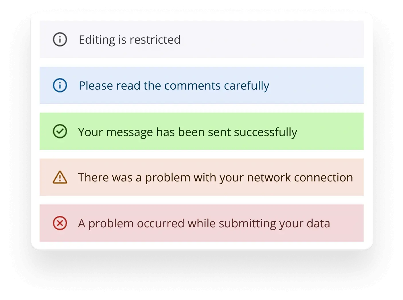
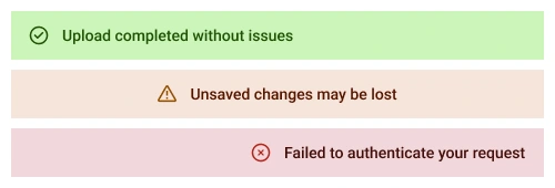
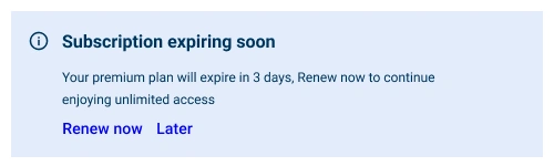
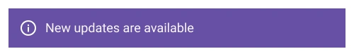
Display messages with predefined severity types, each accompanied by distinctive icons and colors to clearly convey their importance to the user. The available severity types are:
- Normal: Standard messages for general information.
- Success: Indicates successful operations or positive outcomes.
- Info: Provides information or updates.
- Warning: Alerts users to potential issues or cautions.
- Error: Highlights critical issues or failures requiring attention.
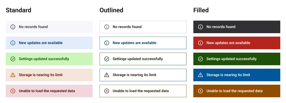
Variants
The React Message component offers predefined appearance variants to provide flexible visual representations of messages:
- Standard: A clean, minimal design with subtle styling for general use.
- Outlined: A bordered appearance for a distinct, highlighted look.
- Filled: A solid background color for a bold and prominent presentation.
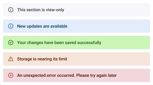
Icons
To enhance user comprehension, the Message incorporates visual icons alongside text. Severity icons are displayed to the left of the message content, providing an immediate visual cue about the message’s urgency. A close icon is also included to the right of the message, allowing users to hide messages after reading them.
Content alignment
Message content is aligned to the left by default for a clean and standard presentation. Users can easily adjust the alignment to the center or right using the built-in classes sf-content-center and sf-content-right, respectively.
Content customization
The React Message component enables users to customize the content with a flexible structure. Content can be a string, paragraph, or any other HTML element, which can be added directly as child elements, allowing developers to create tailored and engaging message displays.
Appearance customization
The React Message component allows users to customize the appearance of the message by applying a custom class at the application level. This class enables users to override the default styles to adjust the message’s appearance.
Accessibility
The React Message component is designed with accessibility in mind to ensure an inclusive user experience:
- Fully supports WAI-ARIA accessibility practices, enabling seamless compatibility with screen readers and assistive devices.
- Adheres to WAI-ARIA best practices for implementing intuitive keyboard interaction with the close icon.
- Complies with WCAG 2.2 standards for UI visual elements, including foreground color, background color, line spacing, text, and images, to ensure readability and usability.
- Supports right-to-left (RTL) text rendering for users working in languages such as Hebrew, Arabic, or Persian.
Developer-friendly APIs
The React Message component provides a comprehensive set of APIs, allowing developers granular control over its appearance and behavior for seamless integration and enhanced functionality.
Built-in themes
The React Message component supports the Material 3 theme, providing a modern and consistent design out of the box. Users can customize this built-in theme or create entirely new themes to achieve their desired look and feel. Theme customization is facilitated by overriding CSS variables.


Pure React Components
Developed using React’s core principles, this library employs functional components and hooks without any external dependencies.
GRIDS
DATA VISUALIZATION
NAVIGATION
INPUTS
Frequently Asked Questions
Why should you choose the Syncfusion React Message component?
Built-in support for severity and predefined appearance variants to convey message importance clearly.
- The user interface can be easily customized to meet specific design requirements.
- Straightforward configuration and a comprehensive API for easy integration.
- Support for all modern browsers for consistent performance.
- Designed with a touch-friendly and responsive UI for optimal user experiences across devices.
Offers expansive learning resources, including demos and documentation, to help you get started quickly.
Where can I find the Syncfusion React Message demo?
You can find our React Message demo here. It demonstrates how to render and configure the Message component.
Can I download and utilize the Syncfusion® React Message for free?
No, this is a commercial product and requires a paid license. However, a free Community License is also available for companies and individuals whose organizations have less than $1 million USD in annual gross revenue, 5 or fewer developers, and 10 or fewer total employees.
How do I get started with the Syncfusion React Message?
A good place to start would be our comprehensive getting started documentation.
Rated by users across the globe
Syncfusion React Message resources


Awards
Greatness—it’s one thing to say you have it, but it means more when others recognize it. Syncfusion® is proud to hold the following industry awards.

