Trusted by the world’s leading companies

Overview
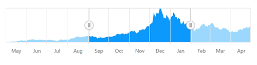
React Range Selector is an interface for selecting a small range from a larger collection. It is commonly used in financial dashboards to filter a date range for data that needs to be visualized.
React Range Selector Code Example
Easily get started with the React Range Selector using a few simple lines of TSX code as demonstrated below. Also explore our React Range Selector Example that shows you how to render and configure the Range Selector in React.
import * as React from 'react'; import * as ReactDom from 'react-dom'; import {RangeNavigatorComponent} from '@syncfusion/ej2-react-charts'; class App extends React.Component<{}, {}> { public render() { return ( <RangeNavigatorComponent></RangeNavigatorComponent> ); } } ReactDom.render(<App />, document.getElementById('element'));Data types
Plot any type of data in the range selector using different value types like numeric, date-time, and logarithmic.
Chart types
Plot data in the range selector with different chart types like line, area, and step line.
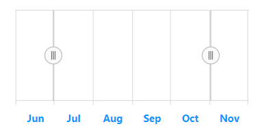
Lightweight
Skip the chart and show only the range for selecting data. This makes the range selector lightweight in mobile devices.
Scales
Major and minor scales display the range with different intervals and are placed at multiple levels of the range selector. A date-time scale can also be configured to be shown in major and minor scales.
Period Selector
Select data using predefined periods in the range selector and use the date picker to select a custom range.
Binding selected data
Bind selected data from the range selector to any other data visualization control using built-in events.
Deferred scrolling
Allows you to defer the selected range to be updated until the user stops dragging the scrolling thumbs. This provides a smooth scrolling experience.
Range selection
The range selector control provides the following three ways to select a range:
- Select a range through labels.
- Drag the left and right thumbs.
- Drag the selected range to maintain the same delta.
Customization
All the elements of the range selector are highly customizable with built-in APIs.
Labels
Customize the size, color, font family, font attribute, and alignment of the labels using built-in APIs.
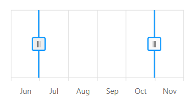
Thumbs
Customize the appearance of the left and right thumbs using built-in APIs.
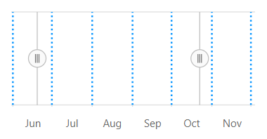
Gridlines
Customize the color, stroke width, dash array, and visibility of the major and minor gridlines using built-in APIs.
Tooltip
Tooltips display the start and end values of a selected range, allowing users to easily select a required range.
RTL
The range selector supports right-to-left rendering and allows the series and scale direction to be displayed from the right to left. This improves the user experience and accessibility of RTL languages.
Touch and Browser support
The interactive range selector control also support touch interactions.

Touch support
All the features in range selector will work on touch devices with zero configuration. Use the touch features such as tooltip and thumb drag without any customization.

Responsive
You can view the range selector on various devices. It is also possible to hide chart for particular screen sizes by making a very minimal change.

Cross browser support
You can render range selector control in all the modern browsers.


Not sure how to create your first React Range Selector? Our tutorial videos and documentation can help.
I’d love to watch it now I’d love to read it nowDiscover Syncfusion’s Complete React Component Ecosystem
Explore over 145+ React UI components featuring established, production-ready controls and the latest pure React components built natively for modern web app development.
- React Components
- Pure React Components
- SMART COMPONENTSGRIDSDATA VISUALIZATIONDROPDOWNSFILE VIEWERS & EDITORSBUTTONSINTERACTIVE CHATINPUTSNAVIGATIONFORMSNOTIFICATIONS
- GRIDSDATA VISUALIZATIONNAVIGATIONINPUTS
Frequently Asked Questions
Why should you choose Syncfusion React Range Selector?
Syncfusion React Range Selector provides the following features:
A modern interface for quickly selecting a time-period to filter data for in-depth analysis.
- Integration with Charts, DataGrid, ListView, and other Syncfusion® controls to visualize filtered data.
- Responsive design that adapts the control’s UI to any mobile device.
- One of the best React Range Selector in the market that offers feature-rich UI to interact with the software.
- Simple configuration and API.
- Supports all modern browsers.
- Mobile-touch friendly and responsive.
Extensive demos and documentation to learn quickly and get started with Range Selector React.
Where can I find the Syncfusion React Range Selector demo?
You can find our React Range Selector demo, which demonstrates how to render and configure the Range Selector.
Can I download and utilize the Syncfusion React Range Selector for free?
No, this is a commercial product and requires a paid license. However, a free community license is also available for companies and individuals whose organizations have less than $1 million USD in annual gross revenue, 5 or fewer developers, and 10 or fewer total employees.
How do I get started with Syncfusion React Range Selector?
A good place to start would be our comprehensive getting started documentation.
Our Customers Love Us
Having an excellent set of tools and a great support team, Syncfusion® reduces customers’ development time.Here are some of their experiences.

Aweseome, enough said. really
Easy usability, solving real life problems. easy to implement. most of the cases has the operators and settings possibilities you right away need. never fails to impress

Oliver O, 
Geschäftsführung Kreation/Artdirektion, Small-Business
A giant framework with great pricing options
I have loved the components and options that Syncfusion has, besides, its documentation, demos, and Support are excellent.

Alejandro Javier V,
CEO, Small-Business
Rated by users across the globe
Syncfusion React Range Selector Resources


Technical Support  Contact Support
Contact Support UI Kits  Figma Download
Figma Download Awards
Greatness—it’s one thing to say you have it, but it means more when others recognize it. Syncfusion® is proud to hold the following industry awards.

