WPF Button - A Simple and Flexible Input Control
- Dropdown button and split button controls are extended from the WPF button.
- Buttons can be arranged in three different sizes, small, normal and large, and also provide image settings.
- Checkable and multiline support, plus MVVM design pattern and command binding compatibility.
.NET 10 support now available
Trusted by the world’s leading companies

Overview
The WPF Button is an advanced control that offers features such as checkable support, multiline support, image size options, different button size modes, and icon templates. A split button and dropdown button are extended from the WPF Button with different characteristics to meet different application needs. The Button control is compatible with the MVVM design pattern.
WPF Image Button
The advanced WPF button supports images along with text. With checkable support, the button control imitates the check box functionality and resembles toggle button with different states.

Dropdown button
The WPF dropdown button provides advanced menu-like appearance to the button UI. When the arrow is clicked, it displays a dropdown list for selection. Other features of the dropdown menu and its items include boundary detection, title text, icon setting, check selection, etc.

Split button
The split button is a combination of a button and a menu control. The button itself provides a default selection or when the arrow is clicked, displays a dropdown list for other possible selections.

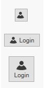
Different button sizes
The WPF button comes in different sizes like small, normal, and large.

Small Button
In a small size button, only a small image representing the purpose of the button will be displayed. There will be no text.

Normal Button
In a normal size button, a small image with the text on the side will be displayed.

Large Button
In a large size button, a large image along with the text at the bottom will be displayed.
Icon Template
The WPF button, dropdown button and split button supports adding any type of images such as path data, font icons, etc. as template.
Button

DropDown Button
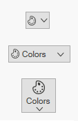
Split Button
Different image sizes
The WPF button image can be set in small and large sizes. Apart from the predefined sizes, the size of the image can also be set manually using height and width settings.

Command binding
The WPF button control facilitates command binding support that is best suited to the MVVM approach. Predefined commands such as cut, copy, paste, etc. can be accommodated.
Displaying multiline content
In large buttons, text can be displayed in multiple lines based on the length of the content for better user experience.

Toggle State
When the IsCheckable property is set to true, the button control can also be used as a toggle button, similar to the on/off view. The default value of this property is false.

Custom style and themes

Built-in themes
Shipped with built-in themes like Blend, Office 2010, Office 2013, Office 2016, Office 365, Visual Studio 2013, Visual Studio 2015, Metro, etc.

Custom styling
The appearance of the control can be customized to any extent programmatically.

Localization
Allows users to customize the text in the user interface based on the local culture.

Right-to-left (RTL)
The text direction and layout of the control can be displayed in the right-to-left direction.

UI Automation
The WPF button is compatible with Coded UI and UFT (formerly QTP) automation tools.

WPF Button Code Example
Easily get started with the WPF Button using a few simple lines of XAML and C# code example as demonstrated below. Also explore our WPF Button Example that shows you how to render and configure the Button in WPF.
<syncfusion:ButtonAdv Height="44" VerticalAlignment="Center" HorizontalAlignment="Center" Width="162"/>using Syncfusion.Windows.Tools.Controls; namespace WpfApp1 { public partial class MainWindow : Window { public MainWindow() { InitializeComponent(); ButtonAdv button = new ButtonAdv(); button.Height=44; button.Width=31; this.Content = button; } } }Not sure how to create your first WPF Button? Our documentation can help.
I’d love to read it now145+ WPF CONTROLS
ALL CONTROLS
DATA VISUALIZATION
MODERN THEMES
LAYOUT
NAVIGATION
INPUT CONTROLS
BUTTONS
BUSINESS INTELLIGENCE
DATA SCIENCE
MISCELLANEOUS
LISTS & DROPDOWN
NOTIFICATION
FILE VIEWERS & EDITORS
CONVERSATIONAL UI
Frequently Asked Questions
Why should you choose Syncfusion WPF Button?
The Syncfusion WPF Button provides the following:
- Buttons can be loaded in three different sizes, small, normal, and large. Images can be added to the different button modes.
Provides MVVM design pattern and command binding compatibility.
- One of the best WPF Button in the market that offers feature-rich UI to interact with the software.
- Simple configuration and API.
- Touch-friendly and responsive UI.
Extensive demos, documentation to learn quickly and get started with WPF Button.
Can I download and utilize the Syncfusion WPF Button for free?
No, this is a commercial product and requires a paid license. However, a free community license is also available for companies and individuals whose organizations have less than $1 million USD in annual gross revenue, 5 or fewer developers, and 10 or fewer total employees.
How do I get started with Syncfusion WPF Button?
A good place to start would be our comprehensive getting started documentation.
Our Customers Love Us
Having an excellent set of tools and a great support team, Syncfusion® reduces customers’ development time.Here are some of their experiences.

Excellent experience with Syncfusion!
Syncfusion is a product that makes life easier! I use it to create Blazor applications (server side and webassembly) and the controls speed up development a lot. Furthermore, if needed, it is possible to ask for direct support that is never long in coming!

Andrea Scarpante, 
Sydea srl
The complete component set
It is the most complete component set available. Also very handy is the fact that there is a community edition, this gives me the opportunity to test thing at home without buying a separate license.

Johan Visser, 
H and T Pawnbrokers
Rated by users across the globe
Syncfusion WPF Resources
Learning  Documentation
Documentation 


Awards
Greatness—it’s one thing to say you have it, but it means more when others recognize it. Syncfusion® is proud to hold the following industry awards.

