


A rich interaction, lightweight, high performance UI library based on Weex.
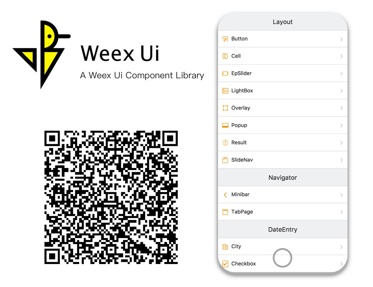
Try it with Fliggy、Taobao、Tmall、Weex Playground or any browsers now! 简体中文>>
npm i weex-ui -S<template> <div> <wxc-button text="Open Popup" @wxcButtonClicked="buttonClicked"> </wxc-button> <wxc-popup width="500" pos="left" :show="isShow" @wxcPopupOverlayClicked="overlayClicked"> </wxc-popup> </div> </template> <script> import { WxcButton, WxcPopup } from 'weex-ui'; // or // import WxcButton from 'weex-ui/packages/wxc-button'; // import WxcPopup from 'weex-ui/packages/wxc-popup'; module.exports = { components: { WxcButton, WxcPopup }, data: () => ({ isShow: false }), methods: { buttonClicked () { this.isShow = true; }, overlayClicked () { this.isShow = false; } } }; </script>import { WxcComponent1, WxcComponent2 } from "weex-ui"In order not to pack all the components, you can use babel-plugin-component import specified component.
npm i babel-plugin-component -D// add a plugins setting to .babelrc { "plugins": [ [ "component", { "libraryName": "weex-ui", "libDir": "packages" } ] ] }import WxcComponent1 from "weex-ui/packages/wxc-component1" import WxcComponent2 from "weex-ui/packages/wxc-component2"If you use weex-toolkit to develop a Weex project, Please add 'state-0' and 'babel-plugin-component' to .babelrc.
weex update weexpack npm i babel-preset-stage-0 babel-plugin-component -D{ "presets": ["es2015", "stage-0"], "plugins": [ [ "component", { "libraryName": "weex-ui", "libDir": "packages" } ] ] }- If
webpack.config.jsbabel-loader has a exclude for node_modules, Please turn on for week-uiexclude: /node_modules(?!\/.*(weex).*)/. - You can find more examples here. Write once and support iOS / Android / Html5 right now!
| Name | Category | Description |
|---|---|---|
| wxc-button | Layout | Basic button |
| wxc-cell | Layout | Cell layout element |
| wxc-ep-slider * | Layout | Cool slider neighbor |
| wxc-lightbox | Layout | Picture list full screen display |
| wxc-overlay | Layout | Basic monlayer element |
| wxc-popup | Layout | Popup box |
| wxc-result | Layout | General results page |
| wxc-slide-nav | Layout | Increases view windows |
| wxc-minibar | Navigator | Top navigation |
| wxc-tab-bar | Navigator | Tab bar switching component |
| wxc-tab-page * | Navigator | Single page Tab switching component |
| wxc-checkbox | Data Entry | Checkbox list |
| wxc-countdown | Data Entry | Countdown component |
| wxc-radio | Data Entry | Radio list |
| wxc-slider-bar * | Data Entry | Sliding select data |
| wxc-stepper | Data Entry | Quantity changer |
| wxc-searchbar | Data Entry | Search bar component |
| wxc-grid-select | Data Display | Grid selection component |
| wxc-indexlist | Data Display | Index list component |
| wxc-page-calendar | Data Display | Full page calendar |
| wxc-rich-text | Data Display | Dynamic template |
| wxc-simple-flow | Data Display | Simple flow chart |
| wxc-tag | Data Display | Various forms of tag |
| wxc-dialog | Feedback | Second confirmation window |
| wxc-loading | Feedback | Content load reminder |
| wxc-mask | Feedback | Intermediate popup panel |
| wxc-noticebar | Feedback | Message prompt bar component |
| wxc-progress | Feedback | Progress bar |
| wxc-lottery-rain | Game | Cat-cat game |
| utils | Service | Common function |
*These rich interaction components are based on expressionBinding feature. Make sure your app support it.- It's recommended to use the Octotree extension for better documentation search experience.
npm i npm run startOnce it has been compiled, a browser window will be opened automatically. You can switch to developer mode to see the demo. And there will be a QR code that you can use to try the demo on your phone in the console.
- Use it with NPM.
- Star it if you like.
- If you have any ideas or suggestions to improve Weex Ui, welcome to submit a PR.
- Having a problem getting something to work or want to know why we setup something in a certain way? File a GitHub Issue.
- The MIT License
- Please feel free to use and contribute to the development.