I just saw a nice plot there:
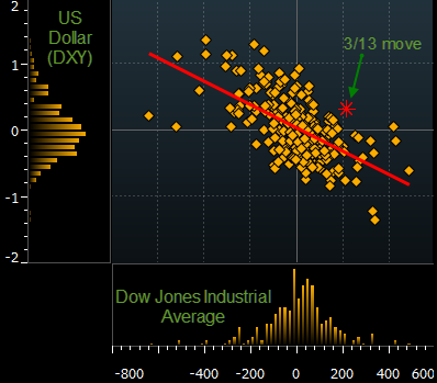
How could I implement that in Mathematica — by which I mean the plot structure, not so much the styling.
I just saw a nice plot there:
How could I implement that in Mathematica — by which I mean the plot structure, not so much the styling.
Here's my solution, which constructs the three components and uses Inset to combine them into a single graphic. I've taken some care so that:
customPlot[data_, o___] := Block[{xmin, xmax, ymin, ymax, x, y, mainplot, xhist, yhist, opts = Flatten[{o}]}, {x, y} = Transpose[data]; xhist = HistogramList[x, 50]; yhist = HistogramList[y, 50]; {xmin, xmax} = Through[{Min, Max}[First[xhist]]]; {ymin, ymax} = Through[{Min, Max}[First[yhist]]]; mainplot = ListPlot[data, Frame -> {{False, True}, {False, True}}, Axes -> False, FrameTicks -> None, AspectRatio -> 1, PlotRange -> {{xmin, xmax}, {ymin, ymax}}, PlotRangePadding -> Scaled[0.02], ImagePadding -> {{None, 1}, {None, 1}}, FilterRules[opts, Options[ListPlot]], FrameStyle -> GrayLevel[0.3], GridLines -> Automatic, GridLinesStyle -> Directive[Gray, Dotted]]; xhist = Histogram[x, {First[xhist]}, Frame -> {{True, True}, {True, False}}, FrameTicks -> {{None, None}, {Automatic, None}}, Axes -> False, AspectRatio -> 1/3, ImagePadding -> {{1, 1}, {None, All}}, FilterRules[opts, Options[Histogram]], GridLines -> {Automatic, None}, FrameStyle -> GrayLevel[0.3], GridLinesStyle -> Directive[Gray, Dotted]]; yhist = Histogram[y, {First[yhist]}, Frame -> {{True, False}, {True, True}}, Axes -> False, FrameTicks -> {{Automatic, None}, {None, None}}, AspectRatio -> 3, BarOrigin -> Left, ImagePadding -> {{All, None}, {1, 1}}, FilterRules[opts, Options[Histogram]], GridLines -> {None, Automatic}, FrameStyle -> GrayLevel[0.3], GridLinesStyle -> Directive[Gray, Dotted]]; Graphics[{{Opacity[0], Point[{{360, 360}, {-120, -120}}]}, Inset[mainplot, {0, 0}, {Left, Bottom}, {360, 360}], Inset[xhist, {0, 0}, {Left, Top}, {360, Automatic}], Inset[yhist, {0, 0}, {Right, Bottom}, {Automatic, 360}]}, PlotRange -> {{-120, 360}, {-120, 360}}, FilterRules[opts, Options[Graphics]], ImagePadding -> {{30, 1}, {30, 1}}] ] Now to create some data and try it out:
d = RandomVariate[BinormalDistribution[{0, 0}, {1, 2}, 0.4], 100]; customPlot[d] customPlot[d, PlotStyle -> Directive[PointSize[Large], Orange], ChartStyle -> Orange, ChartElementFunction -> "FadingRectangle", FrameStyle -> White, Background -> Black] ImagePadding on all the components to fix this (which means that tick labels may get clipped slightly.) $\endgroup$ There is also a more eye-catchy approach that uses built-in functions.
data = RandomReal[BinormalDistribution[{-1, 2}, {1, 1}, .8], 1000]; GraphicsColumn[ Table[DensityHistogram[data, {.2}, ColorFunction -> "DarkRainbow", Method -> {"DistributionAxes" -> p}, ImageSize -> 500, BaseStyle -> {FontFamily -> "Helvetica"}, LabelStyle -> Bold], {p, {True, "Histogram", "SmoothHistogram", "BoxWhisker"}}]] 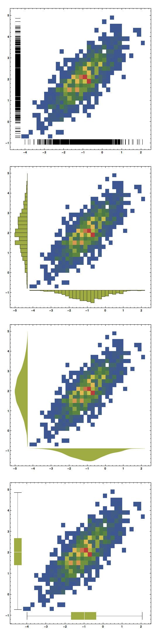
And it works also with SmoothDensityHistogram, although it seems that in this case Histogram cannot be used as a method:
GraphicsColumn[ Table[SmoothDensityHistogram[data, ColorFunction -> "DarkRainbow", Method -> {"DistributionAxes" -> p}, ImageSize -> 500, BaseStyle -> {FontFamily -> "Helvetica"}, LabelStyle -> Bold], {p, {True, "SmoothHistogram", "BoxWhisker"}}]] 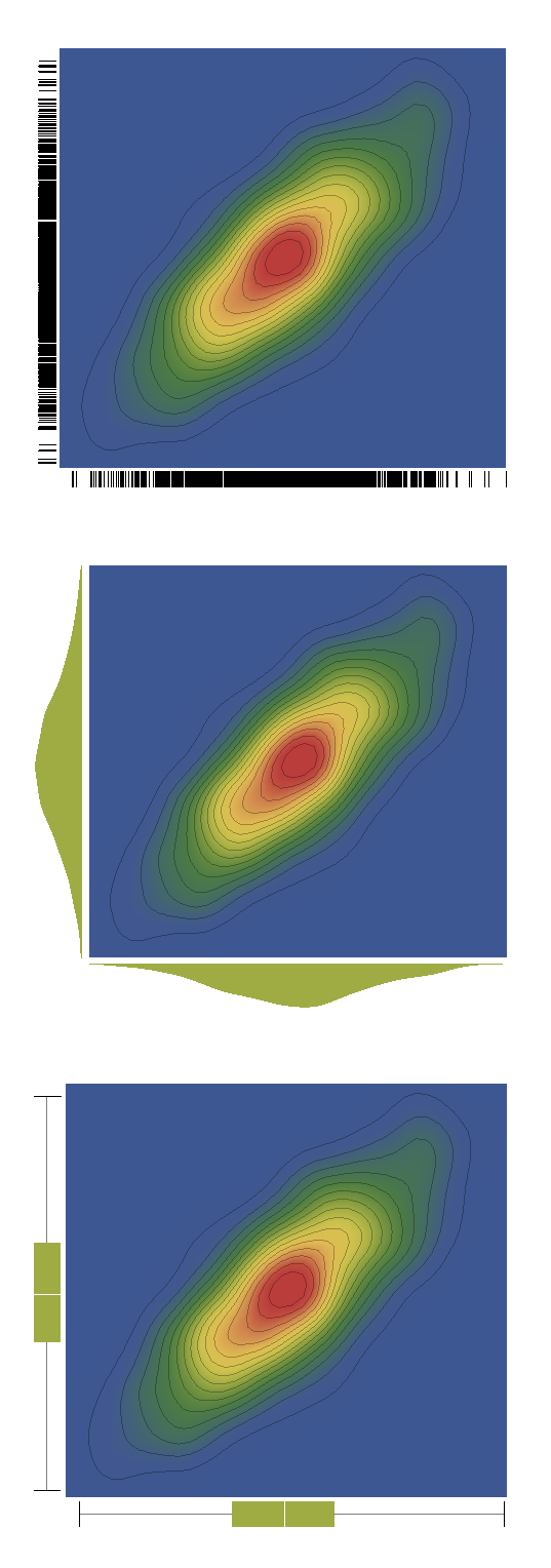
data = RandomReal[BinormalDistribution[{0, 0}, {1, 1}, .8], 1000]; hist = DensityHistogram[data, {.2}, Method -> {"DistributionAxes" -> "Histogram"}][[1, 2]]; Show[ Graphics[hist, AspectRatio -> 1, Frame -> True, PlotRangeClipping -> True, PlotRangePadding -> {{Scaled[0.02], Scaled[0.02]}, {Scaled[0.02], Scaled[0.02]}}], ListPlot[data] ] 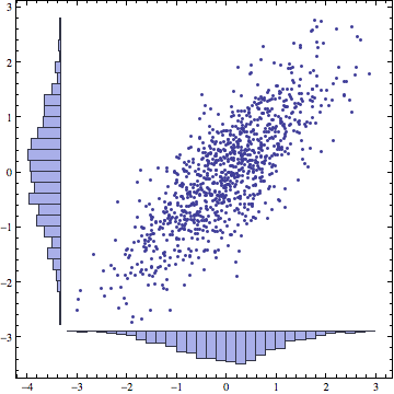
Method -> {"DistributionAxes" ->...} only "BoxWhisker" is listed in the examples. $\endgroup$ Histogram as a "DistributionAxes" option, so I followed then the trial-and-error method to find other solutions. It might well be that there are other options out there that work. $\endgroup$ This doesn't have the styling and it doesn't yet enforce the plot ranges or implement the regression line, but it's a start:
fakeBloombergThing[data:{{_?NumericQ, _?NumericQ}..}] := Grid[{{Histogram[data[[All, 2]], BarOrigin -> Left , AspectRatio -> 5, ImageSize -> 80], ListPlot[data, Frame -> True, AspectRatio -> 1, ImageSize -> 350]}, {Null, Histogram[data[[All, 1]] , AspectRatio -> 1/5, ImageSize -> 350]}}] Some fake data:
testdata = RandomVariate[BinormalDistribution[{-1, 1}, {1, 2}, -.6], 100]; fakeBloombergThing[testdata] 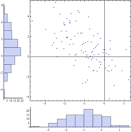
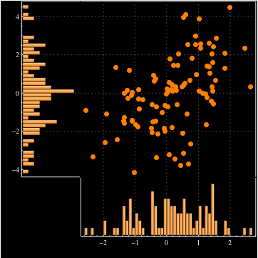
ImagePadding as well for cases where significant figures in ticks can be large. That might also correct the misalignment of the "Y" histogram x axis with the scatter plot x axis. $\endgroup$ Here's a truly hacky approach that uses Show to align a ListPlot of the points with the DensityHistogram, which we use only for the histograms along the axes. In order to hide the actual density histogram, we make everything white (which somewhat limits the styling options).
somePoints = RandomReal[BinormalDistribution[{-1, 2}, {1, 1}, .8], 1000]; Show[ DensityHistogram[somePoints, {.2}, ColorFunction -> (White &), Method -> {"DistributionAxes" -> "Histogram"}], ListPlot[somePoints]] 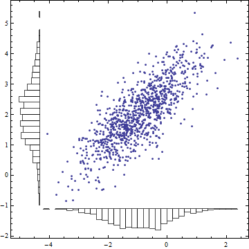
ColorFunction -> (Opacity[0] &) instead of ColorFunction->(White &) $\endgroup$ 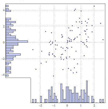
Fillingbefore - it's not the sort of thing we do at my employer. We are quite minimalist on the decoration side. $\endgroup$