I have a set of data that is in the form
{{\[Theta], \[Phi], r},....} Or to make it simpler:
data={{0, 0, 3.3102}, {0, 2, 3.3102}, ..., {10, 90, 4.084}} Alternatively, a data set can be generated by using:
data=Flatten[Table[{th,phi,RandomReal[100]},{th,0,45,2},{phi,0,90,2}],1]; Now I want to plot this data in a polar plot to get something equivalent to: 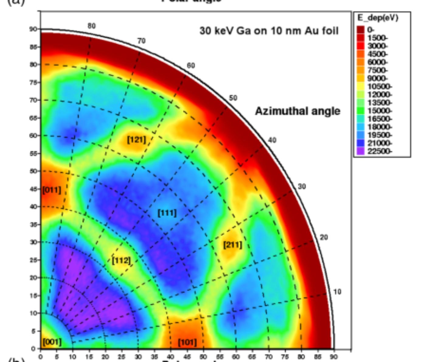
Where the text in the picture referring to different crystal planes is not important. To generate a uniform density plot, there should be some interpolation between data points but I guess that is not necessary as I can always do that in preprocessing of the data points. Now this is somewhat easily generated by using python, however I am looking for a way to generate such a plot in mathematica in attempts to keep layout consistency between my other plots.
I can easily generate a ListDensityPlot using:
ListDensityPlot[data] That looks like (with some legends manipulation and graphics options tweaked to make it look "more presentable"): 
I managed to convert the rectangular plot to a circular one using transfromation of coordinates i.e.
N[{#[[1]] Cos[#[[2]]], #[[1]] Sin[#[[2]]], #[[3]]}] & /@data Not a 100% sure that this is correct to be honest, and looking into it but nonetheless, This gives me:
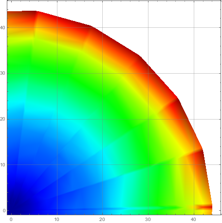
But I still don't know how to add the grid lines properly, the custom legend i.e. Azimuthal Angle I guess I can always add afterwards by hand but it would be appreciated to add it while plotting too