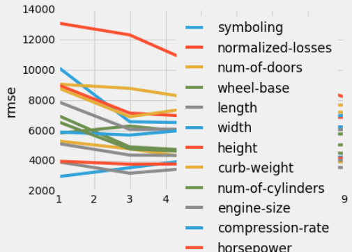
Right now I have this code:
for each in list_of_cols: x = vary_k_df_rmse['k_value'] y = vary_k_df_rmse[each] plt.plot(x,y) plt.xlabel('k Value') plt.ylabel('rmse') plt.legend() The above code produces the following graph, with multiple lines in a single plot: 
I need to enlarge the plot above so the legend isn't sitting on the lines.
Adding the following line doesn't work: plt.figure(figsize=(20,10)). This is what most existing answers suggest to do.
for each in list_of_cols: x = vary_k_df_rmse['k_value'] y = vary_k_df_rmse[each] plt.figure(figsize=(20,10)) plt.plot(x,y) plt.xlabel('k Value') plt.ylabel('rmse') plt.legend() 
Adding the above line to the for list that generates the graph made it so that the lines appeared in different subplots, rather than all on the same plot.