I have the following dictionary:
top = {'aaaa': {'☹': 7, '👹': 12, '😡': 6}, 'bbbb': {'👏': 2, '😉': 2, '😘': 2}, 'cccc': {'☹': 5, '😆': 3, '🙂': 3}, 'dddd': {'🌝': 8, '😈': 7, '🤗': 3}, 'eeee': {'☺': 3, '😂': 5, '😔': 4}, 'ffff': {'☹': 5, '💞': 5, '😢': 5}} Each 'aaaa' or 'bbbb' is the user's name, and his values is the emoji he is using the most. I want to plot a decent looking graph to visualize. After a few tries, this is my best work:
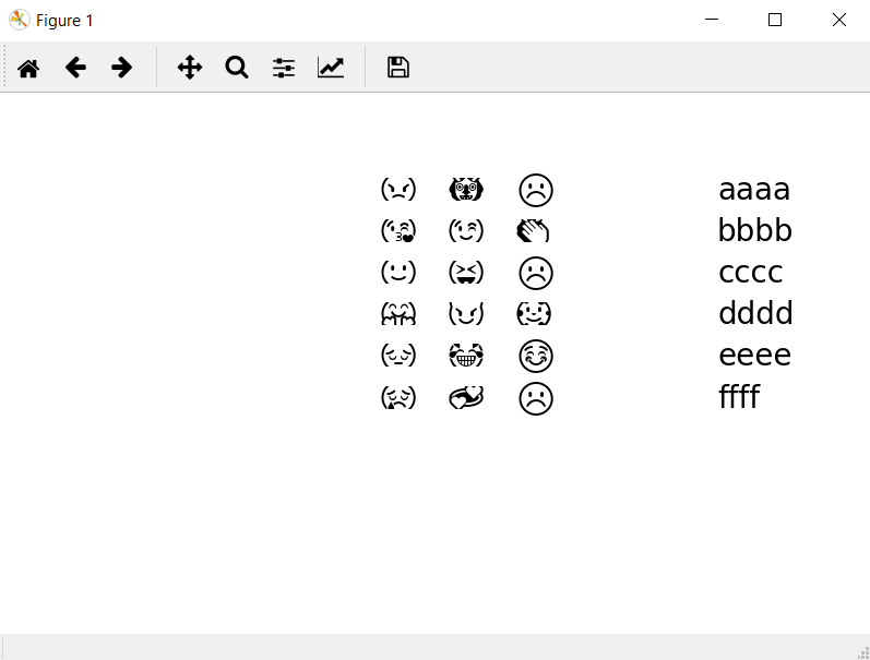
with the code:
import matplotlib.pyplot as plt def top_emoji(top): fig, ax = plt.subplots(figsize=(8, 5)) y = 9 level = 0 start = 9 for name, dictionary in top.items(): ax.text(start, y - level, name, fontsize=20) x = 3 for emoj in dictionary.keys(): ax.text(start - x, y - level, emoj, fontname='Segoe UI Emoji', fontsize=20) x += 1 level += 1 ax.axis([0, 10, 0, 10]) ax.get_xaxis().set_visible(False) ax.get_yaxis().set_visible(False) ax.axis('off') plt.show() Which is terrible in my opinion. Any recommendations for improvements will be much appreciated.