0
$\begingroup$

I want to understand how to interpret ADEV plots. I was of the understanding that if we see a peak at 1sec of TDEV plot there is a 1Hz noise in Time Interval Error(TIE) Capture.

To understand the relationship between TIE and TDEV I considered TIE to be a sinusoidal wave of 1Hz sampled using a signal of 20Hz (much greater than Nyquist requirement) and for a period of 10sec (tmax)

Sharing the code used:

import numpy as np import allantools from matplotlib import pyplot as plt # import ipywidgets as widgets from ipywidgets import interact, fixed np.seterr(divide='ignore', invalid='ignore') # data generation # signal characteristics and sampling characteristics freq = 1 tmin = 0 tmax = 10 sampling_period = 1/16 def generate_data(freq, tmin, tmax, sampling_period): t = np.arange(tmin,tmax,sampling_period) data = np.sin(2*np.pi*t*freq) #data = return data,t def plot_data(ax, t, data): ax.plot(t,data) def compute_adev(data, rate): # Load data a = allantools.Dataset(data=data,rate=rate,data_type="phase") # compute mdev a.compute('adev') # Plot it using the Plot class b = allantools.Plot() b.plot(a, errorbars=True, grid=True) # You can override defaults before "show" if needed b.ax.set_xlabel("Tau (s)") b.show() def call_func(freq=1, tmin=0.0, tmax=10.0, sampling_period=1/20): data,t = generate_data(freq, tmin, tmax, sampling_period) ax=plt.axes() plot_data(ax,t,data) compute_adev(data, 1/sampling_period) call_func(1, 0.0, 10.0, 1/20) 

The below Tdev Plot is using tmax=10.0

enter image description here 
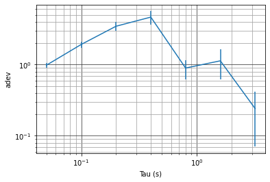
The below Tdev Plot is using tmax=100.0
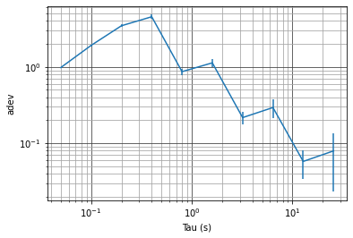
https://i.sstatic.net/6BGEn.png

Question:

The plot is not having peak at 1Hz. Since the input TIE is periodic over 1Hz, shouldn't we expect a peak at Tau = 1sec ?

PS. since i need 300points to create a tag, tagging time-freq and time-domain

$\endgroup$
1
  • $\begingroup$ It looks like you are plotting ADEV, not TDEV-- did you mean ADEV in your question? $\endgroup$ Commented Mar 17, 2022 at 11:22

1 Answer 1

1
$\begingroup$

I explain the interpretation of ADEV plots in more detail at these posts.

How to interpret Allan Deviation plot for gyroscope?

Allan Variance vs Autocorrelation - Advantages

Is Allan variance still relevant?

Specific to the final question by the OP: The Allan Deviation will have a dip at the inverse of the period of an oscillation, not a peak. The peak occurs at approximately half the period (which is intuitive when you consider Allan Deviation is computed by a subtraction of averaged blocks).

Increase the number of samples in the computation, and you will see the tell tale ADEV of a sinusoidal modulation, which is given by an aliased Sinc function multiplied with a comb response as given by the difference of the (moving for overlap-ADEV or block otherwise) averaging (the Allan Deviation is the standard deviation of the frequency vs time after such processing), as I show in the plot below.

The plot below is for a sinusoidal frequency error at a rate of $f_m = 1$ Hz with a peak fractional frequency deviation of 1. I prefer "Overlap ADEV" since it converges to the same result with less error for a given number of samples. Note the first dip occurs at $\tau=1$ corresponding to the frequency $1/\tau= 1$ Hz. The peak occurs at approximately $\tau = 0.38/f_m$.

ADEV Plot

python code used:

import allantools import numpy as np nsamps = 2**16 fs = 1000 freq = 1 t = np.arange(2**16)/fs signal = np.cos(2*np.pi *freq *t) a = allantools.Dataset(data=signal, rate=fs, data_type="freq", taus = np.logspace(-3, 1,1000)) a.compute('oadev') b = allantools.Plot() b.plot(a, errorbars=True, grid=True) b.ax.axis([1e-3, 10, 1e-6, 1]) b.ax.set_xlabel("Tau (s)") b.show() 
$\endgroup$

Start asking to get answers

Find the answer to your question by asking.

Ask question

Explore related questions

See similar questions with these tags.