I will merge pull requests but I don't have the time to actively support this now; sorry for any inconvenience.


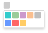
Simple color picker for Angular 2
The module relies on ngx-bootstrap for dropdown functionality.
To include in your project install via NPM with:
npm install --save ng2-color-picker You will then need to include the module to your app.module.ts:
import { ColorPickerModule } from 'ng2-color-picker'; // ... @NgModule({ imports: [ ColorPickerModule ] }) ///...Finally, include the component in your HTML as per the next section.
Once the module is installed, you will need to add HTML markup to include the picker in a component. The minimum requirement is an [(ngModel)] attribute, which should provide a string representation of a color, and an [availableColors] attribute, which should provide a string[] of available colors.
<color-picker [(ngModel)]="color" [availableColors]="availableColors"> </color-picker>It is possible to configure ng2-color-picker by providing a configuration object to the [pickerConfig] attribute (see the next section for more details on this object):
<color-picker [(ngModel)]="color" [availableColors]="availableColors" [pickerConfig]="pickerOptions"> </color-picker>ng2-color-picker exposes an interface to provide an indication of valid configuration properties, this can be referenced as a type for your configuration object by importing it:
import { IColorPickerConfiguration } from 'ng2-color-picker';Which can then be used as the configuration object type in your component:
public pickerOptions: IColorPickerConfiguration;Current list of configuration options, types and default values:
| Property | Type | Default | Description. |
|---|---|---|---|
| width | number | 25 | Width of the picker control. |
| height | number | 25 | Height of the picker control. |
| borderRadius | number | 4 | Radius of the picker control border. |