


A collection of loading spinners built with styled-components.
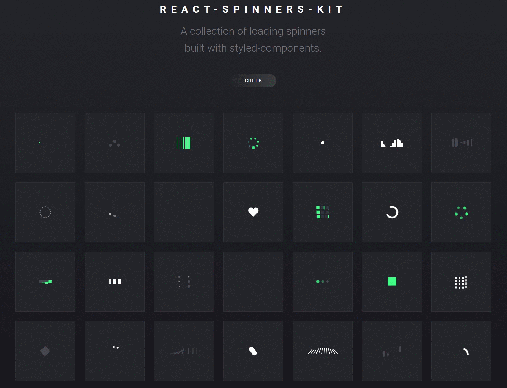
- To check out live examples visit https://dmitrymorozoff.github.io/react-spinners-kit/
Install react-spinners-kit using npm.
or if you prefer yarn
import React from "react"; import ReactDOM from "react-dom"; import { PushSpinner } from "react-spinners-kit"; class App extends React.Component { constructor(props) { super(props); this.state = { loading: true, }; } render() { const { loading } = this.state; return <PushSpinner size={30} color="#686769" loading={loading} />; } } ReactDOM.render(<App />, document.getElementById("root"));- Each spinner accepts a
loadingprop as a boolean. - The
loadingprop defaults totrue. - The loader will not render anything if
loadingisfalse.
| Spinner | size: number | color: string | frontColor: string | backColor: string | sizeUnit: string |
|---|---|---|---|---|---|
| BallSpinner | 40 | #00ff89 | - | - | px |
| BarsSpinner | 40 | #00ff89 | - | - | px |
| CircleSpinner | 30 | #fff | - | - | px |
| CubeSpinner | 25 | - | #00ff89 | #686769 | px |
| DominoSpinner | 100 | #686769 | - | - | px |
| FillSpinner | 20 | #686769 | - | - | px |
| FireworkSpinner | 40 | #fff | - | - | px |
| FlagSpinner | 40 | #fff | - | - | px |
| GridSpinner | 40 | #fff | - | - | px |
| GuardSpinner | 40 | - | #00ff89 | #686769 | px |
| HeartSpinner | 40 | #fff | - | - | px |
| ImpulseSpinner | 40 | - | #00ff89 | #686769 | px |
| PulseSpinner | 40 | #fff | - | - | px |
| PushSpinner | 30 | #686769 | - | - | px |
| SequenceSpinner | 40 | - | #00ff89 | #686769 | px |
| SphereSpinner | 30 | #fff | - | - | px |
| SpiralSpinner | 40 | #00ff89 | #686769 | px | |
| StageSpinner | 40 | #fff | - | - | px |
| SwapSpinner | 40 | #686769 | - | - | px |
| WaveSpinner | 30 | #fff | - | - | px |
| ClapSpinner | 30 | - | #00ff89 | #686769 | px |
| RotateSpinner | 45 | #00ff89 | - | - | px |
| SwishSpinner | 40 | - | #4b4c56 | #fff | px |
| GooSpinner | 55 | #fff | - | - | px |
| CombSpinner | 100 | #fff | - | - | px |
| PongSpinner | 60 | #4b4c56 | - | - | px |
| RainbowSpinner | 50 | #fff | - | - | px |
| RingSpinner | 30 | #00ff89 | - | - | px |
| HoopSpinner | 45 | #4b4c56 | - | - | px |
| FlapperSpinner | 30 | #00ff89 | - | - | px |
| MagicSpinner | 70 | #fff | - | - | px |
| JellyfishSpinner | 60 | #4b4c56 | - | - | px |
| TraceSpinner | 70 | - | #00ff89 | #4b4c56 | px |
| ClassicSpinner | 30 | #fff | - | - | px |
| MetroSpinner | 40 | #fff | - | - | px |
| WhisperSpinner | 50 | #fff | #4b4c56 | #00ff89 | px |
You can also test the components locally by cloning this repo and doing the following steps:
Install dependencies from package.json:
Runs the app in the development mode.
Open http://localhost:1234 to view it in the browser.
Run linter
- Pull requests and ⭐ stars are always welcome
- For bugs and feature requests, please create an issue
- Lint and test your code
MIT