A widget for Flutter that displays a placeholder widget while a specified image loads, then cross-fades to the loaded image. Also handles progress and errors. It uses Image.opacity when appropriate for improved performance.
If image is changed, it will cross-fade to the new image once it is finished loading. Setting image to null will cross-fade back to the placeholder.
You can set duration and curve, as well as most Image properties: width, height, fit, alignment, repeat, matchTextDirection, excludeFromSemantics and semanticLabel.
Use loadingBuilder and errorBuilder to display load progress or error states. Optionally specify syncDuration to use a different (usually faster) duration for fading in a synchronously loaded image, error, or placeholder.
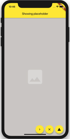
ImageFade( // whenever the image changes, it will be loaded, and then faded in: image: NetworkImage(url), // slow fade for newly loaded images: duration: const Duration(milliseconds: 900), // if the image is loaded synchronously (ex. from memory), fade in faster: syncDuration: const Duration(milliseconds: 150), // supports most properties of Image: alignment: Alignment.center, fit: BoxFit.cover, // shown behind everything: placeholder: Container( color: const Color(0xFFCFCDCA), alignment: Alignment.center, child: const Icon(Icons.photo, color: Colors.white30, size: 128.0), ), // shows progress while loading an image: loadingBuilder: (context, progress, chunkEvent) => Center(child: CircularProgressIndicator(value: progress)), // displayed when an error occurs: errorBuilder: (context, error) => Container( color: const Color(0xFF6F6D6A), alignment: Alignment.center, child: const Icon(Icons.warning, color: Colors.black26, size: 128.0), ), )ImageFade is compatible with CachedNetworkImageProvider.
The published version of this package is availble on pub.dev.
See the example directory for a simple example.