


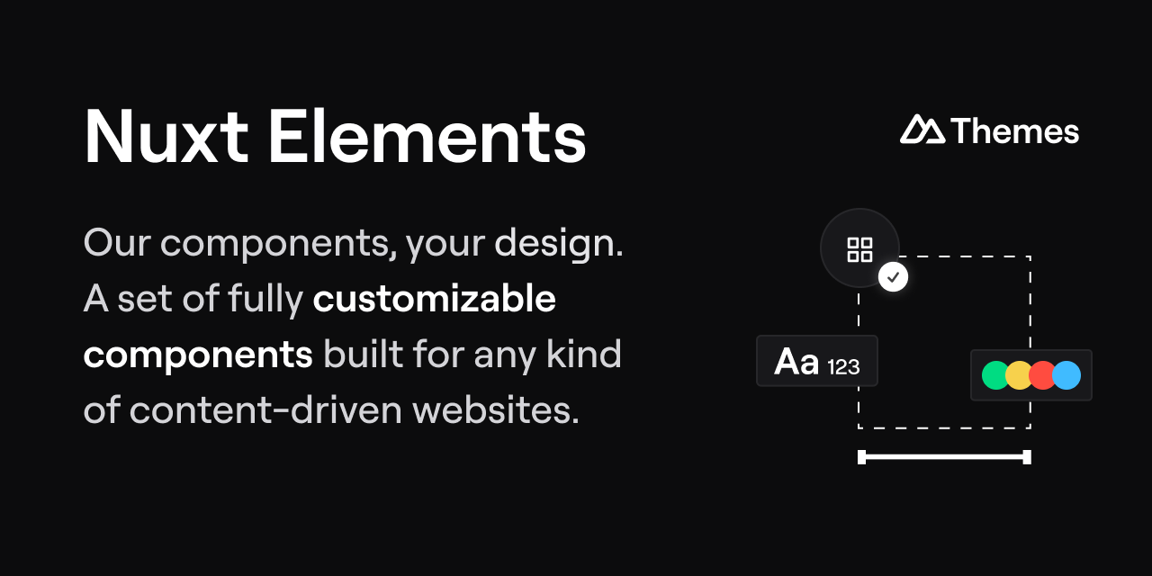
A component library to compose websites powered by design tokens and Markdown, editable in Nuxt Studio.
- Documentation: elements.nuxt.space
- Online playground: stackblitz.com/edit/nuxt-elements-play
In your Nuxt project, install the package:
pnpm add -D @nuxt-themes/elementsThen in your nuxt.config.ts, add it to the extends array:
export default defineNuxtConfig({ extends: ['@nuxt-themes/elements'] })Start using the elements to build your website, checkout the list of elements on elements.nuxt.dev.
An element is a Vue component made to be used inside the content/ directory with the MDC syntax.
The component can have:
- Props to receive data from the editor (generated form)
- Slots using the
<ContentSlot>component to pass MDC to the component
Example:
<script setup lang="ts"> defineProps({ image: { type: String, default: null } }) </script> <template> <section> <h1 class="text-3xl font-bold text-primary-900 dark:text-primary-100"> <ContentSlot :use="$slots.title" unwrap="p">Default title</ContentSlot> </h1> <!-- description slot is optional --> <p class="mt-3" v-if="$slots.description"> <ContentSlot :use="$slots.description" unwrap="p" /> </p> </div> <img v-if="image" :src="image" /> </div> </section> </template>Note that the <ContentSlot> component cannot have class attribute because they are headless components.
Make sure to install the dependencies:
pnpm installStart the playground:
pnpm devStart the documentation:
pnpm generatePreview the built documentation:
pnpm previewTo use the elements in development in your project:
- Run the
pwdcommand in the elements project and copy it, example:/Users/atinux/Projects/nuxt-themes/elements - Add it to the
extendsof yournuxt.config.ts:
export default defineNuxtConfig({ extends: '/Users/atinux/Projects/nuxt-themes/elements' })