46

Disclaimer. This question was asked many times before. But since time has passed and now we are close to Bootstrap 4 release with full flexbox support, it is time for new answers for the same question.

I want to create equal column height with Bootstrap 4. Here is demo of intended result:
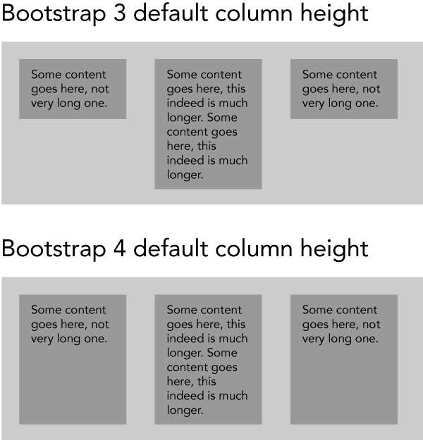
I want a solution, that works in all browsers, that are supported by Bootstrap 4. Better if no JS involved. Some of existing solution are based on Bootstrap 3, some aren't working in Safari on MacOS.

Update. Seems I did wrong research. Bootstrap 4 ships with equal height by default. I have included an updated image with illustration. You don't need to do anything, it is already there.

6
  • @AndrewLyndem I can't find any solution, which is based on B4. I have found a few based on B3. Since the question is pretty popular, I think someone more experienced already have a good tested solution already. Commented Mar 2, 2017 at 9:17
  • This works for B3, for example codepen.io/bootstrapped/details/RrabNe Commented Mar 2, 2017 at 9:17
  • The dup question already has an answer for Bootstrap 4. Commented Mar 2, 2017 at 11:48
  • @ZimSystem It doesn't work in Safari. But maybe because it is a bug in Safari, we could forget about this. Commented Mar 2, 2017 at 12:02
  • 1
    Yes, and the answer is still the same as in the dup. Flexbox is native to Bootstrap 4 so equal heights will work natively. Commented Mar 2, 2017 at 12:06

3 Answers 3

38

You just have to use class="row-eq-height" with your class="row" to get equal height columns for previous bootstrap versions.

but with bootstrap 4 this comes natively.

Sign up to request clarification or add additional context in comments.

4 Comments

I can't see class 'row-eq-height' in B4 alpha, is it there? If not, do you have any working example? Your link is based on B3, not B4.
no I mentioned that equal height column is a native property of b4..the link is for b3
Also, the row-eq-height class was never released in Bootstrap 3. The row-eq-height was part of a 3rd party Vietnamese fork of Bootstrap, and was temporarily an experiment but was not included in BS 3.
This is the correct answer (h-100 class): stackoverflow.com/questions/49437032/…
16

Equal height columns is the default behaviour for Bootstrap 4 grids.

.col { background: red; } .col:nth-child(odd) { background: yellow; }
<link rel="stylesheet" href="https://maxcdn.bootstrapcdn.com/bootstrap/4.0.0-alpha.6/css/bootstrap.min.css" integrity="sha384-rwoIResjU2yc3z8GV/NPeZWAv56rSmLldC3R/AZzGRnGxQQKnKkoFVhFQhNUwEyJ" crossorigin="anonymous"> <div class="container"> <div class="row"> <div class="col"> 1 of 3 </div> <div class="col"> 1 of 3 <br> Line 2 <br> Line 3 </div> <div class="col"> 1 of 3 </div> </div> </div>

2 Comments

Do you have a solution to create default (30px) gaps between columns and still have equal height columns?
@max gutters are still in place by default as well...
6

You can use the new Bootstrap cards:

<link rel="stylesheet" href="https://maxcdn.bootstrapcdn.com/bootstrap/4.0.0-alpha.6/css/bootstrap.min.css" integrity="sha384-rwoIResjU2yc3z8GV/NPeZWAv56rSmLldC3R/AZzGRnGxQQKnKkoFVhFQhNUwEyJ" crossorigin="anonymous"> <script src="https://code.jquery.com/jquery-3.1.1.slim.min.js" integrity="sha384-A7FZj7v+d/sdmMqp/nOQwliLvUsJfDHW+k9Omg/a/EheAdgtzNs3hpfag6Ed950n" crossorigin="anonymous"></script> <script src="https://cdnjs.cloudflare.com/ajax/libs/tether/1.4.0/js/tether.min.js" integrity="sha384-DztdAPBWPRXSA/3eYEEUWrWCy7G5KFbe8fFjk5JAIxUYHKkDx6Qin1DkWx51bBrb" crossorigin="anonymous"></script> <script src="https://maxcdn.bootstrapcdn.com/bootstrap/4.0.0-alpha.6/js/bootstrap.min.js" integrity="sha384-vBWWzlZJ8ea9aCX4pEW3rVHjgjt7zpkNpZk+02D9phzyeVkE+jo0ieGizqPLForn" crossorigin="anonymous"></script> <div class="card-group"> <div class="card"> <img class="card-img-top" src="..." alt="Card image cap"> <div class="card-block"> <h4 class="card-title">Card title</h4> <p class="card-text">This is a wider card with supporting text below as a natural lead-in to additional content. This content is a little bit longer.</p> </div> <div class="card-footer"> <small class="text-muted">Last updated 3 mins ago</small> </div> </div> <div class="card"> <img class="card-img-top" src="..." alt="Card image cap"> <div class="card-block"> <h4 class="card-title">Card title</h4> <p class="card-text">This card has supporting text below as a natural lead-in to additional content.</p> </div> <div class="card-footer"> <small class="text-muted">Last updated 3 mins ago</small> </div> </div> <div class="card"> <img class="card-img-top" src="..." alt="Card image cap"> <div class="card-block"> <h4 class="card-title">Card title</h4> <p class="card-text">This is a wider card with supporting text below as a natural lead-in to additional content. This card has even longer content than the first to show that equal height action.</p> </div> <div class="card-footer"> <small class="text-muted">Last updated 3 mins ago</small> </div> </div> </div>

Link: Click here

regards,

Comments

Start asking to get answers

Find the answer to your question by asking.

Ask question

Explore related questions

See similar questions with these tags.