I have air temperature measurements from two fixed locations measured at hourly intervals. The code below is a random set of numbers used to represent the format of my data:
set.seed(1) RandData <- rnorm(8760*2,sd=10) Locations <- rep(c('UK','France'),each=8760) Date = seq(from=as.POSIXct("1991-01-01 00:00"), to=as.POSIXct("1991-12-31 23:00"), length=8760) Final <- data.frame(Loc = Locations, Doy = as.numeric(format(Date,format = "%j")), Tod = as.numeric(format(Date,format = "%H")), Temp = RandData) I can plot the variation in temperature as a funtion of day of year with the following code:
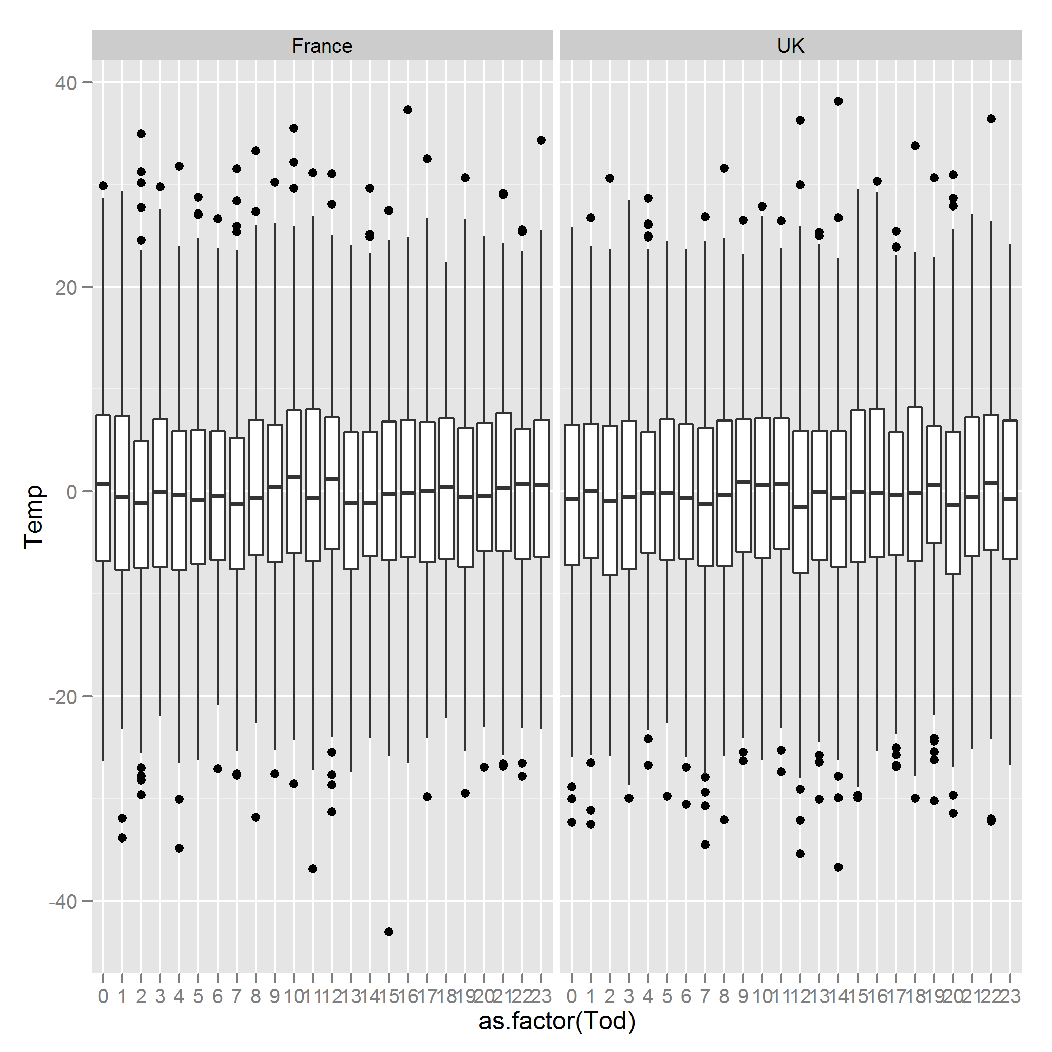
require(lattice) xyplot(Temp~Doy | Loc, data = Final, col = "black", type = "l") This would show the annual pattern of the data. However, what I would like to do is to produce boxplots of the variation in temperature for different times of the day. So, for the example above I would like two figures, one for each country and each figure should be composed of box plots showing the variation in temperature at 00:00, 01:00... and so on, referring to Final$Tod. How can this be achieved?
Many thanks for your help.