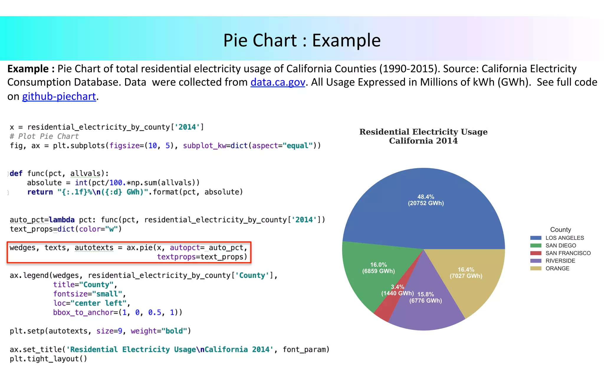
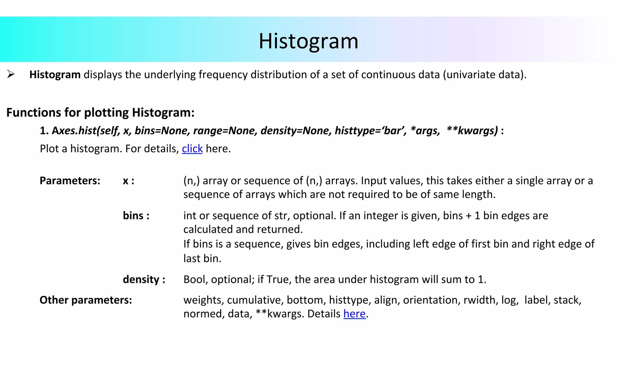
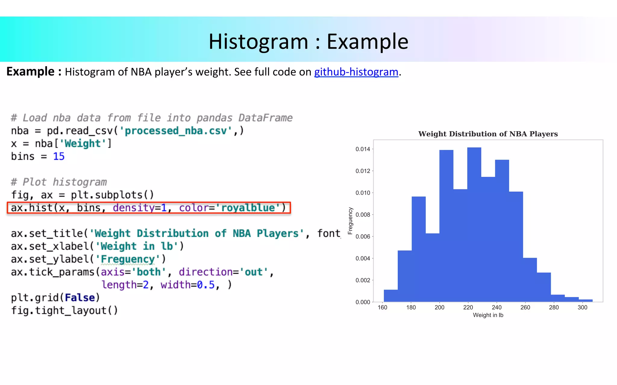
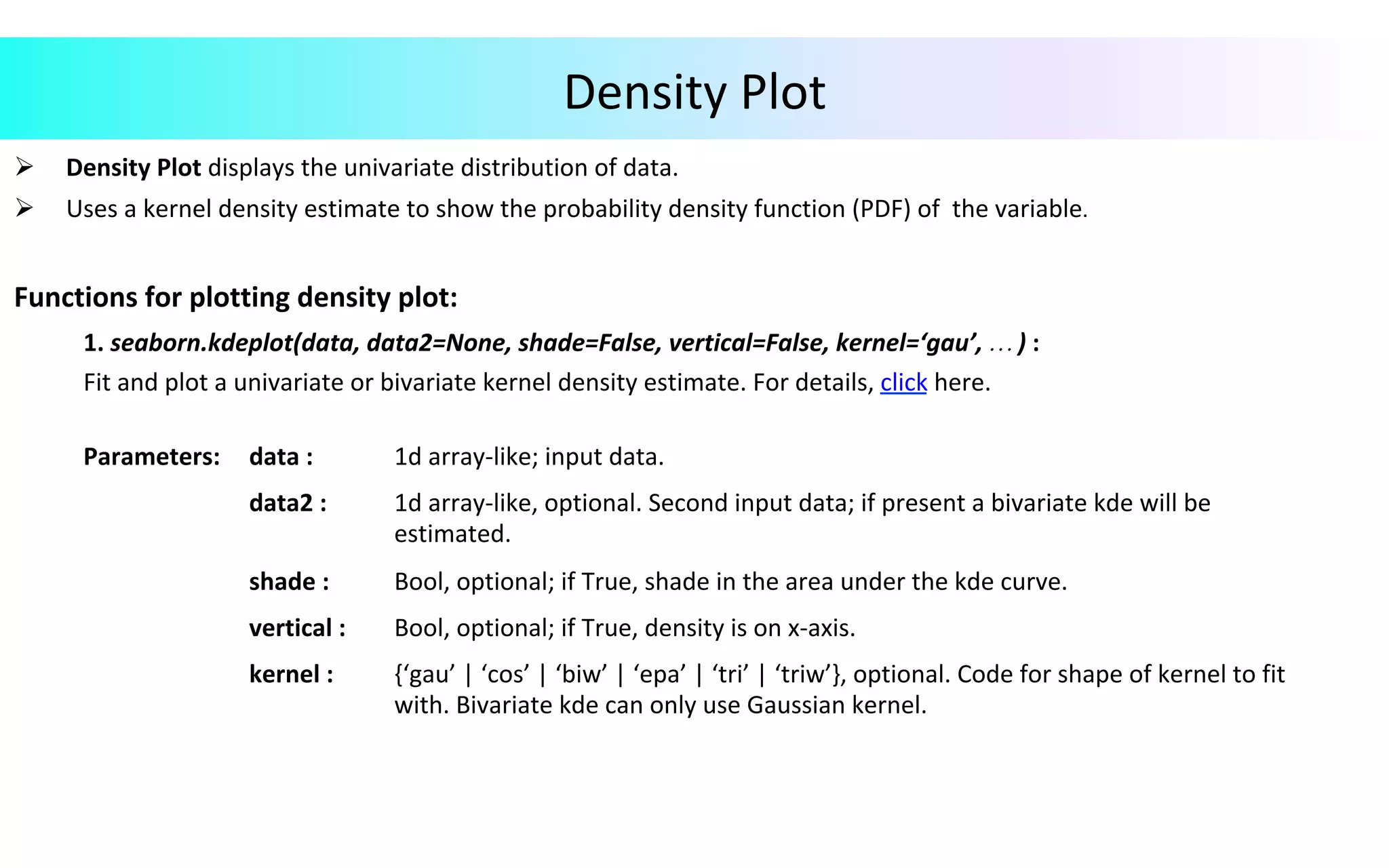
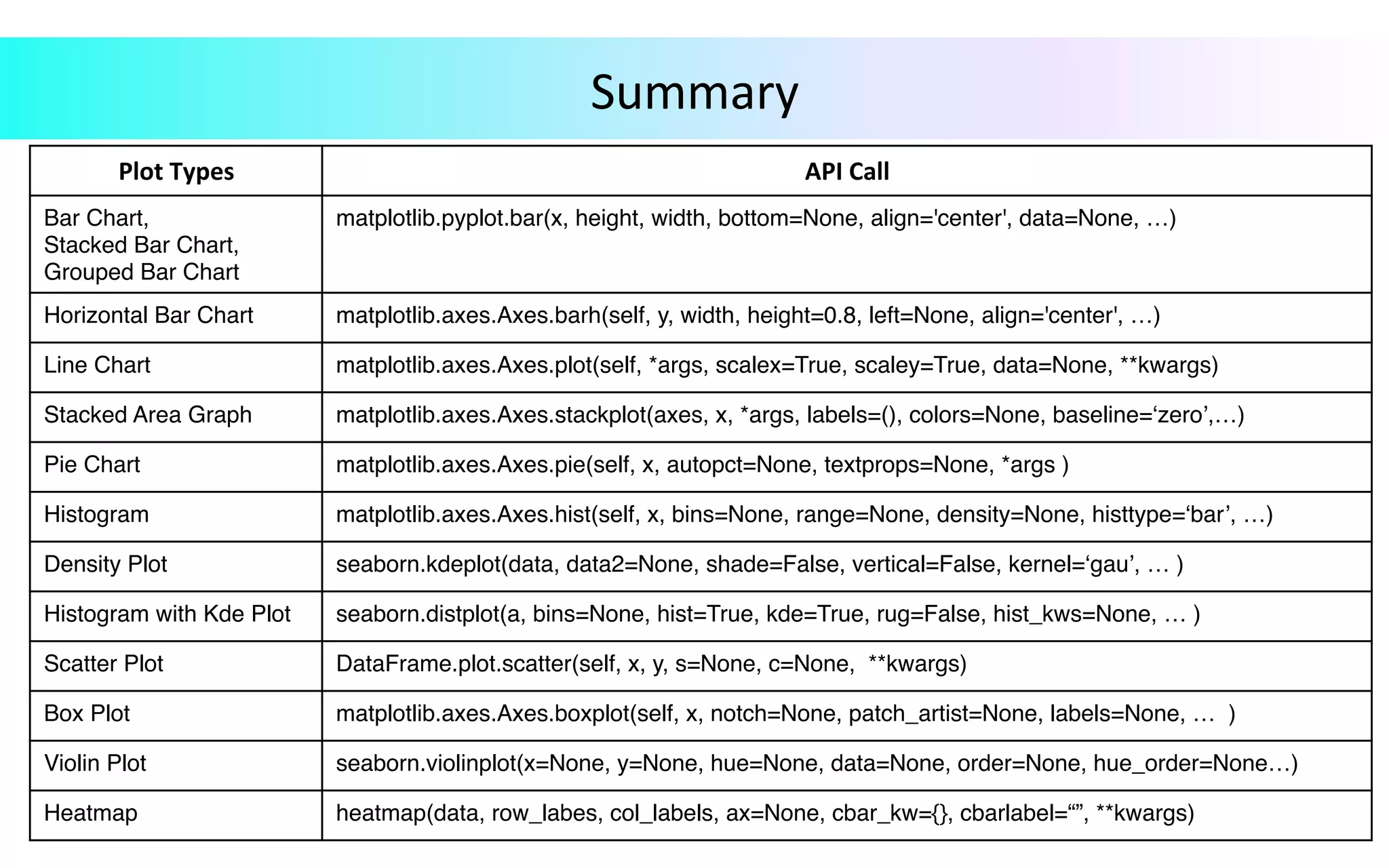
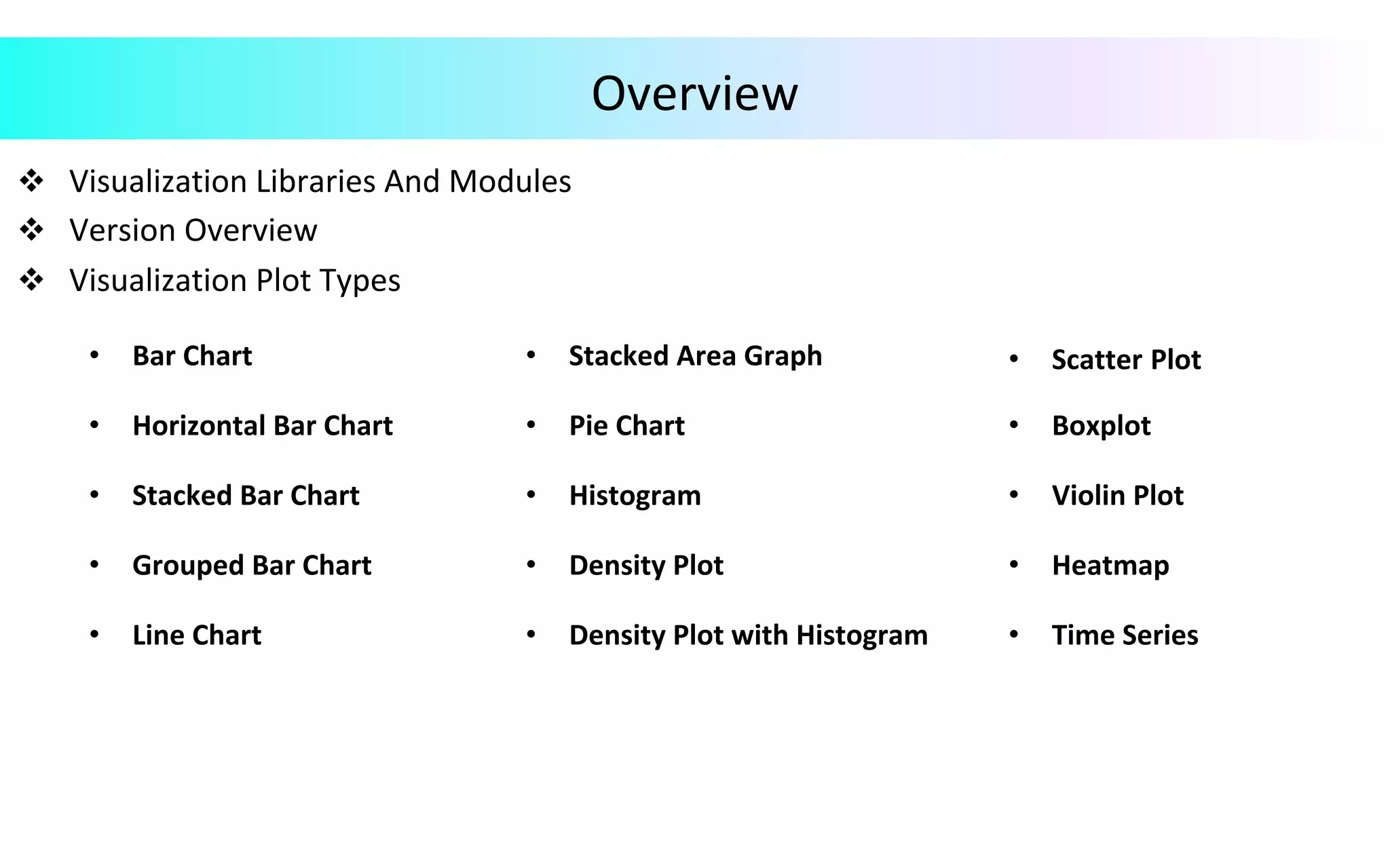
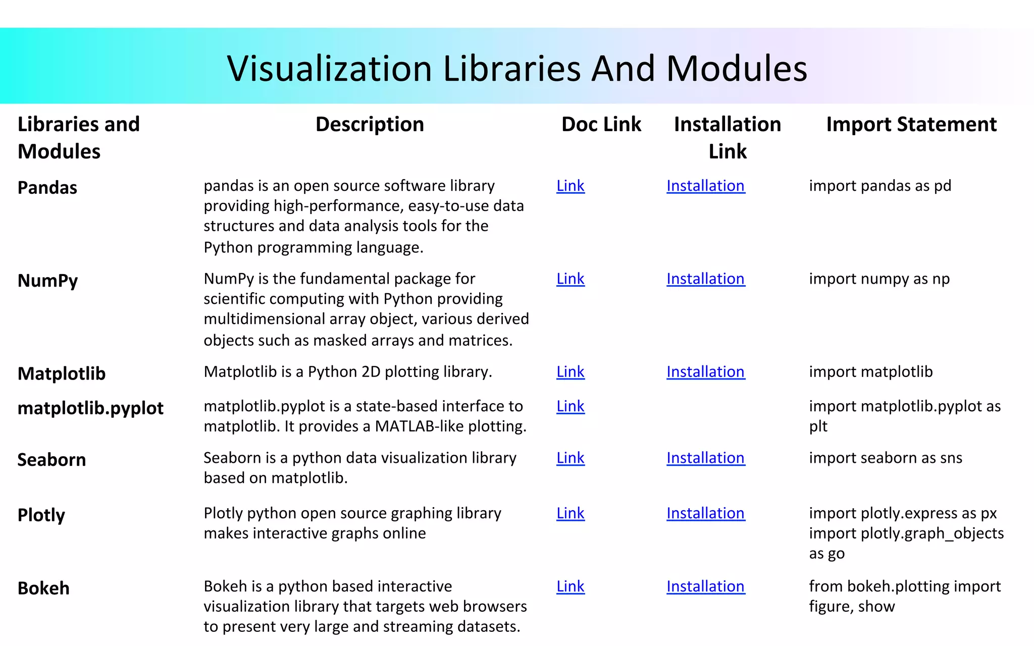
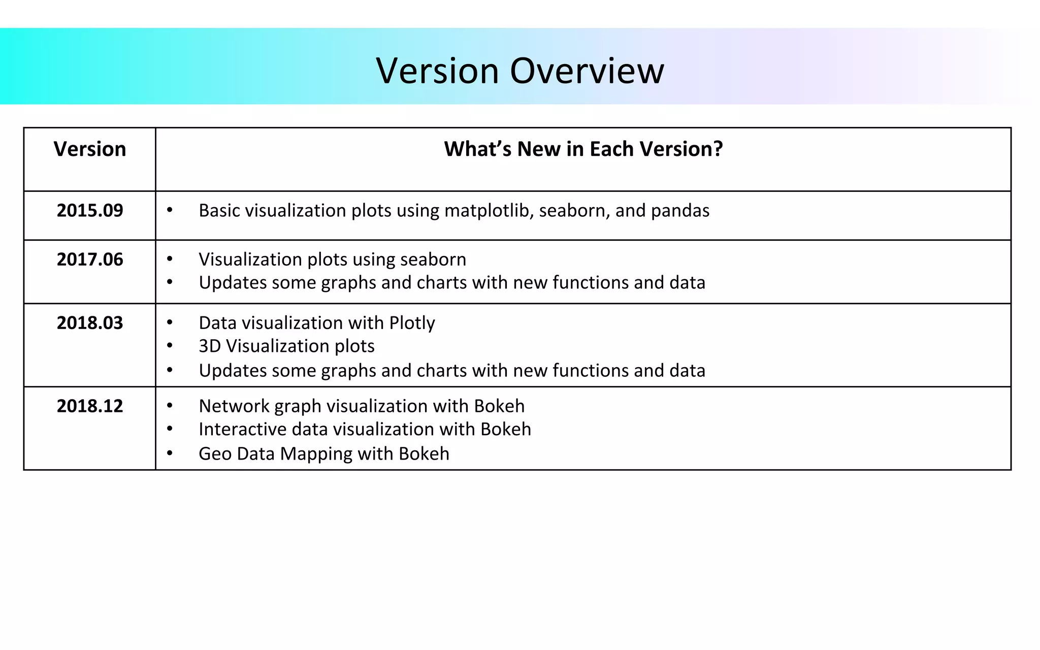
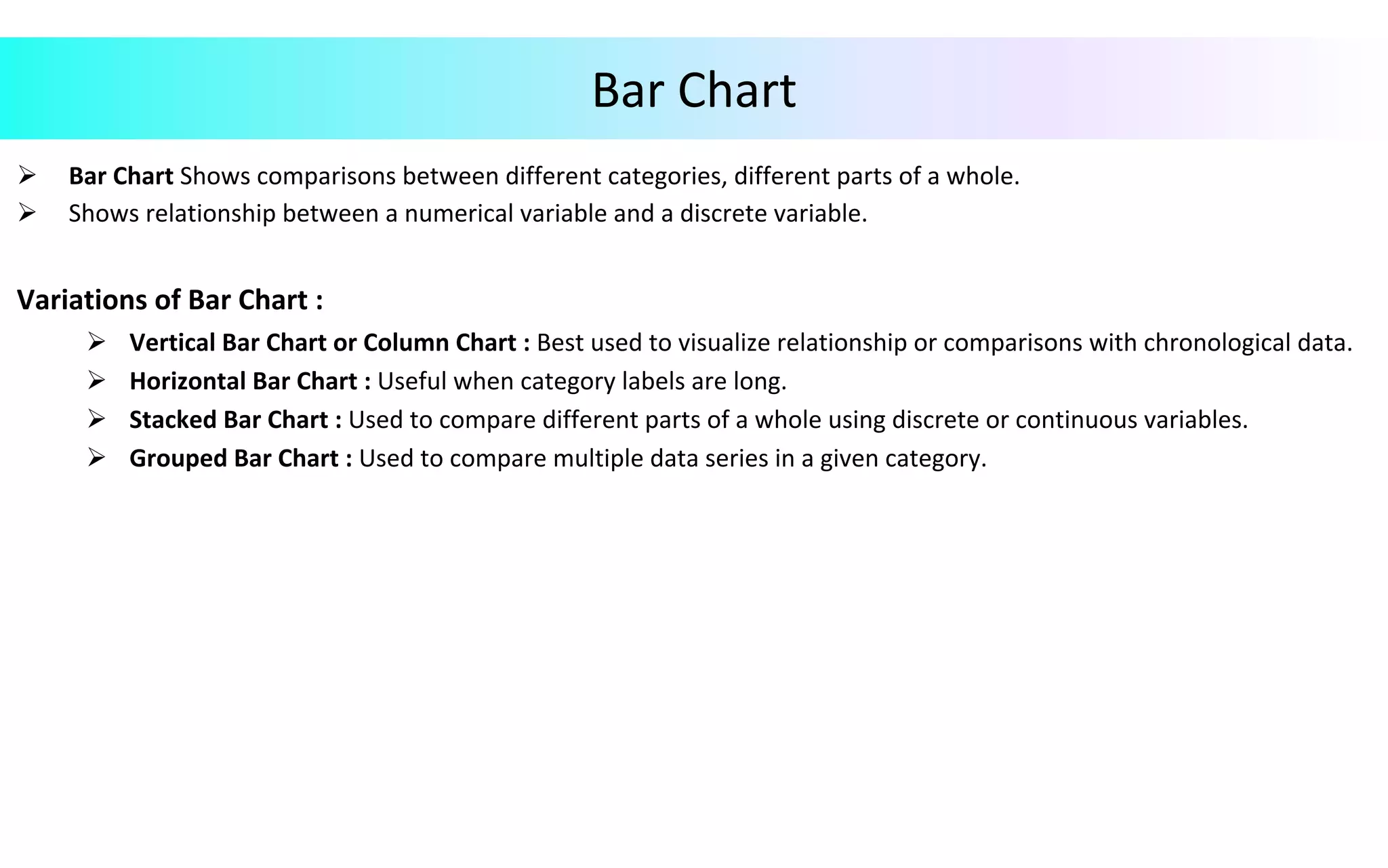
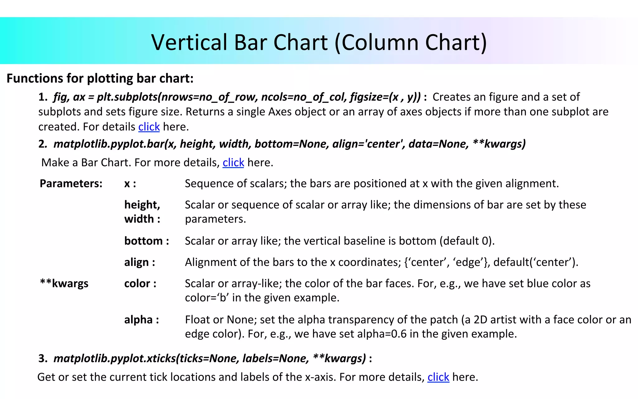
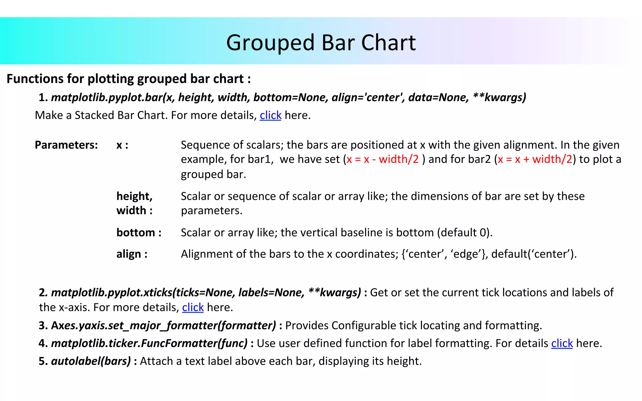
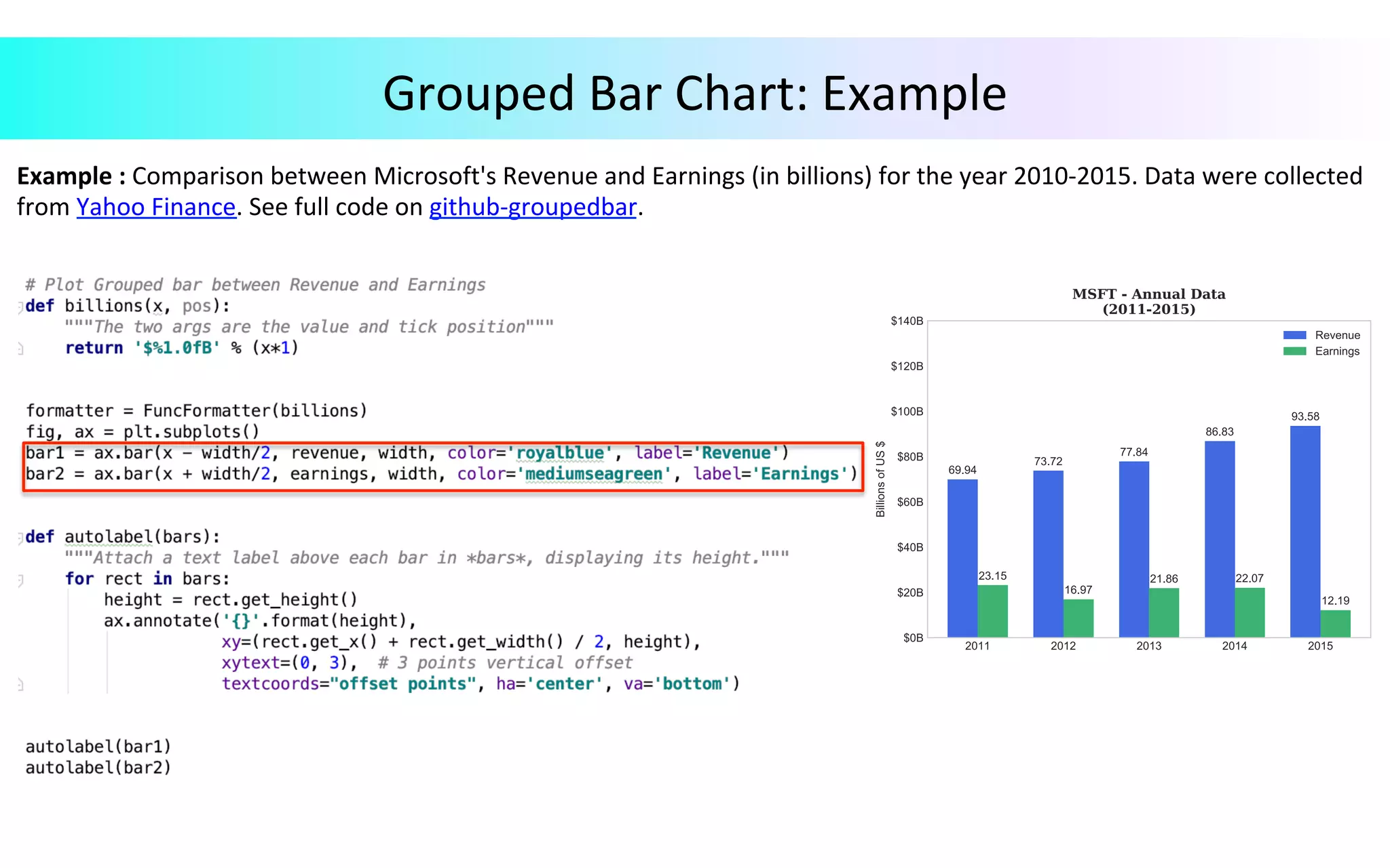
This document provides an overview of data visualization in Python. It discusses popular Python libraries and modules for visualization like Matplotlib, Seaborn, Pandas, NumPy, Plotly, and Bokeh. It also covers different types of visualization plots like bar charts, line graphs, pie charts, scatter plots, histograms and how to create them in Python using the mentioned libraries. The document is divided into sections on visualization libraries, version overview of updates to plots, and examples of various plot types created in Python.
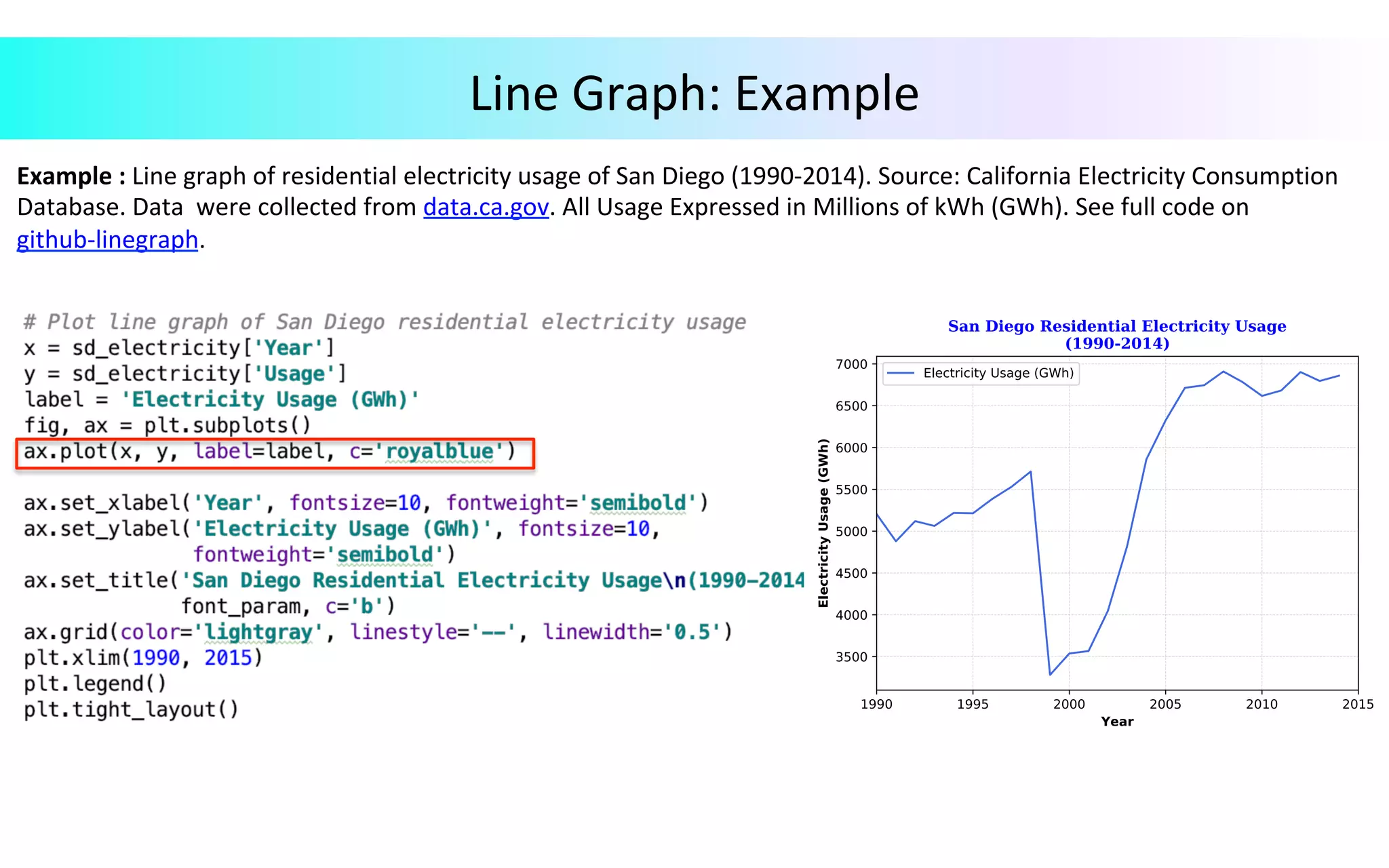
![Line Graph Ø Line Chart displays time-series relationships with continuous data. Functions for plotting line graph : 1. Axes.plot(self, *args, scalex=True, scaley=True, data=None, **kwargs) : Plot y versus x as line and/or markers. For details, click here. Call signatures: Plot([x], y, [fmt], *, data=None, **kwargs) 2. Axes.tick_params(axis='x', direction='out', length=3, width=0.5, labelrotation=75.00): Decorate the appearance of ticks, ticklabels, and gridlines. For more details, click here. 3. Axes.grid(color='lightgray', linestyle='--', linewidth='0.5'): Provides configurable grid lines. For details, click here. Parameters: x, y : array-like or scalar; the coordinates of the points or line nodes are given by x, y. fmt : str, optional; a format string, e.g., ‘ro’ for red circles. data : indexable object, optional; An object with label data. **kwargs Used to specify properties like line label (for auto legend), line width, antialiasing, marker face color.](https://image.slidesharecdn.com/datavisualizationv3-a-191102061619/75/Data-Visualization-in-Python-15-2048.jpg)