I have discrete optical spectra data consisting of pairs of wavelengths and intensities, and I would like to make a ListPlot in which the points are both joined, and colored according to the wavelength as is the filling.
Here's fake data that illustrates the problem:
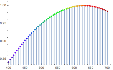
ListPlot[ Table[Style[{λ, Sin[λ/400]}, ColorData["VisibleSpectrum"][λ]], {λ, 400, 700, 5}], PlotStyle -> PointSize[Medium], Filling -> Axis, FillingStyle -> Function[{λ, y}, ColorData["VisibleSpectrum"][#[[1]] &]]] I can get the points to be properly colored, but not the filling. Moreover, the ideal is to have a continuous filling underneath curve (as in the linked example), i.e., not discrete bars. I've tried numerous variations on the FillingStyle, without success.


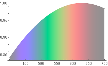

ColorData["VisibleSpectrum"]. $\endgroup$VisibleSpectrumtakes the wavelength (in nanometers) and renders the color—just as is the form of my data. Shouldn't there be an easy way to call VisibleSpectrum in FillingStyle?! $\endgroup$"VisibleSpectrum"does not always give accurate colors. It was only a suggestion; if you insist on using"VisibleSpectrum", then sure, you can use it inFillingStyle:ListLinePlot[Table[{x, Sin[x/400]}, {x, 400, 700, 5}], ColorFunction -> (ColorData["VisibleSpectrum", #] &), ColorFunctionScaling -> False, Filling -> Axis]$\endgroup$