


Blazor UI: Page Alerts
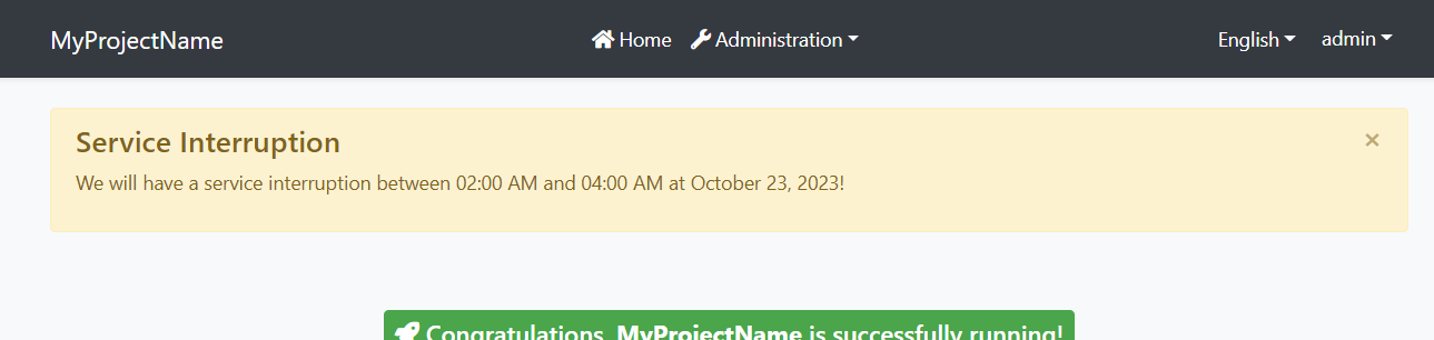
It is common to show error, warning or information alerts to inform the user. An example Service Interruption alert is shown below:
Quick Example
Simply inject IAlertManager to your page or component and call the Alerts.Warning method to show a success message.
namespace MyProject.Blazor.Pages { public partial class Index { private readonly IAlertManager _alertManager; public Index(IAlertManager alertManager) { this._alertManager = alertManager; } protected override void OnInitialized() { _alertManager.Alerts.Warning( "We will have a service interruption between 02:00 AM and 04:00 AM at October 23, 2023!", "Service Interruption"); base.OnInitialized(); } } } If you inherit your page or component from the AbpComponentBase class, you can use the Alerts property to add alerts.
namespace MyProject.Blazor.Pages { public partial class Index : AbpComponentBase { protected override void OnInitialized() { Alerts.Warning( "We will have a service interruption between 02:00 AM and 04:00 AM at October 23, 2023!", "Service Interruption"); base.OnInitialized(); } } } You typically use
@inherits AbpComponentBasein the.razorfile to inherit from theAbpComponentBase, instead of inheriting in the code behind file.
Alert Types
Warning is used to show a warning alert. Other common methods are Info, Danger and Success.
Beside the standard methods, you can use the Alerts.Add method by passing an AlertType enum with one of these values: Default, Primary, Secondary, Success, Danger, Warning, Info, Light, Dark.
Dismissible
All alert methods gets an optional dismissible parameter. Default value is true which makes the alert box dismissible. Set it to false to create a sticky alert box.


