React Data Grid – A Feature-Rich Data Table Component
- Designed for fast data handling—efficiently loads millions of records in seconds.
- Enables flexible editing and streamlined row selection.
- Provides advanced column customization.
- Supports built-in summary rows and custom aggregation logic.
Trusted by the world’s leading companies

Overview
The Syncfusion® React Data Grid is a fast and feature-rich UI component. It displays data in tables with high performance and smoothly integrates into React apps. Supporting both local and remote data sources, it handles complex data operations while being responsive and flexible. Its primary features include editing, filtering, selection, sorting, and searching.
Why choose the Syncfusion React Data Grid?
Efficient data binding
The React Data Grid component supports seamless data binding to various local and remote data sources, such as JSON, OData, WCF, and RESTful web services, by using a data manager that supports all custom APIs.
Advanced editing
The React Data Grid component supports create, read, update, and delete (CRUD) operations for both business objects and remote data services. These operations are managed through a data manager, enabling efficient and flexible editing workflows with any data source.
Custom template implementation
The React Data Grid component allows users to create custom a UI using a wide range of templates. These templates enable customization of the grid’s appearance and behavior to achieve specific designs.
Globalization and localization support
The React Data Grid component allows users from different locales to format dates, currencies, and numbers according to regional preferences. This ensures a consistent and culturally appropriate user experience across global applications.
React Data Grid Quick Start: Code example
Get started with the React Data Grid using a few lines of TSX code, as demonstrated below. You can also explore our React Data Grid example that demonstrates how to render and configure the component in a React application.
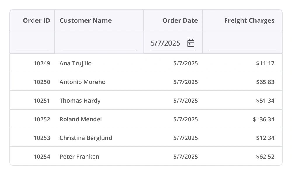
import { Grid, Columns, Column, TextAlign } from '@syncfusion/react-grid'; import { orderDetails } from './orderDetails'; export default function App() { return ( <div> <Grid dataSource={orderDetails} height={400}> <Columns> <Column field="OrderID" headerText="Order ID" width={110} textAlign={TextAlign.Right} /> <Column field="CustomerName" headerText="Customer Name" width={140} /> <Column field="OrderDate" headerText="Order Date" type={ColumnType.Date} format='yMd' textAlign={TextAlign.Right} width={120} /> <Column field="ShipCountry" headerText="Ship Country" width={120} /> <Column field="Freight" headerText="Freight Charges" width={110} textAlign={TextAlign.Right} format="C2" /> </Columns> </Grid> </div> ); };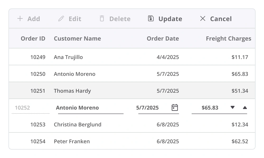
Editing
The React Data Grid component provides robust support for create, read, update, and delete (CRUD) operations. It includes built-in editor components for modifying individual cell values and supports the integration of custom editors through templating. A data manager enables seamless editing workflows across local array-based collections and remote data services.
Sorting
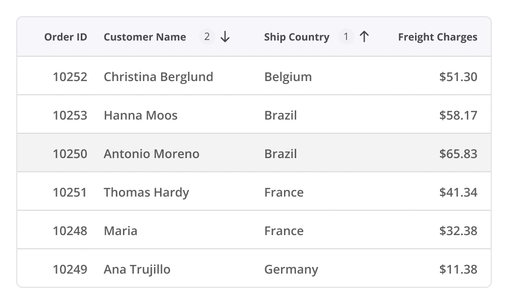
The React Data Grid component allows users to sort rows in ascending or descending order by clicking a column header. For multicolumn sorting, hold the Ctrl key and click additional headers to arrange data across multiple columns. Custom sorting logic can also be defined to meet specific application requirements.
Filtering
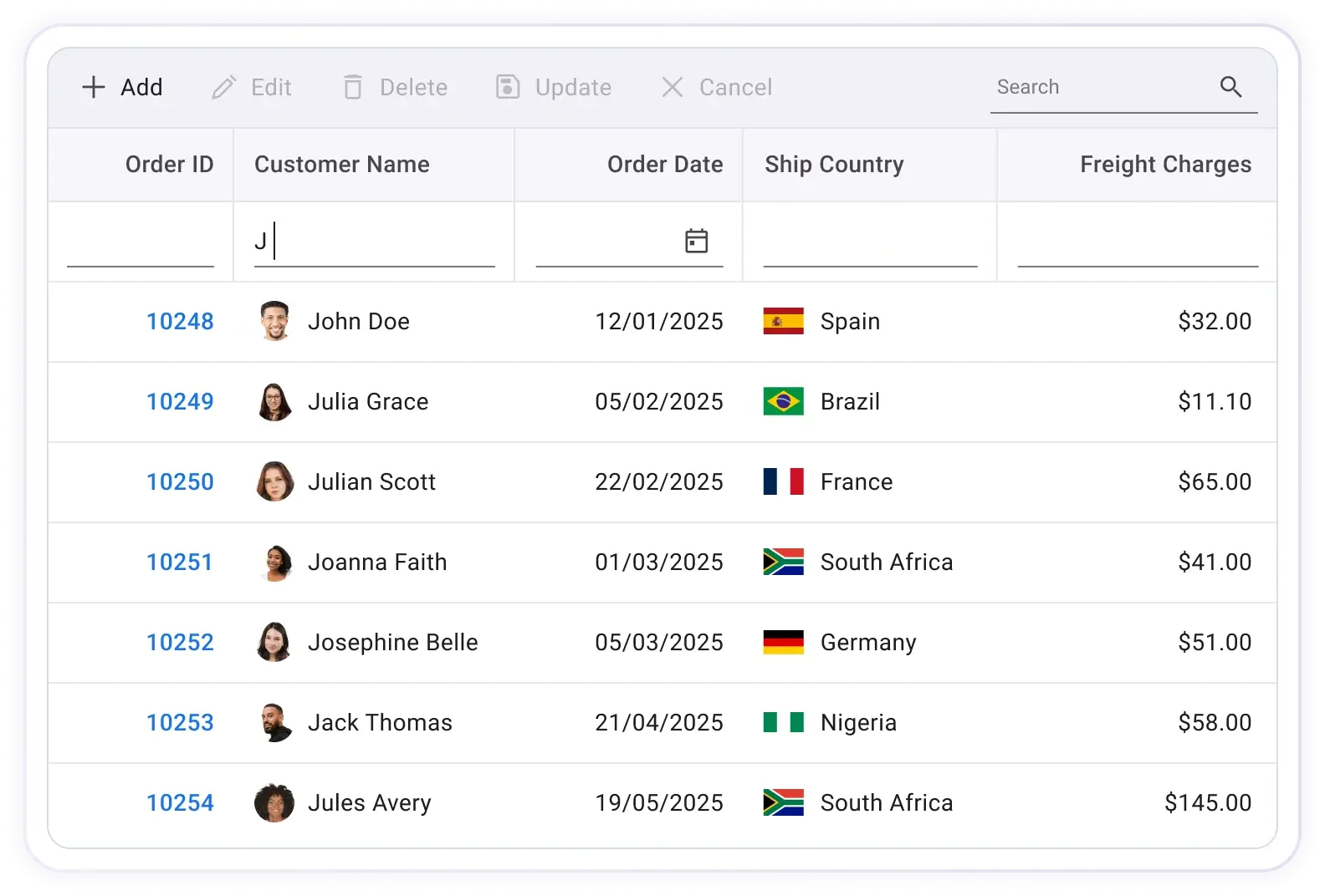
Filtering enables the retrieval of specific or related records that meet defined criteria within the Data Grid. It can be applied through the user interface or programmatically, providing flexible options for refining data based on text, numeric, or date-based conditions. Support for diacritic characters ensures accurate filtering across multilingual datasets. This enhances data exploration and improves access to relevant information.
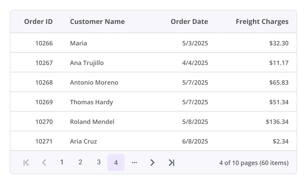
Paging
Paging allows users to navigate a segment of data from the assigned data source, improving performance and usability when working with large datasets. The React Data Grid includes a built-in pager UI, which can be fully customized to match application design requirements. Additionally, it supports on-demand paging, enabling efficient data retrieval from remote web services as needed.
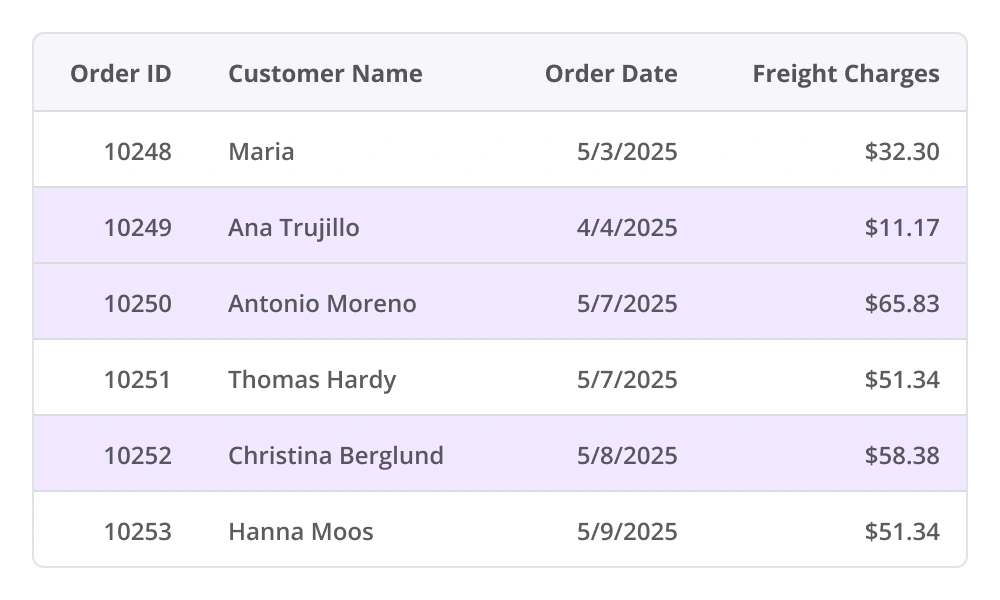
Selection
Select rows by clicking them. To select multiple rows, hold the Ctrl, Shift, or Command key while clicking, or select multiple rows programmatically.
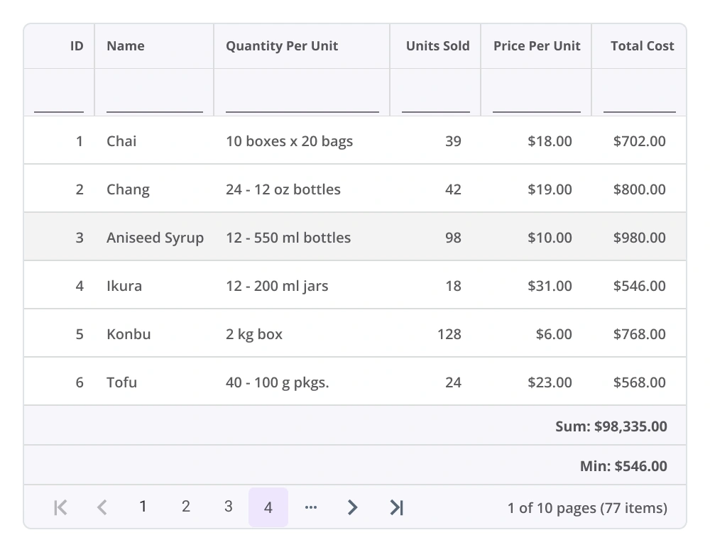
Aggregation
The React Data Grid component supports aggregation of column values, allowing summary data to be displayed easily. Aggregates can be customized to appear in individual summary rows, providing a clear overview of key metrics and enhancing data analysis within the grid.
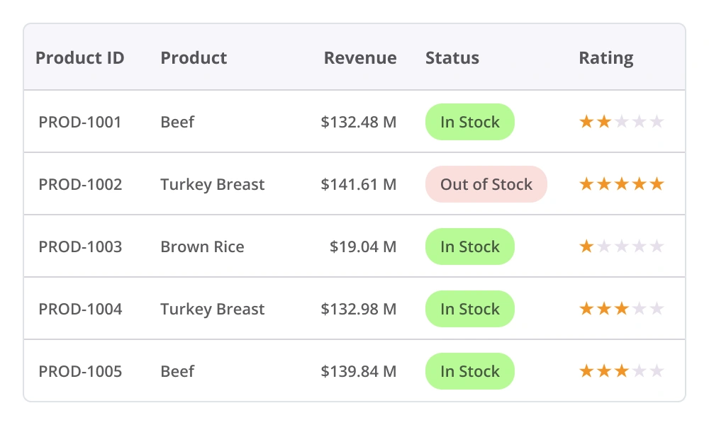
Columns
Columns in the React Data Grid establish the data source schema and support a range of features, including data formatting, auto-generated columns, customizable column definitions, text wrapping, and more, enabling flexible and precise data presentation.
Accessibility

Keyboard navigation
The React Data Grid component supports keyboard navigation across all cells. Features such as sorting, selection, and editing can be performed using defined keyboard shortcuts. This functionality promotes accessibility and supports the development of inclusive applications.

Screen reader
The React Data Grid component includes complete WAI-ARIA accessibility support, ensuring compatibility with assistive technologies, such as screen readers. Its user interface incorporates high-contrast visual elements to improve visibility for users with low vision. Valid UI descriptions are exposed to screen readers, supporting inclusive and accessible application design.

Right to left (RTL)
The React Data Grid component supports right-to-left rendering, allowing text and the component’s layout to flow from right to left. This improves accessibility and enhances the user experience for users who use languages that are written from right to left.


Not sure how to create your first React Data Grid? Our documentation can help.
I’d love to read it nowPure React Components
Developed using React’s core principles, this library employs functional components and hooks without any external dependencies.
GRIDS
DATA VISUALIZATION
NAVIGATION
INPUTS
Frequently Asked Questions
Why should you choose the Syncfusion React Data Grid?
The Syncfusion React Data Grid offers the following features:
- Mobile-first design that adapts to any resolution.
Flexible data binding with support to use local and remote data sources, including JSON, RESTful services, OData services, and WCF services.
Simple configuration and APIs.
- Support for all modern browsers.
Expansive learning resources such as demos and documentation to learn quickly and get started with React Data Grid.
Where can I find the Syncfusion React Data Grid demo?
You can find our React Data Grid demo here. It demonstrates how to render and configure the component.
What is a React data grid?
A React data grid is a UI component that allows users to display and manipulate tabular data with functionalities such as sorting, filtering, pagination, and editing.
How do you enable filtering in the React Data Grid?
To enable filtering in the Syncfusion React Data Grid, set the filterSettings.enabled property to true. This renders a filter bar beneath the column headers, allowing users to enter filter criteria.
What’s the best way to handle large datasets in the React Data Grid?
The best way to handle large datasets is by using paging.
Can I download and utilize the Syncfusion React Data Grid for free?
No, this is a commercial product and requires a paid license. However, a free Community License is available for companies and individuals whose organizations have less than $1 million USD in annual gross revenue, 5 or fewer developers, and 10 or fewer total employees.
How do I get started with the Syncfusion React Data Grid?
A good place to start would be our comprehensive getting started documentation.
What are the features of the Syncfusion React Data Grid?
The React Data Grid offers features like sorting, filtering, pagination, editing, and aggregation.
How can sorting be implemented in a React Data Grid?
Sorting can be enabled in the Data Grid component by setting the sortSettings.enabled property to true. You can define columns with sortable fields and customize sorting by using sortSettings.
Is real-time data supported in a React Data Grid?
Yes, the grid supports real-time data updates through WebSocket, SignalR, or polling. You can refresh the grid or update specific rows dynamically to reflect changes in the data source. Read the documentation to learn more about using real-time data in the Data Grid.
See Real Success Stories
Developers around the world trust Syncfusion’s Essential Studio to simplify complex projects and speed up delivery. With a vast library of UI controls, powerful SDKs, and reliable support, Essential Studio helps teams build enterprise-ready applications with confidence.
Explore Case StudiesIndustry
Software development
75%Cost reduction
50%Faster development
Industry
Utilities (oil and gas)
450+hours saved
Streamlined processes and hours of development effort saved.
Advanced, flexible features
Empowered users through robust and versatile functionality.
Industry
Software and technology
1000+of hours saved
Accelerated development with enterprise-ready UI components.
Efficient file management
Streamlined workflows with document libraries without building them from scratch.
Industry
Software and technology
2 Yearsof delay avoided
Two years of delays prevented with proactive planning.
On-time delivery
Projects delivered on schedule using trusted controls.
Industry
IT services and IT consulting
Improved performance
Large datasets handled with easy customization and quick debugging.
Highly customizable
Plug-and-play controls with quick template integration.
Industry
Professional services
Instant access
Quick availability of features and resources.
Reduced dependencies
Fewer dependencies for faster development.
Rated by users across the globe
Syncfusion React Data Grid resources


Awards
Greatness—it’s one thing to say you have it, but it means more when others recognize it. Syncfusion® is proud to hold the following industry awards.

