React Floating Action Button – Screen’s Primary Action Button
- Persistent visibility: The FAB remains visible above page content to trigger the main action on the screen.
- Adaptable positioning: Easily place the FAB in predefined locations across the layout.
- Impactful styling: Use built-in styles like primary, success, warning, info, and error to make the button visually engaging.
Trusted by the world’s leading companies

Overview
The React Floating Action Button (React FAB) is an extension of the React Button that floats over the screen content to perform the most important action. It supports several built-in features, such as icons, predefined styles, different button sizes, and UI customization.
React Floating Action Button code example
Get started with the React Floating Action Button using a few simple lines of TSX code as demonstrated below. Also, explore our React Floating Action Button example that shows how to render and configure the component.
import { Fab, FabPosition } from '@syncfusion/react-buttons'; import { SaveIcon } from '@syncfusion/react-icons'; export default function App() { return ( <div className='component-section' > <Fab icon={<SaveIcon />} position={FabPosition.MiddleCenter}>Save</Fab> </div> ); }Positioning
The React Floating Action Button (FAB) offers flexible positioning options, allowing it to be placed anywhere on the page or anchored to a specific target element. This adaptability makes it ideal for enhancing user interaction and accessibility across various layouts and screen sizes.
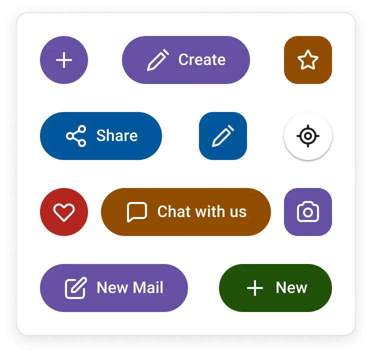
Predefined colors
The React FAB supports several predefined color options to visually convey different application states:
- Primary
- Info
- Success
- Warning
- Error
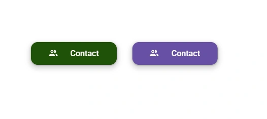
Icon with text button
The React Floating Action Button (FAB) supports flexible content options to display an icon alongside text either to the left or right of the label. Users can also choose to use the icon-only button for a more compact design.
Accessibility
- Fully supports WAI-ARIA accessibility practices to work with screen readers and assistive devices.
- Follows WAI-ARIA best practices for implementing keyboard interaction.
- Adheres to WCAG 2.0 standards in the design of UI visual elements such as foreground color, background color, line spacing, text, and images.
- Supports right-to-left (RTL) text direction for users working with RTL languages like Hebrew, Arabic, or Persian.
Developer-friendly APIs
The Floating Action Button component offers a range of APIs that allows developers to customize its appearance and behavior. With these APIs, developers can create a unique and highly personalized FAB that fits seamlessly into their applications.


Not sure how to create your first React Floating Action Button? Our documentation can help.
I’d love to read it nowPure React Components
Developed using React’s core principles, this library employs functional components and hooks without any external dependencies.
GRIDS
DATA VISUALIZATION
NAVIGATION
INPUTS
Frequently Asked Questions
Why should you choose Syncfusion® React Floating Action Button?
- Provides a floating button that appears over the webpage content to perform the primary screen action.
- Place the FAB in predefined positions.
Includes primary, success, warning, info, and error button styles.
- Use one of the best React Floating Action Buttons in the market.
Enjoy simple configuration and APIs.
- Supports all modern browsers.
Access expansive learning resources such as demos to get started quickly with the React Floating Action Button.
Can I download and utilize the Syncfusion React Floating Action Button for free?
No, this is a commercial product and requires a paid license. However, a free Community License is also available for companies and individuals whose organizations have less than $1 million USD in annual gross revenue, five or fewer developers, and 10 or fewer employees.
How do I get started with Syncfusion React Floating Action Button?
A good place to start would be our comprehensive getting started guide.
Where can I find the Syncfusion React Floating Action Button demo?
You can find our React Floating Action Button demo here. It demonstrates how to render and configure the component.
See Real Success Stories
Developers around the world trust Syncfusion’s Essential Studio to simplify complex projects and speed up delivery. With a vast library of UI controls, powerful SDKs, and reliable support, Essential Studio helps teams build enterprise-ready applications with confidence.
Explore Case StudiesIndustry
Software development
75%Cost reduction
50%Faster development
Industry
Utilities (oil and gas)
450+hours saved
Streamlined processes and hours of development effort saved.
Advanced, flexible features
Empowered users through robust and versatile functionality.
Industry
Software and technology
1000+of hours saved
Accelerated development with enterprise-ready UI components.
Efficient file management
Streamlined workflows with document libraries without building them from scratch.
Industry
Software and technology
2 Yearsof delay avoided
Two years of delays prevented with proactive planning.
On-time delivery
Projects delivered on schedule using trusted controls.
Industry
IT services and IT consulting
Improved performance
Large datasets handled with easy customization and quick debugging.
Highly customizable
Plug-and-play controls with quick template integration.
Industry
Professional services
Instant access
Quick availability of features and resources.
Reduced dependencies
Fewer dependencies for faster development.
Rated by users across the globe
Syncfusion React FAB resources


Awards
Greatness—it’s one thing to say you have it, but it means more when others recognize it. Syncfusion® is proud to hold the following industry awards.

